Foreword
Welcome to the Vizia book!
What is Vizia?
Vizia is a powerful, reactive Rust framework for building modern desktop graphical user interfaces (GUIs). Whether you’re creating a simple utility, a complex application, or anything in between, Vizia provides the tools and abstractions to make GUI development in Rust accessible and enjoyable.
Vizia runs on Windows, Linux, and macOS, enabling you to write once and deploy across all major desktop platforms.
Who is This Book For?
This book is designed for Rust developers who want to build desktop applications with modern, declarative UI code. You don’t need prior GUI programming experience—we’ll guide you through the fundamentals—but you should be comfortable with Rust basics and ownership concepts.
About This Book
This guide serves as both a tutorial and a reference for Vizia. You can work through it sequentially to build a solid foundation, or jump to specific sections as you need them.
For the latest source code, updates, and community discussions:
- Project Home: https://github.com/vizia
- Main Repository: https://github.com/vizia/vizia
Found an Error?
If you encounter any errors, typos, outdated information, or unclear explanations in this book, we’d love to hear about it! Please help us improve by:
- Opening an issue on the vizia-book repository
- Submitting a pull request with a fix if you’d like to contribute directly
Your feedback helps make this resource better for everyone.
Contributing to Vizia
Beyond this book, the Vizia project welcomes contributions from developers of all experience levels! Whether you’re interested in:
- Reporting bugs in the framework or examples
- Improving documentation and examples
- Adding features or optimizations
- Fixing issues or reviewing pull requests
- Writing custom widgets or extensions
All contributions are valuable. Check out the main repository for contribution guidelines and open issues to get started.
Join the Community
For help with vizia, or to get involved with contributing to the project, come join us on our Discord server.
Getting Started
Installing Rust
The Vizia framework is built using the Rust programming language. Currently, to use Vizia, you will need to install the Rust compiler by following the instructions over at https://www.rust-lang.org/learn/get-started.
Platform Build Requirements
Depending on your target OS and backend, you will also need platform-specific build tools and libraries.
Windows
- Install Visual Studio Build Tools with the C++ toolchain.
- Use the
x86_64-pc-windows-msvcRust target (default for Rust on Windows).
macOS
No additional setup is required on macOS. The default Rust toolchain and system libraries are sufficient to build Vizia applications.
Linux
For Ubuntu and Debian-based distributions, install build essentials plus common X11 and Wayland development packages:
sudo apt update
sudo apt install build-essential libssl-dev pkg-config cmake libgtk-3-dev libclang-dev
Running the Examples
The Vizia repository on github contains a number of example applications. To run these examples, first clone the repository to a local directory, then with your terminal of choice, navigate to this directory and run the following command:
cargo run --example name_of_example
Where name_of_example should be replaced with the example name.
There are also example applications which are packages with their own Cargo.toml files. To run, for example, the widget gallery, use the following command:
cargo run -p widget_gallery
Where widget_gallery should be replaced with the name of the example package you wish to run.
Quickstart
Build your first Vizia application step by step, from project setup to a polished final app. Each chapter adds one concept so you can follow along incrementally.
Overview
In this quick start guide we’ll build a very simple counter application consisting of two buttons, one for incrementing the counter and one for decrementing, and a label showing the counter value.
This guide will introduce the reader to the basics of vizia, including setting up an application, composing and modifying views, layout, styling, reactivity, localization and accessibility. The final application will look like the following:

Reactive UI
Vizia is a reactive UI framework. This means that visual elements which represent some state of the application will update when this state changes. Interacting with these visual elements causes the application state to change.
A reactive UI then is a feedback loop of application state change and visual element updates.
In Vizia, this pattern can be broken down into four concepts:
- Models - Data representing the state of an application.
- Views - The visual elements which present the application state as a graphical user interface.
- Binding - The link between model data and views which causes them to update when the data changes.
- Events - Messages which views send to models to trigger changes to the data.
Setting Up
Creating a new project
First, let’s create a new Rust project using the following command:
cargo new --bin hello_vizia
This will generate a hello_vizia directory with the following contents:
.
├── Cargo.toml
├── .git
├── .gitignore
└── src
    └── main.rs
Adding Vizia as a dependency
Open the Cargo.toml file and add the following to the dependencies:
[package]
name = "hello_vizia"
version = "0.1.0"
edition = "2024"

[dependencies]
vizia = {git = "https://github.com/vizia/vizia"}
Creating an Application
The first step to building a GUI with vizia is to create an application. Creating a new application creates a root window and a context. Views declared within the closure passed to Application::new() are added to the context and rendered into the root window.
Add the following code to the main.rs file, replacing the hello world code that was generated for us:
use vizia::prelude::*;
fn main() -> Result<(), ApplicationError> {
Application::new(|cx|{
// Content goes here
})
.run()
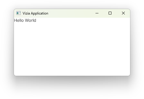
}The run() method on the Application causes the program to enter the event loop and for the main window to display.
We can run our application with cargo run in the terminal, which should result in the following:
Modifying the Window
When creating an Application the properties of the window can be changed using window modifiers. These modifiers are methods called on the application prior to calling run().
For example, the title() and inner_size() window modifiers can be used to set the title and size of the window respectively.
use vizia::prelude::*;

fn main() -> Result<(), ApplicationError> {
    Application::new(|cx|{

    })
    .title("Counter")
    .inner_size((400, 150))
    .run()
}
Adding Views
Views are the building bocks of a vizia GUI and are used to visually present model data and to act as controls which, when interacted with, send events to mutate model data.
We’ll learn more about models and events in the following sections.
Adding a label
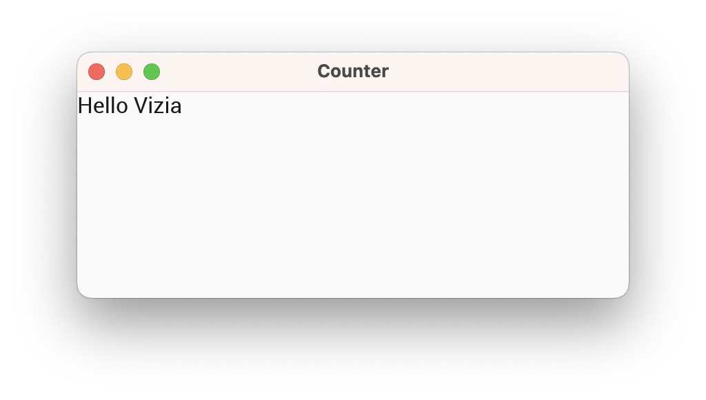
We can declare a Label view with the following code:
use vizia::prelude::*;

fn main() -> Result<(), ApplicationError> {
    Application::new(|cx|{
        Label::new(cx, "Hello Vizia");
    })
    .title("Counter")
    .inner_size((400, 150))
    .run()
}
The first argument to the new() method of the label is a mutable reference to Context, shortened to cx. This allows the view to build itself into the application. For the second argument we pass it a string to display.
Modifying Views
Modifiers are used to customize the appearance and behavior of views in a declarative way. Many of the built-in modifiers in Vizia can be applied to any View, which includes built-in views as well as user-defined views.
Customizing the label with a modifier
Applying modifiers to a view changes the properties of a view without rebuilding it. For example, we can use the background_color() modifier to set the background color of the label view:
Label::new(cx, "Hello Vizia")
    .background_color(Color::rgb(200, 200, 200));
Note how this overrides the default background color of the label, which is provided by a CSS stylesheet.
Multiple modifiers can be chained together to achieve more complex view configuration.
Label::new(cx, "Hello Vizia")
    .width(Pixels(200.0))
    .border_width(Pixels(1.0))
    .border_color(Color::black())
    .background_color(Color::rgb(200, 200, 200));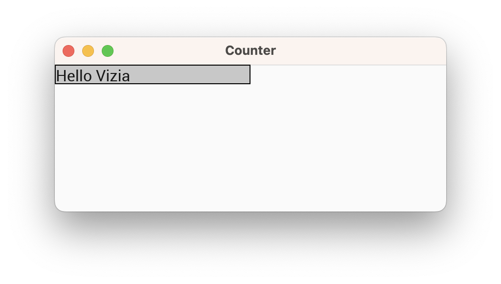
View specific modifiers
Some views have modifiers which are specific to that view type. For example, the Slider view has a modifier for setting the slider range:
let value = Signal::new(50.0);

Slider::new(cx, value)
    .range(0.0..100.0);
View specific modifiers can still be combined with regular modifiers, and the order doesn’t matter. Both of these produce the same result:
Slider::new(cx, value)
    .range(0.0..100.0)
    .width(Pixels(200.0));
Slider::new(cx, value)
.width(Pixels(200.0))
.range(0.0..100.0);Composing Views
Composition of views is achieved through container views. These views take a closure which allows us to build child views within them. Some container views may also arrange their content in a particular way.
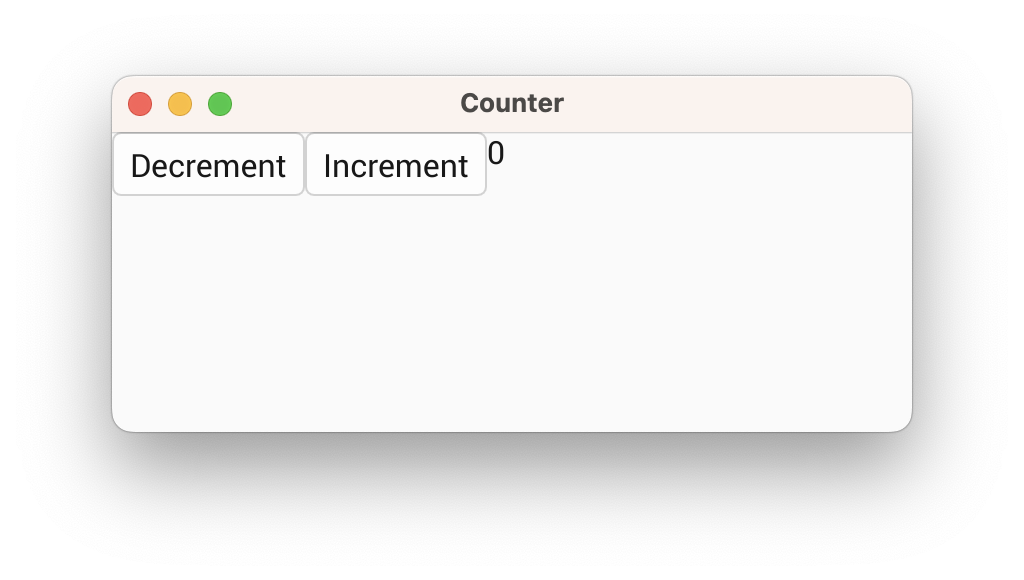
For example, the HStack container view will arrange its contents into a horizontal row. Let’s use this to declare the rest of the views for our counter application:
use vizia::prelude::*;

fn main() -> Result<(), ApplicationError> {
    Application::new(|cx|{

        HStack::new(cx, |cx|{
            Button::new(cx, |cx| Label::new(cx, "Decrement"));
            Button::new(cx, |cx| Label::new(cx, "Increment"));
            Label::new(cx, "0");
        });
    })
    .title("Counter")
    .inner_size((400, 150))
    .run()
}
For now we have hard-coded the label to display the number 0, but later we will hook this up to some model data so that it updates when the data changes. We’ve also removed the modifiers from the label, as we’ll be replacing these with CSS styling later on.
Note that the Button view is also a container, and is designed to allow things like a button with both text and a leading or trailing icon.
Composing views together forms a tree, where each view has a single parent and zero or more children. For example, for the code above the view tree can be depicted with the following diagram:

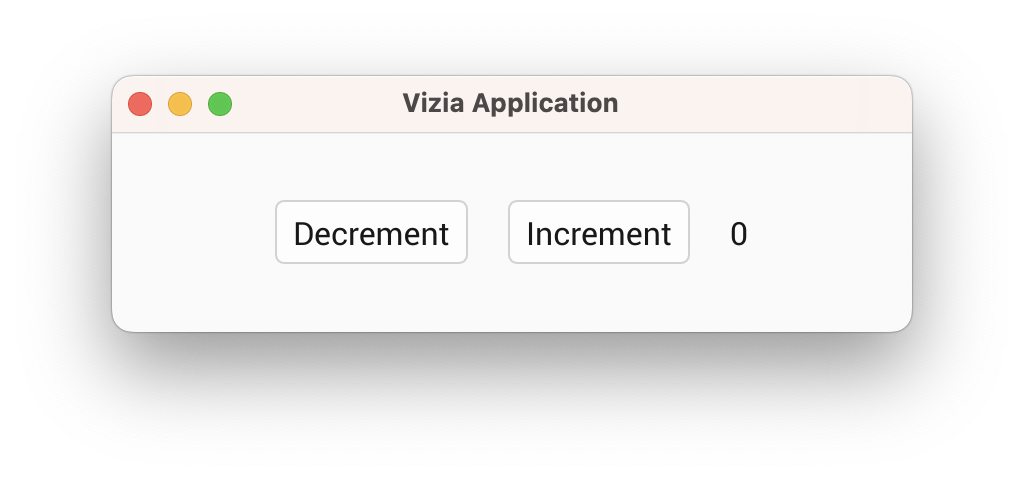
Customizing the Layout
So far we have a horizontal row of buttons and a label, but they’re positioned in the top left corner. Let’s use layout modifiers to position the views in the center of the window with some space between them.
Centering the views
By default the HStack view will stretch to fill its parent, in this case the window. We can center the contents of the HStack using the alignment() modifier and setting it to Alignment::Center. Then we can add horizontal space between the children using the gap() modifier:
use vizia::prelude::*;

fn main() -> Result<(), ApplicationError> {
    Application::new(|cx|{

        HStack::new(cx, |cx|{
            Button::new(cx, |cx| Label::new(cx, "Decrement"));
            Button::new(cx, |cx| Label::new(cx, "Increment"));
            Label::new(cx, "0");
        })
        .alignment(Alignment::Center)
        .gap(Pixels(20.0));
    })
    .inner_size((400, 100))
    .run()
}
Understanding the layout system
The layout system used by vizia is called morphorm and can achieve results similar to flexbox on the web but with fewer concepts to learn. Vizia determines the position and size of views based on a number of layout properties which can be configured. A detailed guide of the layout system can be found here.
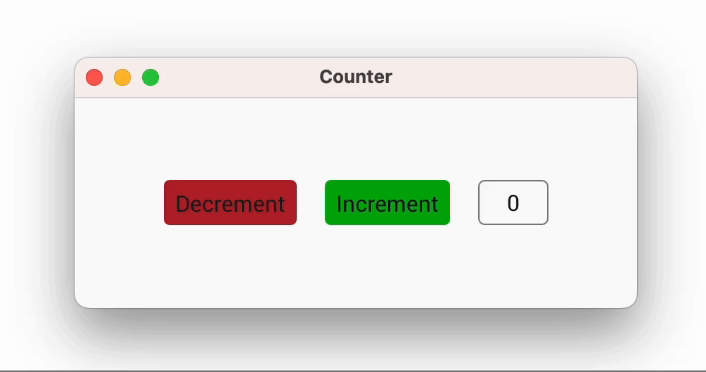
Styling the Application
Previously we saw how modifiers can be used to style views inline. However, vizia also allows views to be styled with Cascading Style Sheets (CSS) so that style rules can be shared by multiple views. Additionally, stylesheets can be reloaded at runtime by pressing the F5 key.
Adding class names to the views
First we’ll add some class names to our views, using the class style modifier, so we can target them with a CSS stylesheet:
use vizia::prelude::*;

fn main() -> Result<(), ApplicationError> {
    Application::new(|cx|{

        HStack::new(cx, |cx|{
            Button::new(cx, |cx| Label::new(cx, "Decrement"))
                .class("dec");
            Button::new(cx, |cx| Label::new(cx, "Increment"))
                .class("inc");
            Label::new(cx, "0")
                .class("count");
        })
        .class("row");
    })
    .title("Counter")
    .inner_size((400, 150))
    .run()
}
Creating a stylesheet
Next, we’ll create a style.css file in the src directory with the following CSS code:
.row {
    alignment: center;
    gap: 20px;
}

button {
    border-width: 0px;
}

button.dec {
    background-color: rgb(170, 50, 50);
}

button.inc {
    background-color: rgb(50, 170, 50);
}

label.count {
    alignment: center;
    border-width: 1px;
    border-color: #808080;
    corner-radius: 4px;
    width: 50px;
    height: 32px;
}
Adding the stylesheet to the app
Finally, we’ll add the CSS file to the vizia application using the .add_stylesheet() function on the context. Here we’re using the include_style!() macro, which will dynamically load the stylesheet at runtime in debug mode, but include the stylesheet into the binary in release mode. This should be done just after creating the application:
use vizia::prelude::*;

fn main() -> Result<(), ApplicationError> {
    Application::new(|cx|{

        // Add the stylesheet to the app
        cx.add_stylesheet(include_style!("src/style.css"))
            .expect("Failed to load stylesheet");

        HStack::new(cx, |cx|{
            Button::new(cx, |cx| Label::new(cx, "Decrement"))
                .class("dec");
            Button::new(cx, |cx| Label::new(cx, "Increment"))
                .class("inc");
            Label::new(cx, "0")
                .class("count");
        })
        .class("row");
    })
    .title("Counter")
    .inner_size((400, 150))
    .run()
}
If we run the app now with cargo run we get the following:
Animating Styles with Transitions
Many of the style and layout properties in vizia can be animated. The simplest way to animate style properties is through CSS transitions.
Transitions are animations for style rule properties which apply when a view matches that rule. Transitions are specified with the transition CSS property, and you must specify the property to animate and the duration of the animation. Optionally you can also specify any delay on the animation, as well as the timing function used.
The default styling for some of the built-in views already has some of these transition. For example, if you hover a button you’ll see its background color animate to a slightly lighter color.
Declaring a transition
For example, we can create a transition for the background color of a view when hovered:
use vizia::prelude::*;

const STYLE: &str = r#"
    .my_view {
        background-color: red;
    }

    .my_view:hover {
        background-color: blue;
        transition: background-color 100ms;
    }
"#;

fn main () -> Result<(), ApplicationError> {
    Application::new(|cx|{

        cx.add_stylesheet(STYLE);

        Element::new(cx)
            .class("my_view")
            .size(Pixels(200.0));
    })
    .run()
}
Note here that we have not used the include_style!() macro within the call to cx.add_stylesheet as the stylesheet is defined as a constant within the Rust code.
Note that the transition only occurs when the cursor hovers the element and not when the cursor leaves the element (unless the transition did not complete when the cursor left). This is because the transition has been specified on the :hover state of the element, and so the background color will transition when going to this state.
To transition back again, we need to specify a transition on the non-hover state as well:
.my_view {
    background-color: red;
    transition: background-color 100ms;
}

.my_view:hover {
    background-color: blue;
    transition: background-color 100ms;
}
Model Data
So far we’ve created the views for our counter application but we haven’t declared the application data with the count value we want to display and modify.
Application data in Vizia is stored in models. Views can then bind to the data in these models in order to react to changes in the data.
Declaring a model
A model definition can be any type, typically a struct, which implements the Model trait:
pub struct AppData {
    pub count: Signal<i32>,
}

impl Model for AppData {}
Building the model into the tree
To use a model, an instance of the data must be built into the application with the build() method:
use vizia::prelude::*;

fn main() -> Result<(), ApplicationError> {
    Application::new(|cx|{
        let count = Signal::new(0);
        AppData { count }.build(cx); // Build the data into the app

        HStack::new(cx, |cx|{
            Button::new(cx, |cx| Label::new(cx, "Decrement"))
                .class("dec");
            Button::new(cx, |cx| Label::new(cx, "Increment"))
                .class("inc");
            Label::new(cx, count)
                .class("count");
        })
        .class("row");

    })
    .title("Counter")
    .inner_size((400, 200))
    .run()
}
This builds the model data into the tree, in this case at the root Window. Internally, models and views are stored separately, however, for processes like event propagation, models can be thought of as existing within the tree, with an associated view.
Therefore, the model-view tree for the above code can be depicted with the following diagram:

If the AppData had been built within the contents of the HStack, then the model would be associated with the HStack rather than the Window.
Data Binding
Now that we have some model data we can bind the count to the Label view.
Data binding is the concept of linking model data to views, so that when the model data is changed, the views observing this data update in response.
In Vizia, data binding is achieved through reactive values called Signals. In this quickstart flow, count is the reactive source used to bind the label to model state.
Exposing bindable model fields
The model field we want to display (count) is stored as a Signal<i32>, so the signal handle can be passed directly to views and modifiers for binding:
pub struct AppData {
    count: Signal<i32>,
}

impl Model for AppData {}
This gives us a reactive signal handle for count.
Binding the label
We can bind the count data to the Label by passing it in place of a string:
use vizia::prelude::*;

fn main() -> Result<(), ApplicationError> {
    Application::new(|cx|{

        let count = Signal::new(0);

        AppData { count }.build(cx);

        HStack::new(cx, |cx|{
            Button::new(cx, |cx| Label::new(cx, "Decrement"))
                .class("dec");
            Button::new(cx, |cx| Label::new(cx, "Increment"))
                .class("inc");
            Label::new(cx, count) // Bind the label to the count data
                .class("count");
        })
        .class("row");
    })
    .title("Counter")
    .inner_size((400, 100))
    .run()
}
This sets up a binding which updates the value of the label whenever the count signal is modified. We can depict this with the following diagram, where the green arrow shows the direct link between the data and the label:

Modifier bindings
Many modifiers also accept signals as well as a literal value. When a bindable value is supplied to a modifier, a binding is set up which updates the modified property when the model data changes. For example:
pub struct AppData {
    color: Signal<Color>,
}

...

Label::new(cx, "Hello World")
    .background_color(color);
Mutating State with Events
The label is now bound to the data so that it updates when the count changes, so now we need to hook up the buttons to change the count.
Vizia uses events to communicate actions to update model or view data. These events propagate through the tree, typically from the view which emits the event, up through the ancestors of the view, to the main window and through any models on the way.
Declaring events
An event contains a message which can be any type, but is typically an enum. We’ll declare an event enum with two variants, one for incrementing the count and one for decrementing:
pub enum AppEvent {
    Increment,
    Decrement,
}
Emitting events
Events are usually emitted in response to some action on a view. For this we can the on_press callback provided by the Button. When the button is pressed this callback is called. We can use the provided EventContext to emit our events up the tree:
Button::new(cx, |cx| Label::new(cx, "Decrement"))
    .on_press(|ex| ex.emit(AppEvent::Decrement))
    .class("dec");
Button::new(cx, |cx| Label::new(cx, "Increment"))
    .on_press(|ex| ex.emit(AppEvent::Increment))
    .class("inc");
The flow of events from the buttons, up through the visual tree, to AppData model can be described with the following diagram, where the red arrows indicate the direction of event propagation:

Handling events
Events are handled by views and models with the event() method of the View or Model traits. Let’s fill in the Model implementation by implementing the event method:
impl Model for AppData {
      fn event(&mut self, cx: &mut EventContext, event: &mut Event) {
        event.map(|app_event, meta| match app_event {
            AppEvent::Decrement => self.count.update(|count| *count -= 1),
            AppEvent::Increment => self.count.update(|count| *count += 1),
        });
    }
}
Calling map() on an event attempts to cast the event message to the specified type and calls the provided closure if it succeeds.
The closure provides the message type and an EventMeta, which can be used to query the origin and target views of the event, or to consume the event to prevent it propagating further.
If we run the application now we can see that the buttons cause the state to mutate, which then causes the label to update.
Making the Counter Reusable
In this section we’re going to turn our counter into a component by declaring a custom view. This will make our counter reusable so we can easily create multiple instances or export the counter as a component in a library.
Step 1: Creating a custom view struct
First we declare a struct which will contain any view-specific state:
pub struct Counter {}Although we could store the count value within the view, we’ve chosen instead to make this view ‘stateless’, and instead we’ll provide it with a signal to bind to some external state (typically from a model), and some callbacks for emitting events when the buttons are pressed.
Step 2: Implementing the view trait
Next, we’ll implement the View trait for the custom counter view:
impl View for Counter {}The View trait has methods for responding to events and for custom drawing, but for now we’ll leave this implementation empty.
Step 3: Building the sub-components of the view
Next we’ll implement a constructor for the counter view. To use our view in a vizia application, the constructor must build the view into the context, which returns a Handle we can use to apply modifiers on our view.
impl Counter {
    pub fn new(cx: &mut Context) -> Handle<Self> {
        Self {

        }.build(cx, |cx|{

        })
    }
}
The build() function, provided by the View trait, takes a closure which we can use to construct the content of the custom view. Here we move the code which makes up the counter:
impl Counter {
    pub fn new(cx: &mut Context) -> Handle<Self> {
        Self {

        }.build(cx, |cx|{
            HStack::new(cx, |cx|{
                Button::new(cx, |cx| Label::new(cx, "Decrement"))
                    .on_press(|ex| ex.emit(AppEvent::Decrement))
                    .class("dec");

                Button::new(cx, |cx| Label::new(cx, "Increment"))
                    .on_press(|ex| ex.emit(AppEvent::Increment))
                    .class("inc");

                Label::new(cx, "0")
                    .class("count");
            })
            .class("row");
        })
    }
}
Step 4: User-configurable binding
The label within the counter is currently bound to a specific signal, but to make the component truly reusable we need to pass a signal in via the constructor. We use a generic parameter with the Res trait, which allows passing any type that can be resolved to an i32 value (signals, memos, constants, etc.):
impl Counter {
    pub fn new(cx: &mut Context, count: impl Res<i32>) -> Handle<Self>
    {
        Self {

        }.build(cx, |cx|{
            HStack::new(cx, |cx|{
                Button::new(cx, |cx| Label::new(cx, "Decrement"))
                    .on_press(|ex| ex.emit(AppEvent::Decrement))
                    .class("dec");

                Button::new(cx, |cx| Label::new(cx, "Increment"))
                    .on_press(|ex| ex.emit(AppEvent::Increment))
                    .class("inc");

                Label::new(cx, count)
                    .class("count");
            })
            .class("row");
        })
    }
}
Step 5 - User-configurable events
The last part required to make the counter truly reusable is to remove the dependency on AppEvent. To do this we’ll add a couple of callbacks to the counter to allow the user to emit their own events when the buttons are presses.
Adding callbacks to the view
First, change the Counter struct to look like this:
pub struct Counter {
    on_increment: Option<Box<dyn Fn(&mut EventContext)>>,
    on_decrement: Option<Box<dyn Fn(&mut EventContext)>>,
}
These boxed function pointers provide the callbacks that will be called when the increment and decrement buttons are pressed.
Before moving on, we need to assign initial field values to the Counter instance that was created earlier:
impl Counter {
    pub fn new(cx: &mut Context, count: impl Res<i32>) -> Handle<Self>
    {
        Self {
            on_decrement: None,
            on_increment: None,
        }.build(cx, |cx|{
            HStack::new(cx, |cx|{
                Button::new(cx, |cx| Label::new(cx, "Decrement"))
                    .on_press(|ex| ex.emit(AppEvent::Decrement))
                    .class("dec");

                Button::new(cx, |cx| Label::new(cx, "Increment"))
                    .on_press(|ex| ex.emit(AppEvent::Increment))
                    .class("inc");

                Label::new(cx, count)
                    .class("count");
            })
            .class("row");
        })
    }
}
Custom modifiers
Next we’ll need to add some custom modifiers so the user can configure these callbacks. To do this we can define a trait and implement it on Handle<'_, Counter>:
pub trait CounterModifiers {
    fn on_increment<F: Fn(&mut EventContext) + 'static>(self, callback: F) -> Self;
    fn on_decrement<F: Fn(&mut EventContext) + 'static>(self, callback: F) -> Self;
}
We can use the modify() method on Handle to directly set the callbacks when implementing the modifiers:
impl<'a> CounterModifiers for Handle<'a, Counter> {
    fn on_increment<F: Fn(&mut EventContext) + 'static>(self, callback: F) -> Self {
        self.modify(|counter| counter.on_increment = Some(Box::new(callback)))
    }

    fn on_decrement<F: Fn(&mut EventContext) + 'static>(self, callback: F) -> Self {
        self.modify(|counter| counter.on_decrement = Some(Box::new(callback)))
    }
}
Internal event handling
Unfortunately we can’t just call these callbacks from the action callback of the buttons. Instead we’ll need to emit some internal events which the counter can receive, and then the counter can call the callbacks. Define an internal event enum for the counter like so:
pub enum CounterEvent {
    Decrement,
    Increment,
}
We can then use this internal event with the buttons:
Button::new(cx, |cx| Label::new(cx, "Decrement"))
    .on_press(|ex| ex.emit(CounterEvent::Decrement))
    .class("dec");

Button::new(cx, |cx| Label::new(cx, "Increment"))
    .on_press(|ex| ex.emit(CounterEvent::Increment))
    .class("inc");
Finally, we respond to these events in the event() method of the View trait for the Counter, calling the appropriate callback:
impl View for Counter {
    fn event(&mut self, cx: &mut EventContext, event: &mut Event) {
        event.map(|counter_event, meta| match counter_event{
            CounterEvent::Increment => {
                if let Some(callback) = &self.on_increment {
                    (callback)(cx);
                }
            }

            CounterEvent::Decrement => {
                if let Some(callback) = &self.on_decrement {
                    (callback)(cx);
                }
            }
        });
    }
}
To recap, now when the user presses on one of the buttons, the button will emit an internal CounterEvent, which is then handled by the Counter view to call the appropriate callback, which the user can set using the custom modifiers we added using the CounterModifiers trait.
Step 6: Using the custom view
Finally, we can use our custom view in the application:
fn main() -> Result<(), ApplicationError> {
    Application::new(|cx|{

        cx.add_stylesheet(include_style!("src/style.css"))
            .expect("Failed to load stylesheet");

        let count = Signal::new(0);
        AppData { count }.build(cx);

        Counter::new(cx, count)
            .on_increment(|cx| cx.emit(AppEvent::Increment))
            .on_decrement(|cx| cx.emit(AppEvent::Decrement));
    })
    .title("Counter")
    .inner_size((400, 150))
    .run()
}
We pass it the count signal, but the custom view can accept any signal or value that resolves to an i32. We also provide it with callbacks that should trigger when the increment and decrement buttons are pressed. In this case the callbacks will emit AppEvent events to mutate the model data.
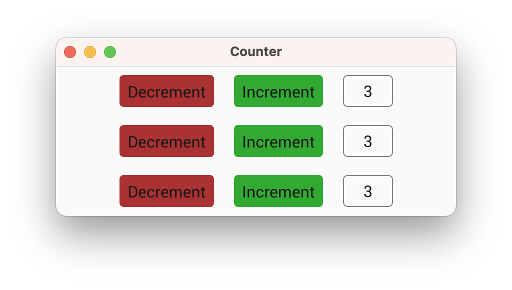
When we run our app now it will seem like nothing has changed. However, now that our counter is a component, we could easily add multiple counters all bound to the same data (or different data):
fn main() {
    Application::new(|cx|{

        cx.add_stylesheet(include_style!("src/style.css"))
            .expect("Failed to load stylesheet");

        let count = Signal::new(0);
        AppData { count }.build(cx);

        Counter::new(cx, count)
            .on_increment(|cx| cx.emit(AppEvent::Increment))
            .on_decrement(|cx| cx.emit(AppEvent::Decrement));
        Counter::new(cx, count)
            .on_increment(|cx| cx.emit(AppEvent::Increment))
            .on_decrement(|cx| cx.emit(AppEvent::Decrement));
        Counter::new(cx, count)
            .on_increment(|cx| cx.emit(AppEvent::Increment))
            .on_decrement(|cx| cx.emit(AppEvent::Decrement));
    })
    .title("Counter")
    .inner_size((400, 150))
    .run();
}
Localizing the Application
An important part of building a GUI is making sure the application is usable for different regions around the world. Vizia uses fluent to provide translatable text for an application.
Creating fluent files
Fluent files provide a key-value store for translated text strings which vizia uses to localize text in an application.
Let’s add two fluent (.ftl) files to our application. We’ll call them the same name, counter.ftl, but place them within separate directories, en-Us and es, within a resources directory.
Your project folder structure should now look like this:
.
├── Cargo.toml
├── .git
├── .gitignore
└── src
    ├── resources
    │   ├── en-US
    │   │   └── counter.ftl
    │   └── es
    │       └── counter.ftl
    ├── main.rs
    └── style.css
resources/en-US/counter.ftl
inc = Increment
dec = Decrement
resources/es/counter.ftl
inc = Incrementar
dec = Decrementar
Adding translations to the application
cx.add_translation(
langid!("en-US"),
include_str!("resources/en-US/counter.ftl").to_owned(),
);
cx.add_translation(
langid!("es"),
include_str!("resources/es/counter.ftl").to_owned(),
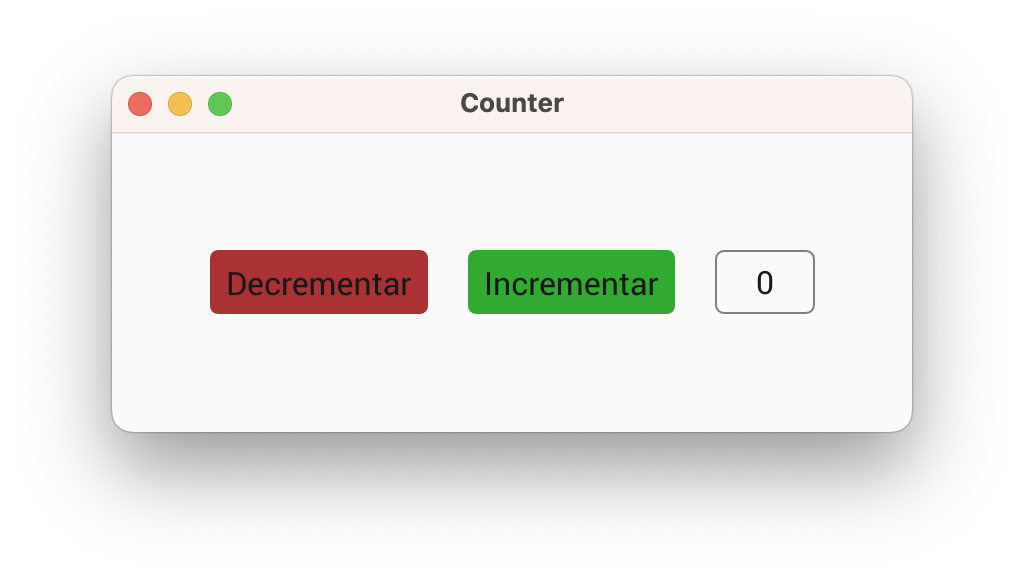
);Localizing text
To localize the text in our application we use the Localized type within the labels of the buttons, passing the translation keys to the constructor:
Button::new(cx, |cx| Label::new(cx, Localized::new("dec")));

Button::new(cx, |cx| Label::new(cx, Localized::new("inc")));
When the application is run these Localized objects are replaced with the translated strings from the fluent files based on the system locale.
Testing localization
The locale used for selecting translations is stored in a model called the Environment. By default the locale used for translations is set to the system locale, however, we can use an EnvironmentEvent to set the locale to a user-specified value. This is useful for testing the localization of an application.
cx.emit(EnvironmentEvent::SetLocale(langid!("es")));If we run our app now we’ll see that the text has been translated into Spanish. Because the buttons are set up to hug their content, the widths of the buttons have automatically updated to accommodate the slightly longer text strings.
Note that if you’re following this tutorial on a machine where the system locale is already set to Spanish then you’ll see the Spanish translations without needing to emit the SetLocale event. To see the English versions of the text replace the "es" with "en-US" when emitting the event.
Making the Application Accessible
Making the application accessibility is about making it so that assistive technologies, such as a screen reader, can navigate and query the application.
Our application so far is actually already mostly accessible as the built-in views, such as the buttons, are already set up to be accessible. However, even though the built-in views are accessible, this does not mean the app is automatically accessible.
For the case of our counter, when the increment or decrement buttons are pressed, causing the count to change, a screen reader does not know to speak the current count to inform the user of the change. To account for this we can use something called a ‘live region’.
A live region is a view which has changing content but is not itself interactive. In the counter application a label shows the current counter value. This label is not itself interactive but has content which changes, and so should be marked as a live region. This will cause, for example, a screen reader to announce the value when the count changes.
A view can be marked as a live region with the live() modifier:
Label::new(cx, count)
    .class("count")
    .live(Live::Assertive);
If we were to use our counter application with a screen reader enabled now, the count value would be spoken when either of the buttons are pressed.
The Final Code
Rust
use vizia::prelude::*;

// Define the application data model
pub struct AppData {
    count: Signal<i32>,
}

// Define events for mutating the application data
pub enum AppEvent {
    Increment,
    Decrement,
}

// Mutate application data in response to events
impl Model for AppData {
    fn event(&mut self, cx: &mut EventContext, event: &mut Event) {
        event.map(|app_event, meta| match app_event {
            AppEvent::Decrement => self.count.update(|count| *count -= 1),
            AppEvent::Increment => self.count.update(|count| *count += 1),
        });
    }
}

// Define a custom view for the counter
pub struct Counter {
    on_increment: Option<Box<dyn Fn(&mut EventContext)>>,
    on_decrement: Option<Box<dyn Fn(&mut EventContext)>>,
}

impl Counter {
    pub fn new(cx: &mut Context, count: impl Res<i32>) -> Handle<Self>
    {
        Self {
            on_decrement: None,
            on_increment: None,
        }.build(cx, |cx|{
            HStack::new(cx, |cx|{
                Button::new(cx, |cx| Label::new(cx, Localized::new("dec")))
                    .on_press(|ex| ex.emit(CounterEvent::Decrement))
                    .class("dec");

                Button::new(cx, |cx| Label::new(cx, Localized::new("inc")))
                    .on_press(|ex| ex.emit(CounterEvent::Increment))
                    .class("inc");

                Label::new(cx, count)
                    .class("count")
                    .live(Live::Assertive);
            })
            .class("row");
        })
    }
}

// Internal events
pub enum CounterEvent {
    Decrement,
    Increment,
}

// Handle internal events
impl View for Counter {
    fn event(&mut self, cx: &mut EventContext, event: &mut Event) {
        event.map(|counter_event, meta| match counter_event{
            CounterEvent::Increment => {
                if let Some(callback) = &self.on_increment {
                    (callback)(cx);
                }
            }

            CounterEvent::Decrement => {
                if let Some(callback) = &self.on_decrement {
                    (callback)(cx);
                }
            }
        });
    }
}

// Custom modifiers
pub trait CounterModifiers {
    fn on_increment<F: Fn(&mut EventContext) + 'static>(self, callback: F) -> Self;
    fn on_decrement<F: Fn(&mut EventContext) + 'static>(self, callback: F) -> Self;
}

// Implement custom modifiers
impl<'a> CounterModifiers for Handle<'a, Counter> {
    fn on_increment<F: Fn(&mut EventContext) + 'static>(self, callback: F) -> Self {
        self.modify(|counter| counter.on_increment = Some(Box::new(callback)))
    }

    fn on_decrement<F: Fn(&mut EventContext) + 'static>(self, callback: F) -> Self {
        self.modify(|counter| counter.on_decrement = Some(Box::new(callback)))
    }
}

fn main() -> Result<(), ApplicationError> {
    Application::new(|cx|{

        cx.add_stylesheet(include_style!("src/style.css")).expect("Failed to load stylesheet");

        cx.add_translation(
            langid!("en-US"),
            include_str!("resources/en-US/counter.ftl").to_owned(),
        );

        cx.add_translation(
            langid!("es"),
            include_str!("resources/es/counter.ftl").to_owned(),
        );

        // Uncomment to test with spanish locale.
        // If system locale is already Spanish, replace "es" with "en-US".
        // cx.emit(EnvironmentEvent::SetLocale(langid!("es")));

        let count = Signal::new(0);

        // Build model data into the application
        AppData { count }.build(cx);

        // Add the custom counter view and bind to the model data
        Counter::new(cx, count)
            .on_increment(|cx| cx.emit(AppEvent::Increment))
            .on_decrement(|cx| cx.emit(AppEvent::Decrement));
    })
    .title("Counter")
    .inner_size((400, 150))
    .run()
}
CSS
.row {
    alignment: center;
    gap: 20px;
}

button {
    border-width: 0px;
}

button.dec {
    background-color: rgb(170, 50, 50);
}

button.inc {
    background-color: rgb(50, 170, 50);
}

label.count {
    child-space: 1s;
    border-width: 1px;
    border-color: #808080;
    corner-radius: 4px;
    width: 50px;
    height: 32px;
}
Fluent
resources/en-US/counter.ftl
inc = Increment
dec = Decrement
resources/es/counter.ftl
inc = Incrementar
dec = Decrementar
Application and Windows
Learn how to create applications and configure windows in Vizia. This section covers multiple windows, positioning, popups, and restoring window state.
Creating an Application
The first step to building a GUI with vizia is to create an application. Creating a new application creates a main window and a context. Views declared within the closure passed to Application::new() are added to the context and rendered into the main window.
use vizia::prelude::*;

fn main() -> Result<(), ApplicationError> {
    Application::new(|cx|{
        // Content goes here
    })
    .run()
}
Calling run() on the Application causes the program to enter the event loop and for the main window to display.
Multiple Windows
While an application provides a default main window, additional windows can be created with the Window view:
use vizia::prelude::*;

fn main() -> Result<(), ApplicationError> {
    Application::new(|cx|{
        // Main window content

        Window::new(cx, |cx| {
            // Secondary window content
        });
    })
    .run()
}
Windows, like other views, are built into the view tree. Therefore, they can access data in models further up the tree from them, and if the containing view is destroyed the window is closed.
A binding view can be used to a conditionally create windows:
Binding::new(cx, show_window, |cx| {
    if show_window.get() {
        Window::new(cx, |cx| {

        })
        .on_close(|cx| {
            cx.emit(AppEvent::WindowClosed);
        });
    }
});
Here we’ve used the on_close window modifier to reset the app state when the window is closed by the user.
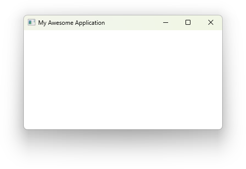
Modifying Window Properties
The properties of a window can be changed using window modifiers. For the main window, these modifiers are called on the application prior to calling run().
For example, the title() and inner_size() window modifiers can be used to set the title and size of the window respectively.
use vizia::prelude::*;

fn main() -> Result<(), ApplicationError> {
    Application::new(|cx|{

    })
    .title("My Awesome Application")
    .inner_size((400, 200))
    .run()
}
Window Positioning
Windows can be positioned in various ways using modifiers that control both the location and anchor point of the window.
Setting absolute position
Use .position() to place a window at specific screen coordinates:
use vizia::prelude::*;

fn main() -> Result<(), ApplicationError> {
    Application::new(|cx| {
        // Content here
    })
    .position((100, 200))  // x=100, y=200
    .run()
}
The position is specified in logical pixels (DPI-independent).
Understanding anchors
An anchor determines which part of the window is positioned at the specified coordinates. Vizia supports nine anchor points:
// Top edge anchors
Anchor::TopLeft      // Top-left corner
Anchor::TopCenter    // Center of top edge
Anchor::TopRight     // Top-right corner

// Middle edge anchors
Anchor::Left         // Left edge center
Anchor::Center       // Window center
Anchor::Right        // Right edge center

// Bottom edge anchors
Anchor::BottomLeft   // Bottom-left corner
Anchor::BottomCenter // Center of bottom edge
Anchor::BottomRight  // Bottom-right corner
Anchor targets
The anchor target determines what coordinate system the position is relative to. There are three options:
AnchorTarget::Monitor: Position relative to the screen/monitorAnchorTarget::Window: Position relative to the parent window (for child windows)AnchorTarget::Mouse: Position relative to the mouse cursor
use vizia_window::AnchorTarget;

// Position relative to monitor (default)
Application::new(|cx| {})
    .position((100, 100))
    .anchor(Anchor::TopLeft)
    .anchor_target(AnchorTarget::Monitor)
    .run();

// Position relative to parent window (for popup/child windows)
Window::popup(cx, false, |cx| {
    Label::new(cx, "Child window");
})
.position((10, 10))
.anchor(Anchor::TopLeft)
.anchor_target(AnchorTarget::Window);

// Position relative to mouse cursor
Window::popup(cx, false, |cx| {
    Label::new(cx, "Context menu");
})
.anchor(Anchor::TopLeft)
.anchor_target(AnchorTarget::Mouse);
Parent anchors for child windows
When creating child windows, use .parent_anchor() to specify where on the parent window the child should be positioned from:
// Position child window relative to the parent's center
Window::popup(cx, false, |cx| {
    Label::new(cx, "Dialog");
})
.position((0, 0))
.anchor(Anchor::Center)
.anchor_target(AnchorTarget::Window)
.parent_anchor(Anchor::Center);
Applying offsets
Use .offset() to apply an additional offset to the positioned window:
// Position at (100, 100) and then offset by (10, 10)
Application::new(|cx| {})
    .position((100, 100))
    .offset((10, 10))
    .anchor(Anchor::TopLeft)
    .run();
Offsets are useful for fine-tuning positions after anchoring.
Common positioning patterns
Centered window
Application::new(|cx| {
    Label::new(cx, "Centered Application");
})
.position((960, 540))  // Typically half your screen resolution
.anchor(Anchor::Center)
.run()
Top-left corner
Application::new(|cx| {
    Label::new(cx, "Top-left");
})
.position((0, 0))
.anchor(Anchor::TopLeft)
.run()
Positioned near cursor
Window::popup(cx, false, |cx| {
    VStack::new(cx, |cx| {
        Button::new(cx, |cx| Label::new(cx, "Copy"));
        Button::new(cx, |cx| Label::new(cx, "Paste"));
        Button::new(cx, |cx| Label::new(cx, "Delete"));
    });
})
.anchor(Anchor::TopLeft)
.anchor_target(AnchorTarget::Mouse)
.offset((5, 5))
Popup and Dialog Windows
Popup windows are secondary windows that appear on top of the main window. They can be used for dialogs, settings, color pickers, and other auxiliary interfaces.
Creating a popup window
Use Window::popup() to create a popup window. It takes three arguments:
cx: The contextis_modal: Whether the popup should be modal (blocks interaction with parent window)content: A closure that builds the popup’s content
use vizia::prelude::*;

fn main() -> Result<(), ApplicationError> {
    Application::new(|cx| {
        let show_popup = Signal::new(false);

        Binding::new(cx, show_popup, move |cx| {
            if show_popup.get() {
                Window::popup(cx, false, |cx| {
                    Label::new(cx, "Hello from popup!");
                });
            }
        });

        Button::new(cx, |cx| Label::new(cx, "Open Popup"))
            .on_press(|cx| cx.emit_to(cx.current(), ShowPopup));
    })
    .run()
}
Modal vs non-modal popups
When is_modal is true, the popup disables interaction with the parent window until the popup closes:
// Modal dialog - parent window is disabled
Window::popup(cx, true, |cx| {
    VStack::new(cx, |cx| {
        Label::new(cx, "Save changes?");
        HStack::new(cx, |cx| {
            Button::new(cx, |cx| Label::new(cx, "Yes"))
                .on_press(|cx| cx.emit(AppEvent::Save));
            Button::new(cx, |cx| Label::new(cx, "No"))
                .on_press(|cx| cx.emit(AppEvent::Cancel));
        });
    });
});

// Non-modal popup - parent window remains interactive
Window::popup(cx, false, |cx| {
    Label::new(cx, "This is a notification...");
});
Configuring popup windows
Popup windows can be configured with modifiers. Common modifiers include:
.title(...): Set the window title.inner_size(...): Set the window size.anchor(...): Set the window position relative to the parent.on_close(...): Handle the close event
Window::popup(cx, false, |cx| {
    Label::new(cx, "Settings");
})
.title("Application Settings")
.inner_size((500, 400))
.anchor(Anchor::Center)
.on_close(|cx| {
    cx.emit(AppEvent::SettingsClosed);
});
Showing and hiding popups
Use a signal and Binding to control when the popup is visible:
pub struct AppData {
    show_dialog: Signal<bool>,
}

impl Model for AppData {
    fn event(&mut self, _cx: &mut EventContext, event: &mut Event) {
        event.map(|app_event, _| match app_event {
            AppEvent::OpenDialog => {
                self.show_dialog.set(true);
            }
            AppEvent::CloseDialog => {
                self.show_dialog.set(false);
            }
        });
    }
}

fn main() -> Result<(), ApplicationError> {
    Application::new(|cx| {
        let show_dialog = Signal::new(false);
        AppData { show_dialog }.build(cx);

        VStack::new(cx, |cx| {
            Button::new(cx, |cx| Label::new(cx, "Open Dialog"))
                .on_press(|cx| cx.emit(AppEvent::OpenDialog));

            Binding::new(cx, show_dialog, move |cx| {
                if show_dialog.get() {
                    Window::popup(cx, true, |cx| {
                        VStack::new(cx, |cx| {
                            Label::new(cx, "This is a dialog");
                            Button::new(cx, |cx| Label::new(cx, "Close"))
                                .on_press(|cx| cx.emit(AppEvent::CloseDialog));
                        })
                        .padding(Pixels(20.0));
                    })
                    .title("Dialog")
                    .inner_size((300, 150))
                    .anchor(Anchor::Center)
                    .on_close(|cx| {
                        cx.emit(AppEvent::CloseDialog);
                    });
                }
            });
        });
    })
    .run()
}
Positioning popups
Use the .anchor() modifier to position popups relative to the parent window:
// Center the popup on the parent window
Window::popup(cx, true, |cx| {
    Label::new(cx, "Centered!");
})
.anchor(Anchor::Center);

// Position at top-left
Window::popup(cx, true, |cx| {
    Label::new(cx, "Top-left");
})
.anchor(Anchor::TopLeft);

// Position at bottom-right
Window::popup(cx, true, |cx| {
    Label::new(cx, "Bottom-right");
})
.anchor(Anchor::BottomRight);
Handling popup close events
Use .on_close() to react when the user closes the popup:
Window::popup(cx, false, |cx| {
    Label::new(cx, "Unsaved changes!");
})
.on_close(|cx| {
    // Perform cleanup or state updates
    cx.emit(AppEvent::PopupClosed);
});
Managing Resources
Resources are the non-view data your application depends on at runtime:
- Fonts for typography
- Icons and SVG assets
- Raster images
- Localized text (translations)
- Stylesheets for visual design
In Vizia, most resources are loaded through methods on the context inside your Application::new closure.
use vizia::prelude::*;

fn main() -> Result<(), ApplicationError> {
	Application::new(|cx| {
		cx.add_stylesheet(include_style!("src/style.css"))
			.expect("failed to load stylesheet");

		cx.load_image(
			"logo",
			include_bytes!("resources/images/logo.png"),
			ImageRetentionPolicy::DropWhenNoObservers,
		);

		Label::new(cx, "Resources loaded");
	})
	.run()
}
Suggested structure
Keep resource files in predictable folders so paths stay stable:
.
├── Cargo.toml
└── src
	├── main.rs
	└── resources
		├── fonts/
		├── images/
		├── icons/
		└── translations/
Next sections
The following pages cover each resource type in detail:
- Fonts
- Icons
- Images
- Translations
- Stylesheets
Fonts
System fonts
By default, text uses the active theme font stack. You can select a system font in CSS or with a modifier.
use vizia::prelude::*;

const STYLE: &str = r#"
    .system-ui {
        font-family: "Arial";
        font-size: 18px;
    }
"#;

fn main() -> Result<(), ApplicationError> {
    Application::new(|cx| {
        cx.add_stylesheet(STYLE).expect("Failed to add stylesheet");

        Label::new(cx, "System font via CSS").class("system-ui");

        Label::new(cx, "System font via modifier")
            .font_family("Times New Roman");
    })
    .run()
}
Loading custom fonts
Load custom font bytes with cx.add_font_mem() before creating views that use that font.
The family name comes from the font metadata itself. Use that family name in CSS or .font_family(...).
use vizia::prelude::*;

const STYLE: &str = r#"
    .brand {
        font-family: "Noto Sans";
        font-size: 20px;
    }
"#;

const CUSTOM_FONT: &[u8] = include_bytes!("resources/fonts/NotoSans-Regular.ttf");

fn main() -> Result<(), ApplicationError> {
    Application::new(|cx| {
        cx.add_stylesheet(STYLE).expect("Failed to add stylesheet");
        cx.add_font_mem(CUSTOM_FONT);

        Label::new(cx, "Custom font via CSS").class("brand");

        Label::new(cx, "Custom font via modifier")
            .font_family("Noto Sans");
    })
    .run()
}
Tips
- Load fonts early, ideally at app startup.
- Keep a small set of font families to reduce app size and startup work.
- Verify the exact family name in the font file if a font does not apply.
Icons
Vizia supports window icons, built-in SVG icons, custom SVG assets, and cursor icons.
Window Icon
Set the application window icon with the .icon() modifier.
The icon data must be RGBA bytes plus width and height.
use vizia::prelude::*;
use image::ImageReader;

fn main() -> Result<(), ApplicationError> {
    let icon = ImageReader::open("resources/icons/app.png")?
        .decode()?
        .to_rgba8();
    let (width, height) = icon.dimensions();
    let icon_data = icon.into_raw();

    Application::new(|cx| {
        Label::new(cx, "My Application");
    })
    .icon(width, height, icon_data)
    .title("My App")
    .run()
}
Built-in icons
Vizia ships many built-in SVG icons in vizia::icons.
Render them with Svg::new:
use vizia::prelude::*;
use vizia::icons::{ICON_CHECK, ICON_CLOSE, ICON_USER, ICON_SETTINGS};

fn main() -> Result<(), ApplicationError> {
    Application::new(|cx| {
        HStack::new(cx, |cx| {
            Svg::new(cx, ICON_CHECK);
            Svg::new(cx, ICON_CLOSE);
            Svg::new(cx, ICON_USER);
            Svg::new(cx, ICON_SETTINGS);
        });
    })
    .run()
}
Styling icons
Icons are regular views, so you can style size, color, spacing, and layout.
use vizia::prelude::*;
use vizia::icons::ICON_CHECK;

Application::new(|cx| {
    Svg::new(cx, ICON_CHECK)
        .width(Pixels(32.0))
        .height(Pixels(32.0))
        .background_color(Color::rgb(76, 175, 80))
        .corner_radius(Pixels(4.0));
})
.run()
Custom SVG icons
In addition to built-in icons, you can render your own SVG bytes.
SVG from file bytes
use vizia::prelude::*;

Application::new(|cx| {
    Svg::new(cx, include_bytes!("resources/icons/custom.svg"))
        .width(Pixels(64.0))
        .height(Pixels(64.0));
})
.run()
SVG from a context resource
use vizia::prelude::*;

Application::new(|cx| {
    cx.load_svg(
        "app.logo",
        include_bytes!("resources/icons/logo.svg"),
        ImageRetentionPolicy::DropWhenNoObservers,
    );

    Svg::new(cx, "app.logo")
        .width(Pixels(48.0))
        .height(Pixels(48.0));
})
.run()
Cursor icons
Cursor icons are also part of the resource story, because they define visual feedback for interaction.
In CSS
use vizia::prelude::*;

const STYLE: &str = r#"
    .interactive {
        cursor: hand;
    }

    .editable {
        cursor: text;
    }

    .busy {
        cursor: progress;
    }
"#;

Application::new(|cx| {
    cx.add_stylesheet(STYLE).expect("Failed to add stylesheet");

    VStack::new(cx, |cx| {
        Label::new(cx, "Clickable item").class("interactive");
        Label::new(cx, "Text input area").class("editable");
        Label::new(cx, "Loading...").class("busy");
    });
})
.run()
Programmatic cursor changes
use vizia::prelude::*;

Application::new(|cx| {
    Label::new(cx, "Hover me")
        .on_hover(|cx| {
            cx.emit(WindowEvent::SetCursor(CursorIcon::Hand));
        })
        .on_hover_out(|cx| {
            cx.emit(WindowEvent::SetCursor(CursorIcon::Default));
        });
})
.run()
Images
Vizia supports both raster images and SVG graphics.
Loading and displaying raster images
Use the Image view to show a raster image by name. Load the image into the context first:
use vizia::prelude::*;

fn main() -> Result<(), ApplicationError> {
    Application::new(|cx| {
        cx.load_image(
            "my_image",
            include_bytes!("resources/images/photo.png"),
            ImageRetentionPolicy::DropWhenUnusedForOneFrame,
        );

        Image::new(cx, "my_image");
    })
    .run()
}
Displaying SVG content
Use the Svg view to display inline SVG data:
use vizia::prelude::*;
use vizia::icons::ICON_CHECK;

Application::new(|cx| {
    Svg::new(cx, ICON_CHECK);
})
.run();
Alternatively, load arbitrary SVG bytes:
Svg::new(cx, include_bytes!("resources/logo.svg"));Using images as backgrounds
Images can also be set as a background using the background_image modifier or in CSS:
Element::new(cx)
    .size(Pixels(200.0))
    .background_image("my_image");
.banner {
background-image: url("banner.png");
background-size: cover;
}
Image retention policy
When calling cx.load_image(), specify how long the image stays in memory:
| Policy | Description |
|---|---|
DropWhenUnusedForOneFrame | Freed on the next frame after no view references it. |
DropWhenNoObservers | Freed when no views are observing the image anymore. |
Forever | Kept in memory for the lifetime of the application. |
Loading images from files at runtime
Register an image loader with cx.set_image_loader. The closure receives a &mut ResourceContext
and the path string. Spawn a background thread to do IO, then deliver the result via proxy.load_image:
use vizia::prelude::*;

fn main() -> Result<(), ApplicationError> {
    Application::new(|cx| {
        cx.set_image_loader(|cx, path| {
            let path = path.to_string();
            cx.spawn(move |proxy| {
                if let Ok(bytes) = std::fs::read(&path) {
                    let _ = proxy.load_image(
                        path,
                        &bytes,
                        ImageRetentionPolicy::DropWhenNoObservers,
                    );
                }
            });
        });

        Image::new(cx, "assets/images/logo.png");
    })
    .run()
}
Once registered, any Image::new(cx, path) or CSS background-image: url("...") call for an image path
not already loaded will trigger the loader.
Tips
- Use
DropWhenNoObserversfor large assets that are not always visible. - Use stable string keys (for example,
"app.logo") instead of ad-hoc paths when preloading assets. - Keep image decoding in background threads when loading from disk at runtime.
Translations
Vizia uses Fluent (.ftl) files for localized strings. Load translation files with cx.add_translation() during app startup.
use vizia::prelude::*;

fn main() -> Result<(), ApplicationError> {
    Application::new(|cx| {
        cx.add_translation(
            "en-US".parse().unwrap(),
            include_str!("resources/translations/en-US/hello.ftl").to_owned(),
        )
        .expect("Failed to add en-US translation");

        cx.add_translation(
            "fr".parse().unwrap(),
            include_str!("resources/translations/fr/hello.ftl").to_owned(),
        )
        .expect("Failed to add fr translation");

        Label::new(cx, Localized::new("hello-world"));
    })
    .run()
}
Use a locale-based folder structure:
.
├── Cargo.toml
└── src
    ├── resources
    │   └── translations
    │       ├── en-US
    │       │   └── counter.ftl
    │       └── es
    │           └── counter.ftl
    └── main.rs
Multiple files per locale
You can register multiple Fluent files for the same locale. Vizia merges them into one bundle.
cx.add_translation(
    "en-US".parse().unwrap(),
    include_str!("resources/translations/en-US/common.ftl").to_owned(),
)
.expect("Failed to add common strings");

cx.add_translation(
    "en-US".parse().unwrap(),
    include_str!("resources/translations/en-US/settings.ftl").to_owned(),
)
.expect("Failed to add settings strings");
Splitting translations by feature can make large applications easier to maintain.
Locale negotiation and fallback
Vizia uses the system locale by default, then negotiates to the best available loaded locale. If a key is still missing, it falls back per-message to the default bundle.
This means you can load a partial locale and keep the app functional while you complete translations.
Changing locale at runtime
cx.emit(EnvironmentEvent::SetLocale("fr".parse().unwrap()));Translation diagnostics
Missing messages, missing attributes, and Fluent formatting issues are reported through the log backend at warn level.
To make these visible while developing, configure a logger for your app (for example env_logger).
Stylesheets
Stylesheets define how views look. You can load CSS from a Rust string or from external files.
Inline stylesheet
Use cx.add_stylesheet() with a string constant:
use vizia::prelude::*;

const STYLE: &str = r#"
    label {
        color: var(--foreground);
        font-size: 16px;
    }

    .highlighted {
        background-color: var(--accent);
        color: var(--accent-foreground);
    }
"#;

fn main() -> Result<(), ApplicationError> {
    Application::new(|cx| {
        cx.add_stylesheet(STYLE).expect("Failed to add stylesheet");

        Label::new(cx, "Hello, styled world!").class("highlighted");
    })
    .run()
}
External stylesheet file
Use include_style!() to embed a CSS file at compile time:
use vizia::prelude::*;

fn main() -> Result<(), ApplicationError> {
    Application::new(|cx| {
        cx.add_stylesheet(include_style!("src/style.css"))
            .expect("Failed to add stylesheet");

        Label::new(cx, "Styled from file");
    })
    .run()
}
The path is relative to your crate root (the folder with Cargo.toml).
Hot reloading
When running in debug mode, stylesheets added with include_style!() can be reloaded by pressing F5.
Order and precedence
Stylesheets are applied in the order they are added. If two rules have the same specificity, the rule from the later stylesheet wins.
See also
Views and Modifiers
Understand how views are composed and how modifiers customize behavior and appearance. This section introduces the core building blocks for interface structure.
Adding views
Views are the building bocks of a vizia GUI and are used to visually present model data and to act as controls which, when interacted with, send events to mutate model data.
We’ll learn more about models and events in the following sections.
Declaring views
For example, we can declare a Label view to display a text string:
use vizia::prelude::*;

fn main() -> Result<(), ApplicationError> {
    Application::new(|cx|{
        Label::new(cx, "Hello World");
    })
    .inner_size((400, 200))
    .run()
}
The first argument to the new() method of the label is a mutable reference to Context, shortened to cx. This allows the view to build itself into the application and is passed from view to view.
Composing views
Composition of views is achieved through container views, which typically take a closure which allows us to build child views within it. Some container views may arrange their content in a particular way.
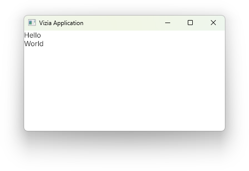
For example, the VStack container view will arrange its contents into a vertical column:
use vizia::prelude::*;

fn main() -> Result<(), ApplicationError> {
    Application::new(|cx|{

        VStack::new(cx, |cx|{
            Label::new(cx, "Hello");
            Label::new(cx, "World");
        });
    })
    .inner_size((400, 100))
    .run()
}
Composing views together forms a tree, where each view has a single parent and zero or more children. For example, for the code above the view tree can be depicted with the following diagram:

The Window is the parent of the VStack, while the VStack is the parent of both the Labels. Therefore, the Window is an ancestor of the Labels and the Labels are descendants of the window. This terminology is relevant when writing CSS style rules, which we’ll cover later in this guide.
Modifying Views
Modifiers are used to customize the appearance and behaviour of views in a declarative way. Many of the built-in modifiers in Vizia can be applied to any View, which includes built-in views as well as user-defined views.
Customize a view with a modifier
Modifiers are functions which are called on a Handle, which is returned by the constructor of all views. Applying modifiers to a view changes the properties of a view without rebuilding it. For example, we can use the background_color() modifier to set the background color of a label view:
Label::new(cx, "Hello World")
    .background_color(Color::rgb(255, 0, 0));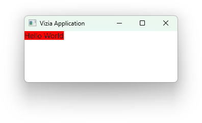
Multiple modifiers can be chained together to acheieve more complex view configuration.
Label::new(cx, "Hello World")
    .width(Pixels(200.0))
    .border_width(Pixels(1.0))
    .border_color(Color::black())
    .background_color(Color::rgb(200, 200, 200));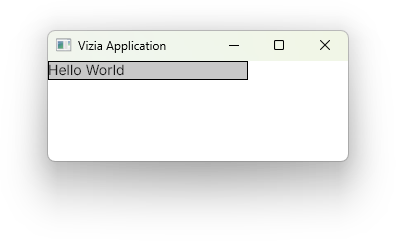
View specific modifiers
Some views have modifiers which are specific to that view type. For example, the Slider view has a modifier for setting the slider range:
let value = Signal::new(50.0);

Slider::new(cx, value)
    .range(0.0..100.0);
View specific modifiers can still be combined with regular modifiers, and the order doesn’t matter. Both of these produce the same result:
Slider::new(cx, value)
    .range(0.0..100.0)
    .width(Pixels(200.0));
Slider::new(cx, value)
.width(Pixels(200.0))
.range(0.0..100.0);Modifier bindings
Many modifiers also accept a signal as well as a value. When a signal is supplied to a modifier, a binding is set up which will update the modified property when the signal changes. For example:
let color = Signal::new(Color::rgb(255, 0, 0));

Label::new(cx, "Hello World")
    .background_color(color);
Custom View Modifiers
To create a set of custom view modifiers, first declare a trait with the desired modifier functions. The modifier functions must take self by value and return Self.
pub trait CustomModifiers {
    fn title(self) -> Self;
}
Next, we can implement the custom modifiers for all views like so:
impl<'a, V: View> CustomModifiers for Handle<'a, V> {
    fn title(self) -> Self {
        self.font_size(24.0).font_weight(FontWeightKeyword::Bold)
    }
}
Sometimes it may be more appropriate to implement the custom modifiers for specific views. For example, we can implement the custom modifiers just the Label view like so:
impl<'a> CustomModifiers for Handle<'a, Label> {
    fn title(self) -> Self {
        self.font_size(24.0).font_weight(FontWeightKeyword::Bold)
    }
}
As long as CustomModifiers is imported we can then use the custom title() modifier like any other modifier on a label:
Label::new(cx, "Some Kind of Title").title();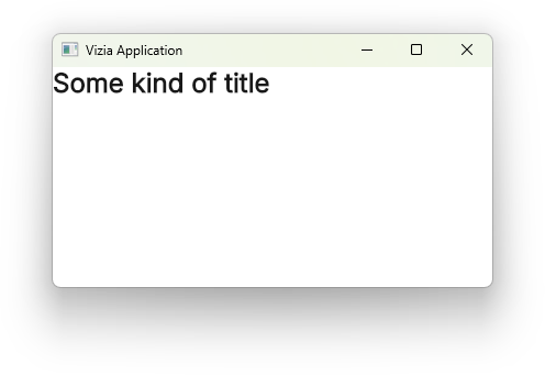
Models
Use models to store and organize application state. This section also introduces environment data for shared, contextual information.
Models
Application data in Vizia is stored in models. Views can then bind to the data in these models in order to react to changes in the data.
Declaring Models
A model definition can be any type, typically a struct, which implements the Model trait:
pub struct Person {
    pub name: Signal<String>,
    pub email: Signal<String>,
}

impl Model for Person {}
Building Models
A model definition can be built into the view tree with the build() method:
use vizia::prelude::*;

fn main() -> Result<(), ApplicationError> {
    Application::new(|cx|{
        Person {
            name: Signal::new(String::from("John Doe")),
            email: Signal::new(String::from("john.doe@company.com")),
        }.build(cx);

        HStack::new(cx, |cx|{
            Label::new(cx, "Hello");
            Label::new(cx, "World");
        });
    })
    .run();
}
This builds the model data into the tree, in this case at the root Window.
Internally, Vizia enforces a separation between views and models by storing them separately. However, for processes like event propagation, models can be thought of as existing within the tree, with an associated parent view.
The model-view tree for the above code can be depicted with the following diagram:

If the AppData had been built within the contents of the HStack, then the model would be associated with the HStack rather than the Window.
Accessing Model Signals with cx.data()
When setup and usage are split across modules, you can read a model from context with cx.data() and copy the signal handle from it:
fn build_name_label(cx: &mut Context) {
    let name = cx.data::<Person>().name;
    Label::new(cx, name);
}
This works from anywhere in scope of the model and is useful when retrofitting existing code.
However, the preferred pattern is to create signals up front, pass them into the model before calling build(), and pass those same signals down to the views that need them:
use vizia::prelude::*;

fn main() -> Result<(), ApplicationError> {
    Application::new(|cx| {
        let name = Signal::new(String::from("John Doe"));
        let email = Signal::new(String::from("john.doe@company.com"));

        Person { name, email }.build(cx);

        HStack::new(cx, |cx| {
            Label::new(cx, name);
            Label::new(cx, email);
        });
    })
    .run();
}
Passing signal handles explicitly makes data flow easier to follow, avoids hidden dependencies, and keeps views more reusable.
Environment
The Environment is a built-in model used to specify system specific application data, such as the current system locale and current system theme preference, which can then be used by any view in the application.
For example, we can bind to the locale and conditionally change the properties of a view depending on the selected language:
use vizia::prelude::*;

fn main() -> Result<(), ApplicationError> {
    Application::new(|cx| {
        Binding::new(cx, Environment::locale, |cx| {
            match Environment::locale.get(cx).to_string().as_ref() {
                "en-US" => {
                    Element::new(cx).background_color(Color::from("#006847"));
                }

                "fr" => {
                    Element::new(cx).background_color(Color::from("#004768"));
                }

                _ => {}
            }
        });
    })
    .run()
}
// Image here
The above example has an Element which will change color depending on the locale between en-US (US English) and fr (french).
By default the environment will use values specified by the system, such as the system specified language, but we can override these values with an environment event.
For example, we can toggle between two locales with a pair of checkboxes:
use vizia::prelude::*;

fn main() -> Result<(), ApplicationError> {
    Application::new(|cx| {
        cx.emit(EnvironmentEvent::SetLocale("en-US".parse().unwrap()));

        HStack::new(cx, |cx| {
            Checkbox::new(cx, Environment::locale.map(|locale| {
                    locale.to_string() == "en-US"
                }))
                .on_toggle(|cx| {
                    cx.emit(EnvironmentEvent::SetLocale("en-US".parse().unwrap()))
                });
            Label::new(cx, "English");

            Checkbox::new(cx, Environment::locale.map(|locale| {
                    locale.to_string() == "fr"
                }))
                .on_toggle(|cx| {
                    cx.emit(EnvironmentEvent::SetLocale("fr".parse().unwrap()))
                });
            Label::new(cx, "French")
                .left(Pixels(10.0));
        })
        .space(Pixels(10.0))
        .top(Stretch(1.0))
        .bottom(Stretch(1.0))
        .gap(Pixels(5.0))
        .height(Auto);

        Binding::new(cx, Environment::locale, |cx| {
            match Environment::locale.get(cx).to_string().as_ref() {
                "en-US" => {
                    Element::new(cx).background_color(Color::from("#006847"));
                }

                "fr" => {
                    Element::new(cx).background_color(Color::from("#004768"));
                }

                _ => {}
            }
        });
    })
    .run()
}
// Image here
Signals and Binding
Explore reactive state flow with signals and data binding. You will learn patterns for reading, writing, deriving, and synchronizing state.
Table of contents
- Data Binding
- Signals
- Reading Signals
- Writing Signals
- Conditional Views
- Derived Signals with Memo
- Derived Signals with map()
- Sync Signals
Data Binding
Data binding is the concept of linking model data to views, so that when the model data is changed, the views observing this data update automatically in response. Therefore, it is data binding which provides the mechanism for reactivity in Vizia.
In Vizia, data binding is achieved through signals. A signal is a piece of reactive state. Signals can be stored directly in models and passed to views and modifiers to create bindings.
Signals
For example, given the following model data:
pub struct AppData {
    color: Signal<Color>,
}

impl Model for AppData {}
When color changes, any view or modifier bound to it updates automatically.
Property Binding
We can use this signal with the background_color modifier of a view to set up a binding, so that when the data changes the background color is updated. Passing signals to modifiers is known as property binding.
pub struct AppData {
    color: Signal<Color>,
}

impl Model for AppData {}

fn main() -> Result<(), ApplicationError> {
    Application::new(|cx|{

        let color = Signal::new(Color::red());

        AppData { color }.build(cx);

        Label::new(cx, "Hello Vizia").background_color(color);
    }).run()
}
View Binding
Some views accept a signal as an input. When provided a signal, the view sets up a binding to the data. For example, Label accepts a signal to any type which implements ToString:
pub struct Person {
    pub name: Signal<String>,
}

impl Model for Person {}

fn main() -> Result<(), ApplicationError> {
    Application::new(|cx|{
        let name = Signal::new(String::from("Jeff"));

        Person { name }.build(cx);

        Label::new(cx, name);
    })
    .run()
}
When the name field changes, the text of the label updates to show the new value.
See also
Signals
Signals are values with change tracking built in. In practice, this means you create a signal once, bind it to views and modifiers, and then update it as application state changes.
Creating a signal
let count = Signal::new(0);Signals are Copy, so you can pass them into bindings and callbacks without cloning or borrowing state.
Signals are commonly stored on a model:
pub struct AppData {
    count: Signal<i32>,
}

impl Model for AppData {}
Signals are lightweight handles and are Copy, so you can pass them into bindings and callbacks without cloning or borrowing state.
Where to read and write
- For read patterns (
get,with,map,SignalGet), see Reading Signals. - For write patterns (
set,update,set_if_changed,write), see Writing Signals.
Capturing signals in closures
When a closure captures a signal, prefer move:
Binding::new(cx, count, move |cx| {
    if count.get(cx) > 10 {
        Label::new(cx, "Large value");
    }
});
Because signals are Copy, moving a signal into the closure just copies the handle.
See also
- Data binding
- Reading Signals
- Writing Signals
- Derived Signals with Memo
- Derived Signals with
map() - Sync Signals
Reading Signals
Signals can be read in several ways depending on where the read takes place.
Reading inside reactive contexts
Use get() to read the current value of the signal:
fn event(&mut self, _cx: &mut EventContext, event: &mut Event) {
    event.map(|app_event, _| match app_event {
        AppEvent::Check => {
            let current = self.count.get();
            if current > 10 {
                // ...
            }
        }
    });
}
Note: get() clones the inner value, so for large types or frequent reads, consider using with() instead.
Reading with with
with() lets you work with the signal’s value without cloning it. Pass a closure that receives a reference:
let list_len = self.list.with(|list| list.len());This is useful when the inner type is expensive to clone, or when you just need to inspect or transform a piece of the value.
Reading with read()
read() gives direct access to the signal value through a read guard (ReadRef) instead of cloning.
let count_ref = self.count.read();
if *count_ref > 10 {
    // ...
}
Use this when you want borrow-style access to the value. Like other tracked reads, read() subscribes the current reactive context.
Read-only signals
When a part of your code should only read a signal, pass a ReadSignal<T> instead of Signal<T>.
You can create one with read_only():
let count: Signal<i32> = Signal::new(0);
let count_read: ReadSignal<i32> = count.read_only();
Or split a signal into read and write handles with new_split():
let (count_read, count_write) = Signal::new_split(0);ReadSignal<T> supports reading methods like get(), with(), and read(), but cannot be used to write. This helps make APIs clearer and prevents accidental mutation.
See also
Writing Signals
Signals are updated using set() or update().
Setting a new value
Use set() when you already know the replacement:
self.count.set(42);Note: set() triggers all reactive bindings and dependents, even if the new value is identical to the old one. Use set_if_changed() to skip updates when the value hasn’t actually changed.
Updating based on the current value
Use update() when the new value depends on the old one:
self.count.update(|n| *n += 1);Like set(), update() always triggers dependents, regardless of whether the value changed.
This is the preferred pattern in event handlers:
impl Model for AppData {
    fn event(&mut self, _cx: &mut EventContext, event: &mut Event) {
        event.map(|app_event, _| match app_event {
            AppEvent::Increment => self.count.update(|n| *n += 1),
            AppEvent::Decrement => self.count.update(|n| *n -= 1),
            AppEvent::Reset    => self.count.set(0),
        });
    }
}
Writing through a reference
Use write() to obtain a mutable reference for in-place mutation of complex types:
self.items.write().push(new_item);The change is committed and dependents are notified when the returned WriteRef is dropped.
Setting only if changed
Use set_if_changed() to update only when the new value differs from the old:
self.count.set_if_changed(42);This avoids triggering unnecessary reactivity when filtering or debouncing input. For types that don’t implement PartialEq, this method won’t be available.
Write-only signals
Use Signal::write_only() to produce a WriteSignal<T> that cannot be read. Useful for passing update capability to a component without granting read access:
let write_count = count.write_only();

Button::new(cx, |cx| Label::new(cx, "Reset"))
    .on_press(move |_| write_count.set(0));
Split signals
Signal::new_split() returns a separate ReadSignal and WriteSignal from the start:
let (read_count, write_count) = Signal::new_split(0i32);See also
Conditional Views
The Binding view provides a way to explicitly control which parts of the view tree get rebuilt when some state changes, specifically anything within the content closure of a Binding view.
Because of this, a regular if statement can be used to conditionally rebuild views. In the following example, a label view is built into the tree when a boolean signal is true, otherwise the view is removed from the tree.
use vizia::prelude::*;

struct AppData {
    show_view: Signal<bool>,
}

enum AppEvent {
    ToggleShowView,
}

impl Model for AppData {
    fn event(&mut self, _cx: &mut EventContext, event: &mut Event) {
        event.map(|app_event, _| match app_event {
            AppEvent::ToggleShowView => {
                self.show_view.set(!self.show_view.get());
            }
        });
    }
}

fn main() -> Result<(), ApplicationError> {
    Application::new(|cx|{
        let show_view = Signal::new(false);

        AppData {
            show_view,
        }.build(cx);

        Label::new(cx, "Show View")
            .on_press(|cx| cx.emit(AppEvent::ToggleShowView));

        Binding::new(cx, show_view, |cx| {
            if show_view.get(cx) {
                Label::new(cx, "Surprise!");
            }
        });
    })
    .inner_size((400, 100))
    .run()
}
Only the contents of the Binding::new closure are rebuilt when show_view changes.
See also
Derived Signals with Memo
Memo<T> is a derived reactive value. It recomputes when tracked dependencies change, and only notifies dependents when the computed value is different from the previous value.
Use Memo when you want to:
- Derive one value from one or more signals.
- Share that derived value in multiple places.
- Avoid unnecessary downstream updates when the output did not change.
Creating a memo
use vizia::prelude::*;

fn main() -> Result<(), ApplicationError> {
    Application::new(|cx| {
        let count = Signal::new(0);

        let is_even = Memo::new(move |_| count.get() % 2 == 0);

        Label::new(cx, is_even.map(|even| {
            if *even { "Even" } else { "Odd" }
        }));
    })
    .run()
}
In this example, is_even tracks count. Whenever count changes, the memo recomputes, and the label updates only if the bool result changed.
Memo from multiple signals
Memo::new can read from multiple signals and derive a single output:
use vizia::prelude::*;

let first_name = Signal::new(String::from("Ada"));
let last_name = Signal::new(String::from("Lovelace"));

let full_name = Memo::new(move |_| {
    format!("{} {}", first_name.get(), last_name.get())
});

Label::new(cx, full_name);
This pattern keeps formatting logic in one place and gives you a reusable derived value for views and modifiers.
About the closure argument
The closure signature is Fn(Option<&T>) -> T. The parameter is the previous memo value, when available.
let memo = Memo::new(|previous: Option<&i32>| {
    let _old = previous.copied().unwrap_or_default();
    42
});
Most of the time you can ignore the argument with _ and write Memo::new(move |_| ...).
See also
Derived Signals with map()
Signals can be transformed into derived values for binding. This is useful when the source state is not the exact shape you want to display.
Creating a derived value with map()
For example, if we have a signal containing a full name, we can derive the first character for display:
use vizia::prelude::*;

pub struct AppData {
    pub name: Signal<String>,
}

impl Model for AppData {}

fn main() -> Result<(), ApplicationError> {
    Application::new(|cx| {
        let name = Signal::new(String::from("John Doe"));

        AppData { name }.build(cx);

        Label::new(cx, name.map(|name| name.chars().next().unwrap_or('?')));
    })
    .inner_size((400, 100))
    .run()
}
When name changes, the label updates automatically because the derived signal is still reactive.
Derived signals are also useful for:
- Converting numbers to formatted strings.
- Mapping enums to UI labels or colors.
- Computing booleans for
disabled,checked, or class toggles.
map() vs Memo::new
- Use
signal.map(...)for simple one-signal transforms. - Use
Memo::new(...)when combining multiple signals, reusing the derived value, or when an explicit named derived value improves readability.
Internally, map() also produces a memoized derived value.
See also
Sync Signals
SyncSignal<T> is a thread-safe version of Signal<T>. Use it when you need to read or write reactive state from outside the main UI thread.
Creating a sync signal
use vizia::prelude::*;

let progress = SyncSignal::new(0.0f32);
Sending updates from a background thread
SyncSignal implements Send + Sync, so it can be moved into threads and async tasks:
let progress = SyncSignal::new(0.0f32);

std::thread::spawn(move || {
    for i in 0..=100 {
        progress.set(i as f32 / 100.0);
        std::thread::sleep(std::time::Duration::from_millis(50));
    }
});

// Bind to the signal in the UI
Application::new(|cx| {
    ProgressBar::horizontal(cx, progress);
}).run();
Updates from the background thread are picked up on the next frame.
Read-only and write-only variants
Just like Signal, SyncSignal can be split:
let read = progress.read_only();   // SyncReadSignal<f32>
let write = progress.write_only(); // SyncWriteSignal<f32>
Share write with background threads and keep read in the UI.
When to use SyncSignal vs Signal
- Use
Signal<T>for state that is only ever read and written from the UI thread. - Use
SyncSignal<T>when a background thread or async task needs to push updates.
See also
Events
Learn how events move through the view tree and trigger updates. This section covers propagation, targeting, timed events, timers, and async task integration.
Events
Events communicate actions through the tree. A common pattern is:
- A view emits an event in response to user input.
- A model handles the event.
- The model updates signals.
- Bound views react automatically.
Declaring event messages
An event message can be any type, but enums are typically the clearest choice.
pub enum AppEvent {
    UpdateName(String),
}
Emitting events from views
Use cx.emit(...) to send an event upward from the current entity.
use vizia::prelude::*;

pub struct AppData {
    name: Signal<String>,
}

impl Model for AppData {}

pub enum AppEvent {
    UpdateName(String),
}

fn main() -> Result<(), ApplicationError> {
    Application::new(|cx| {
        let name = Signal::new(String::from("John Doe"));

        AppData { name }.build(cx);

        Label::new(cx, name);

        Button::new(cx, |cx| Label::new(cx, "Rename"))
            .on_press(|cx| cx.emit(AppEvent::UpdateName(String::from("Rob Doe"))));
    })
    .inner_size((400, 100))
    .run()
}
Handling events in models
Models (and views) handle events in event(&mut self, cx, event).
use vizia::prelude::*;

pub struct AppData {
    name: Signal<String>,
}

pub enum AppEvent {
    UpdateName(String),
}

impl Model for AppData {
    fn event(&mut self, _cx: &mut EventContext, event: &mut Event) {
        event.map(|app_event, _meta| match app_event {
            AppEvent::UpdateName(new_name) => {
                self.name.set(new_name.clone());
            }
        });
    }
}
event.map(...) attempts to downcast the event message to the requested type and runs the closure only when it matches.
Stopping propagation
Call meta.consume() to stop an event from continuing further along its propagation path.
event.map(|app_event, meta| match app_event {
    AppEvent::UpdateName(new_name) => {
        self.name.set(new_name.clone());
        meta.consume();
    }
});
Propagation and Targeting
Event metadata controls where an event travels.
Vizia supports these propagation modes:
Propagation::Up: from target upward through ancestors.Propagation::Direct: only the target entity receives the event.Propagation::Subtree: target entity and its descendants.
emit vs emit_to
Use emit for the common bubble-up flow from the current entity:
cx.emit(AppEvent::Save);Use emit_to to send directly to a known target entity:
let target: Entity = some_entity;
cx.emit_to(target, AppEvent::Save);
emit_to sends the event with direct propagation.
Custom propagation
When you need precise control, build an Event manually and send it with emit_custom.
let custom = Event::new(AppEvent::Refresh)
    .target(target)
    .origin(cx.current)
    .propagate(Propagation::Subtree);

cx.emit_custom(custom);
Consuming an event
Inside a handler, call meta.consume() to stop further propagation.
event.map(|app_event, meta| match app_event {
    AppEvent::OpenMenu => {
        meta.consume();
    }
});
This is useful when a child view handles an interaction and parent handlers should not react to the same event.
Timed Events
Events can be scheduled to emit at a specific point in time, allowing you to implement delays, timeouts, and delayed actions without needing separate timers.
Scheduling events
Use cx.schedule_emit() to send an event at a later time:
use vizia::prelude::*;
use web_time::{Instant, Duration};

pub enum AppEvent {
    Delayed,
}

let delay = Duration::from_secs(2);
let when = Instant::now() + delay;
cx.schedule_emit(AppEvent::Delayed, when);
The method returns a TimedEventHandle that can be used to cancel the scheduled event before it sends.
Targeting scheduled events
Like regular events, you can schedule events to a specific target using cx.schedule_emit_to():
let target: Entity = some_entity;
let when = Instant::now() + Duration::from_secs(1);
cx.schedule_emit_to(target, AppEvent::Delayed, when);
Custom propagation for scheduled events
For precise control over how a scheduled event propagates, use cx.schedule_emit_custom():
let custom = Event::new(AppEvent::Delayed)
    .target(target)
    .origin(cx.current)
    .propagate(Propagation::Subtree);

let when = Instant::now() + Duration::from_secs(1);
cx.schedule_emit_custom(custom, when);
Canceling scheduled events
Keep the returned TimedEventHandle to cancel a scheduled event before it emits:
let handle = cx.schedule_emit(AppEvent::Delayed, Instant::now() + Duration::from_secs(5));

// ... later, if you want to prevent the event from sending:
cx.cancel_scheduled(handle);
Practical example: Delayed notification
Here’s a complete example showing a button that triggers a delayed event:
use vizia::prelude::*;
use web_time::{Instant, Duration};

pub struct AppData {
    message: Signal<String>,
}

pub enum AppEvent {
    ShowMessage(String),
}

impl Model for AppData {
    fn event(&mut self, _cx: &mut EventContext, event: &mut Event) {
        event.map(|app_event, _| match app_event {
            AppEvent::ShowMessage(msg) => {
                self.message.set(msg.clone());
            }
        });
    }
}

fn main() -> Result<(), ApplicationError> {
    Application::new(|cx| {
        let message = Signal::new(String::new());
        AppData { message }.build(cx);

        VStack::new(cx, |cx| {
            Label::new(cx, message);

            Button::new(cx, |cx| Label::new(cx, "Notify in 2s"))
                .on_press(|cx| {
                    let when = Instant::now() + Duration::from_secs(2);
                    cx.schedule_emit(
                        AppEvent::ShowMessage(String::from("Notification!")),
                        when
                    );
                });
        });
    })
    .inner_size((400, 100))
    .run()
}
When the button is pressed, the ShowMessage event is scheduled to emit after 2 seconds, updating the label with the notification message.
Timers
Timers fire a callback repeatedly on a fixed interval. Use them for polling, animation updates, clocks, or progress tracking.
Creating a timer
Call cx.add_timer() with an interval, an optional total duration, and a callback:
use vizia::prelude::*;
use web_time::Duration;

let timer = cx.add_timer(
    Duration::from_millis(100),  // interval
    None,                        // no fixed duration; runs until stopped
    |cx, action| match action {
        TimerAction::Start => {}
        TimerAction::Tick(_delta) => {
            cx.emit(AppEvent::Tick);
        }
        TimerAction::Stop => {}
    },
);
add_timer returns a Timer handle used to start and stop the timer.
Starting and stopping
Start the timer from a button press or event handler:
cx.start_timer(timer);Stop it explicitly when it is no longer needed:
cx.stop_timer(timer);TimerAction
The callback receives one of three actions:
| Action | Description |
|---|---|
TimerAction::Start | Called once when the timer starts. |
TimerAction::Tick(delta) | Called at each interval. delta is the elapsed time since the last tick. |
TimerAction::Stop | Called once when the timer stops. |
Fixed duration timer
Pass Some(Duration) as the second argument to run for a fixed time and stop automatically:
let timer = cx.add_timer(
    Duration::from_secs(1),
    Some(Duration::from_secs(10)),
    |cx, action| {
        if let TimerAction::Tick(_) = action {
            cx.emit(AppEvent::SecondElapsed);
        }
    },
);
Checking timer state
Use cx.timer_is_running(timer) to query whether a timer is active:
if !cx.timer_is_running(timer) {
    cx.start_timer(timer);
}
See also
- Timed Events — one-shot scheduled events fired at a future time.
Async Tasks with Tokio
Use async runtimes like Tokio for network requests, database calls, or other long-running work. In Vizia, keep all UI state updates on the UI thread and send results back as events.
Why use a context proxy
Vizia contexts are tied to the UI thread. Background tasks should not mutate signals directly.
Instead:
- Capture a
ContextProxywithcx.get_proxy(). - Run async work on a Tokio runtime.
- Emit an event from the async task with the result.
- Handle that event in your model and update signals there.
Example
use vizia::prelude::*;

pub struct AppData {
    status: Signal<String>,
    runtime: tokio::runtime::Runtime,
}

#[derive(Debug)]
pub enum AppEvent {
    StartRequest,
    RequestFinished(Result<String, String>),
}

impl Model for AppData {
    fn event(&mut self, cx: &mut EventContext, event: &mut Event) {
        event.take(|app_event, _| match app_event {
            AppEvent::StartRequest => {
                self.status.set("Loading...".to_string());

                // Capture a proxy so the async task can notify the UI thread.
                let mut proxy = cx.get_proxy();

                self.runtime.spawn(async move {
                    // Replace this with real async work (HTTP, DB, etc.).
                    let result: Result<String, String> = Ok("Finished async work".to_string());

                    let _ = proxy.emit(AppEvent::RequestFinished(result));
                });
            }

            AppEvent::RequestFinished(Ok(message)) => {
                self.status.set(message.clone());
            }

            AppEvent::RequestFinished(Err(error)) => {
                self.status.set(format!("Error: {error}"));
            }
        });
    }
}

fn main() -> Result<(), ApplicationError> {
    Application::new(|cx| {
        let status = Signal::new("Idle".to_string());
        let runtime = tokio::runtime::Runtime::new().expect("failed to create tokio runtime");

        AppData { status, runtime }.build(cx);

        Label::new(cx, status);
        Button::new(cx, |cx| Label::new(cx, "Run Async Task"))
            .on_press(|cx| cx.emit(AppEvent::StartRequest));
    })
    .run()
}
Notes
- Prefer storing a runtime on your model (or use an existing application-level runtime).
- Ignore proxy send errors only if shutdown is acceptable; otherwise log or handle them.
- If you need to target a specific entity, use
proxy.emit_to(target, message). - Keep heavy work out of event handlers so the UI thread remains responsive.
Styling
Style your UI with selectors, properties, variables, and themes. Use this section as a map to the visual system available in Vizia.
Stylesheets
Styling refers to modifying the visual properties of a view, such as its background, border, font, etc.
Previously it was shown how modifiers can be used to style views inline. However, it is also possible for multiple views to share the same styling through the use of Cascading Style Sheets (CSS).
Vizia can use CSS to apply style rules to multiple views simultaneously. A CSS string can be defined within a rust file as a constant, or within an external CSS file.
Adding a constant stylesheet string
To add a stylesheet which is already a string in rust code, use the add_stylesheet() method on Context. For example:
use vizia::prelude::*;

const STYLE: &str = r#"
    element {
        background-color: red;
    }
"#

fn main() {
    Application::new(|cx|{

        cx.add_stylesheet(STYLE);

        Element::new(cx)
            .size(Pixels(100.0));
    })
}
Adding an external CSS file
To add a stylesheet which is defined in a separate .css file, use add_stylesheet() method with the include_style!() macro. For example:
/* style.css */
element {
    background-color: blue;
}
/* main.rs */
use vizia::prelude::*;

fn main() {
    Application::new(|cx|{

        cx.add_stylesheet(include_style!("style.css"));

        Element::new(cx)
            .size(Pixels(100.0));
    })
}
External stylesheets can be hot-reloaded using the
F5key while the application is running in debug mode.
Rules & Selectors
Vizia currently supports a custom subset of the CSS standard. This section provides an overview and reference of the supported CSS selectors, selector combinators and pseudo-classes available in vizia.
Style Rules
A typical style rule might look something like this:
hstack.one label {
    background-color: red;
    width: 30px;
}
The first part before the opening brace is called a selector, which determines which views the rule applies to, and the part inside the brackets are a list of properties and values to apply to the styling of matching views.
Selectors
Basic Selectors
| Selector | Description |
|---|---|
| type | Selects all views that have the given element name, e.g. button will select all Button views. |
| class | Selects all views that have the given class name prefixed with a period, e.g. .class-name will match any view that has class("class-name"). A class name can be added to a view with the class style modifier. The toggle_class modifier can be used to conditionally add/remove a class from a view, typically with the use of a signal bound to a boolean. |
| ID | Selects views with the specified ID name, prefixed with a hash, e.g. #id-name will match the view that has id("id-name"). An ID name can be added to a view with the id style modifier and must be a unique name. |
| universal | The universal selector, denoted with an asterisk, selects all views. |
Combinators
Using combinators, we can combine selectors to select views based on their relationship to other views within the tree.
| Combinator | Description |
|---|---|
| descendant | Selects views which match the selector after the space if they are descended from an view which matches the selector before the space. For example, hstack label will match any Label which has an HStack as an ancestor further up the tree. |
| child | Selects views which match the selector after the greater than character (>) if they are the child of a view which matches the selector before the greater than character. For example, hstack > label will match any Label which has an HStack as a parent. |
| subsquent-sibling | The subsequent-sibling combinator, denoted with a tilde (~), selects siblings. Given A ~ B, all views matching B will be selected if they are preceded by A, provided both A and B share the same parent. |
| next-sibling | The next-sibling combinator, denoted by the plus symbol (+), is similar to the subsequent-sibling. However, given A + B, it only matches B if B is immediately preceded by A, with both sharing the same parent. |
Pseudo-classes
| Pseudo-class | Description |
|---|---|
:root | Selects the root window. |
:hover | Selects the currently hovered view. |
:checked | Selects any view which has been marked as checked. A view can be marked as checked with the checked style modifier. |
:disabled | Selects any view which has been marked as disabled. A view can be marked as disabled with the disabled style modifier. |
:active | Selects any view which has been marked as active. |
:focus | Selects the currently focused view. |
:focus-visible | Selects the currently focused view if the view was focused via keyboard navigation. |
List of supported style properties
This section provides a list of the currently supported style properties in vizia. This excludes layout properties which are detailed in the layout section of this guide.
For the corresponding modifier name, replace any hyphens with underscores. For example, background-color in CSS becomes the background_color() modifier in Rust.
| Property | Type | Initial Value | Inherited | Animatable |
|---|---|---|---|---|
display | Display | flex | No | Yes |
visibility | Visibility | visible | No | No |
overflow | Overflow | visible | No | No |
overflow-x | Overflow | visible | No | No |
overflow-y | Overflow | visible | No | No |
clip-path | ClipPath | none | No | Yes |
opacity | Opacity | 1.0 | No | Yes |
z-index | i32 | 0 | No | No |
blend-mode | BlendMode | normal | No | No |
backdrop-filter | Filter | none | No | Yes |
filter | Filter | none | No | Yes |
background-color | Color | transparent | No | Yes |
background-image | Vec<BackgroundImage> | none | No | Yes |
background-size | Vec<BackgroundSize> | auto auto | No | Yes |
fill | Color | transparent | No | Yes |
border | shorthand | |||
border-color | Color | transparent | No | Yes |
border-style | BorderStyle | solid | No | No |
border-width | BorderWidth | 0 | No | Yes |
caret-color | Color | transparent | Yes | Yes |
color | Color | transparent | Yes | Yes |
corner-radius | CornerRadius | 0 | No | Yes |
corner-top-left-radius | LengthOrPercentage | 0 | No | Yes |
corner-top-right-radius | LengthOrPercentage | 0 | No | Yes |
corner-bottom-left-radius | LengthOrPercentage | 0 | No | Yes |
corner-bottom-right-radius | LengthOrPercentage | 0 | No | Yes |
corner-shape | Rect<CornerShape> | round | No | No |
corner-top-left-shape | CornerShape | round | No | No |
corner-top-right-shape | CornerShape | round | No | No |
corner-bottom-left-shape | CornerShape | round | No | No |
corner-bottom-right-shape | CornerShape | round | No | No |
cursor | CursorIcon | default | No | No |
font-family | FontFamily | Yes | No | |
font-size | FontSize | 16 | Yes | Yes |
font-slant | FontSlant | normal | Yes | No |
font-weight | FontWeight | regular | Yes | No |
font-width | FontWidth | normal | Yes | No |
font-variation-settings | Vec<FontVariation> | none | Yes | No |
line-clamp | LineClamp | none | No | No |
outline | shorthand | No | ||
outline-color | Color | transparent | No | Yes |
outline-offset | LengthOrPercentage | 0 | No | Yes |
outline-width | BorderWidth | 0 | No | Yes |
pointer-events | PointerEvents | auto | No | No |
rotate | Angle | 0 | No | Yes |
scale | Scale | 1 | No | Yes |
selection-color | Color | transparent | Yes | Yes |
shadow | Shadow | No | Yes | |
text-align | TextAlign | left | No | No |
text-decoration | shorthand | |||
text-decoration-line | TextDecorationLine | none | Yes | No |
text-overflow | TextOverflow | clip | No | No |
text-stroke | TextStroke | none | Yes | No |
text-stroke-width | Length | 0 | Yes | No |
text-stroke-style | TextStrokeStyle | solid | Yes | No |
text-wrap | bool | true | No | No |
underline-style | TextDecorationStyle | solid | Yes | No |
underline-thickness | LengthOrPercentage | auto | Yes | No |
underline-color | Color | currentColor | Yes | Yes |
overline-style | TextDecorationStyle | solid | Yes | No |
overline-thickness | LengthOrPercentage | auto | Yes | No |
overline-color | Color | currentColor | Yes | Yes |
strikethrough-style | TextDecorationStyle | solid | Yes | No |
strikethrough-thickness | LengthOrPercentage | auto | Yes | No |
strikethrough-color | Color | currentColor | Yes | Yes |
transform | Vec<Transform> | none | No | Yes |
transform-origin | Position | No | Yes | |
transition | Vec<Transition> | none | No | No |
translate | Translate | No | Yes |
CSS Variables
CSS custom properties, commonly known as CSS variables, allow you to store values that can be reused throughout your stylesheets. They provide a way to centralize styling values, making it easier to maintain consistent styling across your application and make dynamic style changes.
Defining Variables
Variables are defined using the --variable-name syntax and can contain any valid CSS value. They are typically defined on the :root selector to make them globally available, but can also be scoped to specific selectors.
Global Variables
Define variables globally on the :root selector to make them accessible throughout your entire stylesheet:
:root {
    --primary-color: rgb(0, 150, 255);
    --secondary-color: rgb(100, 200, 50);
    --spacing-unit: 10px;
    --border-radius: 5px;
    --font-size-large: 18px;
}
Scoped Variables
Variables can also be defined on specific selectors, making them available only to that element and its descendants:
button {
    --button-bg: rgb(50, 100, 255);
    --button-padding: 8px 12px;
    background-color: var(--button-bg);
    padding: var(--button-padding);
}

button:hover {
    --button-bg: rgb(30, 80, 200);
}
Using Variables
Variables are referenced using the var() function. You can use them anywhere you would use a normal CSS value:
:root {
    --primary-color: rgb(0, 150, 255);
    --text-color: rgb(50, 50, 50);
    --spacing: 12px;
}

label {
    color: var(--text-color);
    font-size: var(--font-size-large);
}

hstack {
    space: var(--spacing);
    background-color: var(--primary-color);
}
Referencing Other Variables
Variables can reference other variables, which is useful for creating derived values:
:root {
    --base-color: rgb(100, 150, 200);
    --highlight-color: var(--base-color);
    --compliment-color: rgb(200, 150, 100);
}
Variable Inheritance
CSS variables are inherited by child elements, allowing you to define values at a parent level and use them in children:
:root {
    --text-color: rgb(0, 0, 0);
    --font-size: 14px;
}

hstack {
    --text-color: rgb(255, 255, 255);  /* Override for this element */
}

label {
    color: var(--text-color);          /* Uses inherited value */
    font-size: var(--font-size);       /* Uses parent value */
}
Animating Variables
Variables can be animated using transitions, allowing you to create smooth style changes:
hstack {
    --bg-color: rgb(100, 150, 200);
    background-color: var(--bg-color);
    transition: --bg-color 0.3s;
}

hstack:hover {
    --bg-color: rgb(200, 100, 150);
}
This is particularly useful for creating interactive effects without needing to animate individual properties. When a variable changes, any property using that variable will smoothly transition to the new value.
Supported Variable Types
Variables can hold values of any CSS type supported by Vizia:
- Colors:
rgb(255, 0, 0),#FF0000, named colors - Lengths:
10px,1.5em,50%,5vh - Numbers:
0.5,2,-1 - Durations:
1s,500ms - Angles:
90deg,1.57rad - Keyword values:
center,flex,row
:root {
    --primary-color: rgb(0, 150, 255);
    --border-width: 2px;
    --opacity-value: 0.8;
    --animation-duration: 0.5s;
    --rotation-angle: 45deg;
}
Theming
Vizia supports light and dark mode theming through CSS custom properties (variables). The built-in theme exposes a set of tokens that can be overridden to create custom themes.
Theme modes
Switch between light and dark mode by emitting an EnvironmentEvent:
cx.emit(EnvironmentEvent::SetThemeMode(ThemeMode::DarkMode));
cx.emit(EnvironmentEvent::SetThemeMode(ThemeMode::LightMode));
Vizia reads the system preference by default, so no setup is needed for automatic dark/light mode support.
Built-in CSS variables
The default theme exposes these tokens:
| Variable | Description |
|---|---|
--background | Root background color. |
--foreground | Default text color. |
--card | Card surface background color. |
--card-foreground | Text color on card surfaces. |
--popover | Popover/menu surface background color. |
--popover-foreground | Text color on popover surfaces. |
--primary | Primary action/button color. |
--primary-hover | Hover state color for primary actions. |
--primary-active | Active/pressed state color for primary actions. |
--primary-foreground | Text color on primary surfaces. |
--secondary | Secondary accent color. |
--secondary-hover | Hover state color for secondary actions. |
--secondary-active | Active/pressed state color for secondary actions. |
--secondary-foreground | Text on secondary surfaces. |
--muted | Muted background. |
--muted-foreground | Muted text. |
--accent | Highlight accent color. |
--accent-foreground | Text on accent surfaces. |
--border | Border color. |
--input | Input surface/border tone. |
--ring | Focus ring color. |
--destructive | Danger/destructive action color. |
--chart-1 | Chart series color 1. |
--chart-2 | Chart series color 2. |
--chart-3 | Chart series color 3. |
--chart-4 | Chart series color 4. |
--chart-5 | Chart series color 5. |
--sidebar | Sidebar background color. |
--sidebar-foreground | Sidebar default text color. |
--sidebar-primary | Sidebar primary accent color. |
--sidebar-primary-foreground | Text color on sidebar primary surfaces. |
--sidebar-accent | Sidebar hover/selection accent color. |
--sidebar-accent-foreground | Text color on sidebar accent surfaces. |
--sidebar-border | Sidebar border color. |
--sidebar-ring | Sidebar focus ring color. |
These tokens are defined for both light (:root) and dark (.dark) modes in the default theme.
Overriding token values
Supply a stylesheet that redefines tokens:
:root {
    --primary: #7c3aed;
    --primary-foreground: #ffffff;
    --ring: #7c3aed;
}

:root.dark {
    --background: #0f0f0f;
    --foreground: #f5f5f5;
    --primary: #a78bfa;
}
Add the stylesheet before building views:
cx.add_stylesheet(include_style!("theme_override.css")).unwrap();Ignoring the default theme
To build a fully custom theme from scratch, set ignore_default_theme before building the app:
Application::new(|cx| {
    cx.add_stylesheet(include_style!("my_theme.css")).unwrap();
    // ...
})
.ignore_default_theme()
.run()
See also
Background Properties
Background Color
Sets the background-color of a view.
/* Keyword values */
background-color: red;
background-color: indigo;

/* Hexadecimal value */
background-color: #bbff00; /* Fully opaque */
background-color: #bf0; /* Fully opaque shorthand */
background-color: #11ffee00; /* Fully transparent */
background-color: #1fe0; /* Fully transparent shorthand */
background-color: #11ffeeff; /* Fully opaque */
background-color: #1fef; /* Fully opaque shorthand */

/* RGB value */
background-color: rgb(255 255 128); /* Fully opaque */
background-color: rgb(117 190 218 / 50%); /* 50% transparent */

/* HSL value */
background-color: hsl(50 33% 25%); /* Fully opaque */
background-color: hsl(50 33% 25% / 75%); /* 75% opaque, i.e. 25% transparent */
The background color is rendered behind any background-image but will show through any transparency in the image.
Background Image
The background-image property sets one or more background images on a view.
/* single image */
background-image: linear-gradient(black, white);
background-image: url("cat-front.png");

/* multiple images */
background-image: radial-gradient(circle, #0000 45%, #000f 48%),
  radial-gradient(ellipse farthest-corner, #fc1c14 20%, #cf15cf 80%);
Background Size
The background-size property sets the size of the view’s background image. The image can be left to its natural size, stretched, or constrained to fit the available space.
/* Keyword values */
background-size: cover;
background-size: contain;

/* One-value syntax */
/* the width of the image (height becomes 'auto') */
background-size: 50%;
background-size: 3.2em;
background-size: 12px;
background-size: auto;

/* Two-value syntax */
/* first value: width of the image, second value: height */
background-size: 50% auto;
background-size: 3em 25%;
background-size: auto 6px;
background-size: auto auto;

/* Multiple backgrounds */
background-size: auto, auto; /* Not to be confused with `auto auto` */
background-size: 50%, 25%, 25%;
background-size: 6px, auto, contain;
Background Position
The background-position CSS property sets the initial position for each background image.
/* Keyword values */
background-position: top;
background-position: bottom;
background-position: left;
background-position: right;
background-position: center;

/* <percentage> values */
background-position: 25% 75%;

/* <length> values */
background-position: 0 0;
background-position: 1cm 2cm;
background-position: 10ch 8em;

/* Multiple images */
background-position: 0 0, center;
Border Properties
Border (shorthand)
The border property is shorthand for border-width, border-style, and border-color, and sets the border of a view.
/* style */
border: solid;

/* width | style */
border: 2px dashed;

/* style | color */
border: solid red;

/* width | style | color */
border: 5px dashed green;
Border Width
The border-width property sets the width of a view’s border.
border-width: 5px;
border-width: 20%;
Border Style
The border-style property sets the style of a view’s border.
border-style: none;
border-style: solid;
border-style: dashed;
border-style: dotted;
Border Color
The border-color property sets the color of a view’s border.
border-color: red;
border-color: #566;
Corner Properties
Corner Radius
The corner-radius property rounds the corners of a view’s outer border edge. You can set a single radius to make circular corners.
/* Radius is set for all 4 sides */
corner-radius: 10px;

/* top-left-and-bottom-right | top-right-and-bottom-left */
corner-radius: 10px 5%;

/* top-left | top-right-and-bottom-left | bottom-right */
corner-radius: 2px 4px 2px;

/* top-left | top-right | bottom-right | bottom-left */
corner-radius: 1px 0 3px 4px;
Individual corner radii can be set using the corner-top-left-radius, corner-top-right-radius, corner-bottom-left-radius, and corner-bottom-right-radius properties.
A circular shape can be achieved by setting the corner radius to 50%:
corner-radius: 50%;
Corner Shape
Effects
Shadows
The shadow property adds shadow effects around a view’s frame. You can set multiple shadows separated by commas. A shadow is described by X and Y offsets relative to the element, blur and spread radius, and color.
/* A color and two length values */
/* <color> | <length> | <length> */
shadow: red 60px -16px;

/* Three length values and a color */
/* <length> | <length> | <length> | <color> */
shadow: 10px 5px 5px black;

/* Four length values and a color */
/* <length> | <length> | <length> | <length> | <color> */
shadow: 2px 2px 2px 1px rgb(0 0 0 / 20%);

/* inset, length values, and a color */
/* <inset> | <length> | <length> | <color> */
shadow: inset 5em 1em gold;

/* Any number of shadows, separated by commas */
shadow:
  3px 3px red inset,
  -1em 0 0.4em olive;
Backdrop Filter
The backdrop-filter property allows you apply a blur effect to the area behind a view. Because it applies to everything behind the view, to see the effect the view or its background needs to be transparent or partially transparent.
backdrop-filter: blur(2px);
Layer Properties
Visibility
The visibility property shows or hides a view without affecting its layout.
/* Keyword values */
visibility: visible;
visibility: hidden;
Opacity
The opacity property determines how much of the content behind a view can be seen.
opacity: 0.9;

opacity: 90%;
Blend mode
The blend-mode property determines how a view’s content should blend with the content of the view’s behind it.
/* Keyword values */
blend-mode: normal;
blend-mode: multiply;
blend-mode: screen;
blend-mode: overlay;
blend-mode: darken;
blend-mode: lighten;
blend-mode: color-dodge;
blend-mode: color-burn;
blend-mode: hard-light;
blend-mode: soft-light;
blend-mode: difference;
blend-mode: exclusion;
blend-mode: hue;
blend-mode: saturation;
blend-mode: color;
blend-mode: luminosity;
blend-mode: plus;
Z-Index
The z-index property determines the z-order of a view and its descendants. Overlapping elements with a larger z-index cover those with a smaller one.
Overflow
The overflow shorthand property sets the desired behavior when content does not fit in the view’s bounds in the horizontal and/or vertical direction.
/* Keyword values */
overflow: visible;
overflow: hidden;
overflow: hidden visible;
The overflow can be set for each axis using the overflow-x and overflow-y properties.
Clip Path
The clip-path property creates a clipping region that sets what part of an element should be shown. Parts that are inside the region are shown, while those outside are hidden.
/* Keyword values */
clip-path: auto;

/* <basic-shape> values */
clip-path: inset(100px 50px);
clip-path: rect(5px 5px 160px 145px);
Outline Properties
Outline (shorthand)
The outline property is shorthand for outline-width and outline-color.
/* width | color */
outline: 2px red;
Outline Width
The outline-width property sets the width of a view’s outline.
outline-width: 5px;
outline-width: 20%;
Outline Offset
The outline-offset property sets the amount of space between an outline and the edge or border of a view.
/* <length> values */
outline-offset: 3px;
Outline Color
The outline-color property sets the color of a view’s outline.
outline-color: red;
outline-color: #566;
Text Properties
Font Family
The font-family property specifies a prioritized list of one or more font family names and/or generic family names for the selected view.
/* A font family name and a generic family name */
font-family: "Gill Sans Extrabold", sans-serif;
font-family: "Goudy Bookletter 1911", sans-serif;

/* A generic family name only */
font-family: serif;
font-family: sans-serif;
font-family: monospace;
font-family: cursive;
font-family: fantasy;
Font Size
The font-size property sets the size of the font.
/* <absolute-size> values */
font-size: xx-small;
font-size: x-small;
font-size: small;
font-size: medium;
font-size: large;
font-size: x-large;
font-size: xx-large;
font-size: xxx-large;

/* <relative-size> values */
font-size: smaller;
font-size: larger;

/* <length> values */
font-size: 12px;
Font Weight
The font-weight property determines the weight (or boldness) of the font. The weights available depend on the font-family that is currently set.
/* <font-weight-absolute> keyword values */
font-weight: normal;
font-weight: bold;

/* <font-weight-absolute> numeric values [1,1000] */
font-weight: 100;
font-weight: 200;
font-weight: 300;
font-weight: 400; /* normal */
font-weight: 500;
font-weight: 600;
font-weight: 700; /* bold */
font-weight: 800;
font-weight: 900;
Font Slant
The font-slant property determines whether a font should be styled with a normal, italic, or oblique face from its font-family.
font-slant: normal;
font-slant: italic;
font-slant: oblique;
font-slant: oblique 10deg;
Font Width
The font-width property selects a normal, condensed, or expanded face from a font.
/* keyword values */
font-width: normal;
font-width: ultra-condensed;
font-width: extra-condensed;
font-width: condensed;
font-width: semi-condensed;
font-width: semi-expanded;
font-width: expanded;
font-width: extra-expanded;
font-width: ultra-expanded;
Font Variation Settings
The font-variation-settings property provides low-level control over variable font characteristics by letting you specify the four letter axis names of the characteristics you want to vary along with their values.
/* Set values for variable font axis names */
font-variation-settings: "xhgt" 0.7;
Transform Properties
Transforms are a post-layout effect and therefore affect the rendering of a view but not its layout.
Transform
The transform property lets you rotate, scale, skew, or translate a view.
/* Function values */
transform: matrix(1, 2, 3, 4, 5, 6);
transform: rotate(0.5turn);
transform: rotateX(10deg);
transform: rotateY(10deg);
transform: translate(12px, 50%);
transform: translateX(2em);
transform: translateY(3in);
transform: scale(2, 0.5);
transform: scaleX(2);
transform: scaleY(0.5);
transform: skew(30deg, 20deg);
transform: skewX(30deg);
transform: skewY(1.07rad);
Transform Origin
The transform-origin property determines the origin for a view’s transformations.
/* One-value syntax */
transform-origin: 2px;
transform-origin: bottom;

/* x-offset | y-offset */
transform-origin: 3cm 2px;

/* x-offset-keyword | y-offset */
transform-origin: left 2px;

/* x-offset-keyword | y-offset-keyword */
transform-origin: right top;

/* y-offset-keyword | x-offset-keyword */
transform-origin: top right;
Translate
The translate property allows you to specify translation transforms individually and independently of the transform property.
/* Single values */
translate: 100px;
translate: 50%;

/* Two values */
translate: 100px 200px;
translate: 50% 105px;
Rotate
The rotate property allows you to specify rotation transforms individually and independently of the transform property.
/* Angle value */
rotate: 90deg;
rotate: 0.25turn;
rotate: 1.57rad;
Scale
The scale property allows you to specify scale transforms individually and independently of the transform property.
/* Single values */
/* values of more than 1 or 100% make the element grow */
scale: 2;
/* values of less than 1 or 100% make the element shrink */
scale: 50%;

/* Two values */
scale: 2 0.5;
Other Properties
Cursor
The cursor property sets the mouse cursor, if any, to show when the mouse pointer is over a view.
/* Keyword value */
cursor: auto;
cursor: pointer;
/* … */
cursor: zoom-out;
Pointer Events
The pointer-events property sets under what circumstances (if any) a view can become the target of pointer events.
/* Keyword values */
pointer-events: auto;
pointer-events: none;
Layout
Control how views size, align, and flow within containers. These chapters cover spacing, constraints, wrapping, and grid layout.
Layout
The position and size of a view is determined by its layout properties. Vizia uses a custom layout system called morphorm which can achieve similar results to flexbox.
The following sections details the functioning of the layout system:
Units
Many of the layout properties used in vizia use the Units type to specify their value. The Units type has four variants:
- Pixels
- Percentage
- Stretch
- Auto
Not all variants may have an effect on a particular property. For example, the padding properties do not use the stretch or auto variants.
Pixels
The pixels variant allows space and size to be specified with a fixed number of logical pixels. The physical space or size is determined by the window scale factor:
physical_pixels = logical_pixels * scale_factor
Percentage
The percentage variant allows space and size to be specified as a fraction of the parent size:
computed_value = percentage_value * parent_size / 100.0
The dimension is consistent, so specifying the left space as a percentage will use the parent width to calculate the desired space.
Stretch
The stretch variant allows space and size within a stack to be specified as a ratio of the remaining free space of the parent after subtracting any fixed-size space and size.
This is best understood with an example. For two views in a horizontal stack, the first with a width of stretch factor 1.0 and the second with a width of stretch factor 2.0, the first will occupy 1/3 of the horizontal free space and the second will occupy 2/3 of the horizontal free space.
Auto
The auto variant is typically the default value for a layout property and has no effect. The exception to this is with the size and size constraint properties, where an auto value represents the total size of the children of a view. So for example, setting the width to auto will cause the view to ‘hug’ its children in the horizontal direction.
Layout Properties
This section provides a list of the currently supported style properties in vizia.
| Property | Type | Initial Value | Inherited | Animatable |
|---|---|---|---|---|
layout-type | LayoutType | column | No | No |
position-type | PositionType | relative | No | No |
alignment | Alignment | stretch | No | No |
direction | Direction | left-to-right | No | No |
wrap | LayoutWrap | no-wrap | No | No |
grid-columns | Vec<Units> | - | No | No |
grid-rows | Vec<Units> | - | No | No |
column-start | usize | 1 | No | No |
column-span | usize | 1 | No | No |
row-start | usize | 1 | No | No |
row-span | usize | 1 | No | No |
space | shorthand | - | No | Yes |
left | Units | auto | No | Yes |
right | Units | auto | No | Yes |
top | Units | auto | No | Yes |
bottom | Units | auto | No | Yes |
size | shorthand | - | No | Yes |
width | Units | auto | No | Yes |
height | Units | auto | No | Yes |
min-size | shorthand | - | No | Yes |
min-width | Units | auto | No | Yes |
min-height | Units | auto | No | Yes |
max-size | shorthand | - | No | Yes |
max-width | Units | auto | No | Yes |
max-height | Units | auto | No | Yes |
padding | shorthand | - | No | Yes |
padding-left | Units | 0px | No | Yes |
padding-right | Units | 0px | No | Yes |
padding-top | Units | 0px | No | Yes |
padding-bottom | Units | 0px | No | Yes |
gap | shorthand | - | No | Yes |
horizontal-gap | Units | 0px | No | Yes |
vertical-gap | Units | 0px | No | Yes |
min-gap | shorthand | - | No | Yes |
min-horizontal-gap | Units | auto | No | Yes |
min-vertical-gap | Units | auto | No | Yes |
max-gap | shorthand | - | No | Yes |
max-horizontal-gap | Units | auto | No | Yes |
max-vertical-gap | Units | auto | No | Yes |
Size
The size of a view is controlled by the width and height properties, and can be specified using pixels, a percentage, a stretch factor, or auto.
Fixed Size (Pixels)
The width and height of a view can be specified with a number of logical pixels. In this case changes to the size of the parent view, or to the children of the view, will have no effect on its size.

Percentage Size
The width and height of a view can also be specified as a percentage of the parent view size.

Stretch Size
The width and height of a view can also be specified with a stretch factor, which will cause the view to fill a proportion of the free space.

For example, given the following code:
HStack::new(cx, |cx|{
    Label::new(cx, "Hello")
        .background_color(Color::gray())
        .width(Stretch(1.0));

    Label::new(cx, "World")
        .width(Stretch(2.0));
});
The first label occupies 1/3 of the horizontal space and the second occupies 2/3 of the free space.
The free space is the size of the parent in the main axis (width for row, height for column) minus any fixed space/size.
Auto Size (Hug)
The width and height of a view can be specified as auto, which results in the view ‘hugging’ its children in the specified axis.

For example, given the following code:
HStack::new(cx, |cx|{
    Label::new(cx, "Hello");
    Label::new(cx, "World");
})
.height(Auto);
The height of the HStack is specified as Auto, which causes the computed height to become the maximum of its child heights.
If we had specified the hstack width to be Auto, then the computed width would be the sum of the widths of its children.
The width and height of a view can be specified using the respective layout modifiers which use the Units type:
Label::new(cx, "Hello World")
    .background_color(Color::gray())
    .width(Pixels(200.0))
    .height(Pixels(30.0));
The width and height can also be set simultaneously with the size layout modifier:
Label::new(cx, "Hello World")
    .background_color(Color::gray())
    .size(Pixels(50.0));
Or in CSS:
.hello_label {
    width: 20px;
    height: 1s;
}
Layout Type (Direction)
The layout-type determines the direction which a parent will stack its children. A parent element can arrange its children into a vertical stack (layout-type: column) or a horizontal stack (layout-type: row).

The layout-type of a view can be specified using the respective layout modifier:
VStack::new(cx, |cx|{
    Label::new(cx, "Hello");
    Label::new(cx, "World");
})
.layout_type(LayoutType::Row);
Or in CSS:
.container {
    layout-type: row;
}
Alignment
The alignment property determines how the children will be aligned within a view. There are 9 options:
top-lefttop-centertop-rightleftcenterrightbottom-leftbottom-centerbottom-right
Alignment also applies to text within a view, unless overridden by the text-align property.

The alignment of a view can be specified using the respective layout modifier:
VStack::new(cx, |cx|{
    Label::new(cx, "Hello");
    Label::new(cx, "World");
})
.alignment(Alignment::Center);
Or in CSS:
.container {
    alignment: center;
}
Padding
The padding property, Shorthand for padding-left, padding-top, padding-right, and padding-bottom, determines the spacing between the parent bounds and the children of a view. It can be specified as pixels or a percentage.

The padding-left, padding-top, padding-right, and padding-bottom of a view can be specified using the respective layout modifiers:
Label::new(cx, "Hello World")
    .background_color(Color::gray())
    .padding_left(Pixels(5.0))
    .padding_top(Pixels(10.0))
    .padding_right(Pixels(15.0))
    .padding_bottom(Pixels(20.0));
The padding modifier can also be used to set all four sides simultaneously:
Label::new(cx, "Hello World")
    .background_color(Color::gray())
    .padding(Pixels(20.0));
Or in CSS:
.hello_label {
    padding-left: 5px;
    padding-top: 10px;
    padding-right: 15px;
    padding-bottom: 20px;
}
Gap
The gap property, shorthand for horizontal-gap and vertical-gap, determines the spacing between the children of a view. It can be specified as pixels, a percentage, or a stretch factor.

Stretch Gap
Setting the gap to a stretch factor will result in evenly distributed space between children.

Negative Gap
A negative pixels value for gap can be used and results in the children of the view overlapping.

The gap of a view can be specified using the respective layout modifier:
VStack::new(cx, |cx|{
    Label::new(cx, "Hello");
    Label::new(cx, "World");
})
.gap(Pixels(20.0));
Or in CSS:
.container {
    gap: 20px;
}
The horizontal-gap and vertical-gap can also be set independently:
VStack::new(cx, |cx|{
    Label::new(cx, "Hello");
    Label::new(cx, "World");
})
.horizontal_gap(Pixels(20.0))
.vertical_gap(Pixels(10.0));
Or in CSS:
.container {
    horizontal-gap: 20px;
    vertical-gap: 10px;
}
Position Type
The position type property determines whether a view should be positioned in-line with its siblings in a stack (position-type: relative), which is the default, or out-of-line and independently of its siblings (position-type: absolute).

The position-type of a view can be specified using the respective layout modifier:
VStack::new(cx, |cx|{
Label::new(cx, "Hello");
Label::new(cx, "World");
})
.position_type(PositionType::Absolute);Or in CSS:
.container {
position-type: absolute;
}
Spacing
Spacing applies only to children with a position type of absolute, and is specified using the left, right, top, and bottom properties, or the space property as a shorthand. Each of these properties can have a value in pixels, a percentage, or a stretch factor.
A combination of pixels and stretch spacing can be used to align a view within its parent. For example, stretch factors can be used to center a view by applying equal stretch factors to all spacing properties.

The left, top, right, and bottom of a view can be specified using the respective layout modifiers:
Label::new(cx, "Hello World")
.background_color(Color::gray())
.position_type(PositionType::Absolute)
.left(Pixels(5.0))
.top(Pixels(10.0))
.right(Pixels(15.0))
.bottom(Pixels(20.0));The space modifier can also be used to set all four sides simultaneously:
Label::new(cx, "Hello World")
.background_color(Color::gray())
.position_type(PositionType::Absolute)
.space(Pixels(20.0));Or in CSS:
.hello_label {
left: 5px;
top: 10px;
right: 15px;
bottom: 20px;
}
Constraints
Constraint properties can be used to specify a minimum or maximum value for size or gap.
Size Constraints
Size constraints can have a value in pixels, a percentage, or auto.
The min-size property, which is shorthand for min_width and min_height, can be used to set a minimum constraint for the size of a view.

The max-size property, which is shorthand for max_width and max_height, can be used to set a maximum constraint for the size of a view.

Auto min-width/height
An auto min-width or min-height can be used to specify that a view should not be any smaller than its contents, i.e. the sum or max of its children depending on layout type, in the horizontal or vertical directions respectively.
This is useful in combination with a stretch size, so the view can contract with its parent container but still maintain a minimum size of its content, for example the text of a view.

Auto max-width/height
An auto max-width or max-height can be used to specify that a view should not be any larger than its contents, i.e. the sum or max of its children depending on layout type, in the horizontal or vertical directions respectively.
This is useful in combination with a stretch size, so the view can grow with its parent container but no larger than the size of its content.

Gap Constraints
Gap constraints can have a value in pixels or a percentage.
The min-gap property, which is shorthand for min_horizontal_gap and min_vertical_gap, can be used to set a minimum constraint for the gap between the children of a view. This is particularly useful in combination with a stretch gap, so that the children are evenly distributed but cannot be closer than the minimum gap When the parent container shrinks.

Similarly, the max-gap property, which is shorthand for max_horizontal_gap and max_vertical_gap, can be used to set a maximum constraint for the gap between the children of a view.

Wrap
The wrap property controls whether children overflow and wrap onto a new line when they exceed the available space in a row or column layout.
Values
| Value | Description |
|---|---|
no-wrap | Children are clipped at the container boundary. This is the default. |
wrap | Children that overflow wrap onto a new row or column. |
Using wrap in Rust
HStack::new(cx, |cx| {
for i in 0..10 {
Label::new(cx, format!("Item {}", i))
.width(Pixels(80.0))
.height(Pixels(30.0));
}
})
.wrap(LayoutWrap::Wrap)
.width(Pixels(300.0));Using wrap in CSS
.tag-list {
layout-type: row;
wrap: wrap;
gap: 4px;
}
Gap between wrapped lines
Combined with the gap property, wrap creates a tiled layout of fixed-size items:
HStack::new(cx, |cx| {
// items...
})
.wrap(LayoutWrap::Wrap)
.gap(Pixels(8.0));See also
Grid Layout
Grid layout positions children at specific cells in a two-dimensional grid. Set the parent’s layout_type to Grid and define columns and rows using grid_columns and grid_rows.
Defining a grid
Set column and row sizes on the parent view:
Element::new(cx, |cx| {
// child items
})
.layout_type(LayoutType::Grid)
.grid_columns(vec![Pixels(100.0), Stretch(1.0), Pixels(100.0)])
.grid_rows(vec![Pixels(50.0), Pixels(50.0)]);Or use the Grid built-in view, which sets up grid layout for you:
Grid::new(
cx,
vec![Pixels(100.0), Stretch(1.0), Pixels(100.0)], // columns
vec![Pixels(48.0), Pixels(48.0)], // rows
|cx| {
// build children here
},
);Placing children
Children are placed using column_start, column_span, row_start, and row_span modifiers (1-indexed):
Label::new(cx, "Header")
.column_start(1)
.column_span(3)
.row_start(1);
Label::new(cx, "Sidebar")
.column_start(1)
.row_start(2);
Label::new(cx, "Content")
.column_start(2)
.column_span(2)
.row_start(2);Grid modifiers
| Modifier | Description |
|---|---|
layout_type(LayoutType::Grid) | Enables grid layout on this view. |
grid_columns(Vec<Units>) | Defines the width of each column. |
grid_rows(Vec<Units>) | Defines the height of each row. |
column_start(usize) | The 1-indexed column where this child begins. |
column_span(usize) | How many columns this child occupies. |
row_start(usize) | The 1-indexed row where this child begins. |
row_span(usize) | How many rows this child occupies. |
Units in grid sizing
Grid column and row sizes support all standard Units variants:
Pixels(f32)— fixed size.Percentage(f32)— fraction of parent size.Stretch(f32)— ratio of remaining free space.Auto— size to fit content.
CSS
Grid properties are also available in CSS:
.grid-container {
layout-type: grid;
grid-columns: 100px 1s 100px;
grid-rows: 48px 48px;
}
.header {
column-start: 1;
column-span: 3;
row-start: 1;
}
See also
Animations
Add motion to your interface with transitions and keyframe animations. This section introduces both Vizia-style and CSS-style animation tools.
Transitions
Transitions are animations applied to CSS properties when a view changes state. They are defined using the transition CSS property and require a property name and a duration, plus an optional delay and easing function.
Defining transitions
Transitions are specified in CSS and applied when state changes such as :hover occur:
.button {
background-color: var(--primary);
transition: background-color 200ms ease;
}
.button:hover {
background-color: var(--primary-hover);
}
When the cursor enters the button, the background animates over 200ms using the ease timing function.
Transitioning back
To animate when leaving a state as well as entering it, add a transition to both rules:
.card {
background-color: var(--secondary);
transition: background-color 150ms ease-out;
}
.card:hover {
background-color: var(--accent);
transition: background-color 150ms ease-in;
}
Multiple transitions
Separate multiple property transitions with commas:
.card {
opacity: 1.0;
transform: translate(0px, 0px);
transition: opacity 150ms ease-out, transform 200ms cubic-bezier(0.34, 1.56, 0.64, 1);
}
.card:hover {
opacity: 0.8;
transform: translate(0px, -4px);
}
Timing functions
| Value | Description |
|---|---|
linear | Constant rate. |
ease | Slow start, fast middle, slow end. |
ease-in | Slow start. |
ease-out | Slow end. |
ease-in-out | Slow start and end. |
cubic-bezier(x1, y1, x2, y2) | Custom curve. |
Transition delay
Use a second time value to delay the start:
.popover {
opacity: 0.0;
transition: opacity 200ms ease 50ms;
}
.popover:checked {
opacity: 1.0;
}
The popover waits 50ms before beginning to fade in.
See also
- Animations — keyframe-based animations controlled from Rust.
- CSS Animations —
@keyframes-based CSS animations. - Transitions (Styling) — transitions reference in the styling chapter.
Animation
Vizia provides a powerful animation system for creating smooth, interpolated transitions between property values. Animations can animate any interpolatable property including color, size, position, opacity, transforms, and more.
Creating animations with AnimationBuilder
Animations are created using the AnimationBuilder, which allows you to define keyframes with specific property values:
use vizia::prelude::*;
use web_time::Duration;
let animation = AnimationBuilder::new()
.keyframe(0.0, |key| key.opacity(0.0))
.keyframe(1.0, |key| key.opacity(1.0));Each keyframe is defined at a normalized time (0.0 to 1.0), where 0.0 is the start and 1.0 is the end of the animation.
Adding animations to the context
Animations must be added to the context before they can be played:
let animation_id = cx.add_animation(animation);The returned Animation ID is used to reference the animation when playing it.
Playing animations
Use cx.play_animation_for() to play an animation on a view:
Button::new(cx, |cx| Label::new(cx, "Animate"))
.on_press(move |cx| {
cx.play_animation_for(
animation_id,
target_entity,
Duration::from_secs(2),
Duration::default()
);
});The parameters are:
- Animation ID or name
- Target entity
- Duration of the animation
- Delay before animation starts
Keyframe properties
Keyframes support animating many different properties. Here are common examples:
Opacity and visibility
AnimationBuilder::new()
.keyframe(0.0, |key| key.opacity(0.0))
.keyframe(1.0, |key| key.opacity(1.0))Scale transformations
AnimationBuilder::new()
.keyframe(0.0, |key| key.scale("1.0"))
.keyframe(0.5, |key| key.scale("1.2"))
.keyframe(1.0, |key| key.scale("1.0"))Rotation
AnimationBuilder::new()
.keyframe(0.0, |key| key.rotate("0deg"))
.keyframe(1.0, |key| key.rotate("360deg"))Translation
AnimationBuilder::new()
.keyframe(0.0, |key| key.translate((Pixels(0.0), Pixels(0.0))))
.keyframe(1.0, |key| key.translate((Pixels(100.0), Pixels(0.0))))Color changes
AnimationBuilder::new()
.keyframe(0.0, |key| key.background_color(Color::red()))
.keyframe(1.0, |key| key.background_color(Color::blue()))Border properties
AnimationBuilder::new()
.keyframe(0.0, |key| key.border_width(Pixels(0.0)))
.keyframe(1.0, |key| key.border_width(Pixels(2.0)))Timing functions
Control the animation’s speed curve using timing functions. Available options are:
// Linear progression
key.linear()
// Standard easing functions
key.ease()
key.ease_in()
key.ease_out()
key.ease_in_out()
// Custom cubic bezier
key.cubic_bezier(x1, y1, x2, y2)Complete example: Pulsing animation
Here’s a complete example showing a pulsing element:
use vizia::prelude::*;
use web_time::Duration;
fn main() -> Result<(), ApplicationError> {
Application::new(|cx| {
// Create animation
let pulse = AnimationBuilder::new()
.keyframe(0.0, |key| key.scale("1.0"))
.keyframe(0.5, |key| key.scale("1.1"))
.keyframe(1.0, |key| key.scale("1.0"));
let pulse_id = cx.add_animation(pulse);
VStack::new(cx, |cx| {
Element::new(cx)
.id("box")
.background_color(Color::rgb(100, 150, 255))
.width(Pixels(100.0))
.height(Pixels(100.0));
Button::new(cx, |cx| Label::new(cx, "Start Animation"))
.on_press(move |cx| {
cx.play_animation_for(
pulse_id,
cx.current().with_id("box"),
Duration::from_secs(2),
Duration::default()
);
});
})
.padding(Pixels(20.0))
.gap(Pixels(20.0));
})
.run()
}Complex animations with multiple keyframes
Animations can have multiple keyframes to create more complex motion:
let bounce = AnimationBuilder::new()
.keyframe(0.0, |key| key.translate((Pixels(0.0), Pixels(0.0))))
.keyframe(0.25, |key| key.translate((Pixels(0.0), Pixels(-50.0))))
.keyframe(0.5, |key| key.translate((Pixels(0.0), Pixels(0.0))))
.keyframe(0.75, |key| key.translate((Pixels(0.0), Pixels(-30.0))))
.keyframe(1.0, |key| key.translate((Pixels(0.0), Pixels(0.0))));Sequential animations
Create sequential animations by playing them one after another:
let anim1_id = cx.add_animation(animation1);
let anim2_id = cx.add_animation(animation2);
Button::new(cx, |cx| Label::new(cx, "Sequence"))
.on_press(move |cx| {
// Play first animation
cx.play_animation_for(anim1_id, entity, Duration::from_secs(1), Duration::default());
// Play second animation after first completes
cx.play_animation_for(
anim2_id,
entity,
Duration::from_secs(1),
Duration::from_secs(1) // Delay by 1 second
);
});Animating multiple elements
You can animate the same animation on different elements:
let animation_id = cx.add_animation(animation);
Button::new(cx, |cx| Label::new(cx, "Animate All"))
.on_press(move |cx| {
// Animate first element
cx.play_animation_for(animation_id, element1, Duration::from_secs(2), Duration::default());
// Animate second element with delay
cx.play_animation_for(animation_id, element2, Duration::from_secs(2), Duration::from_millis(100));
// Animate third element with more delay
cx.play_animation_for(animation_id, element3, Duration::from_secs(2), Duration::from_millis(200));
});Practical example: Loading spinner
use vizia::prelude::*;
use web_time::Duration;
fn main() -> Result<(), ApplicationError> {
Application::new(|cx| {
let spin = AnimationBuilder::new()
.keyframe(0.0, |key| key.rotate("0deg"))
.keyframe(1.0, |key| key.rotate("360deg"));
let spin_id = cx.add_animation(spin);
VStack::new(cx, |cx| {
Element::new(cx)
.id("spinner")
.background_color(Color::transparent())
.border_width(Pixels(4.0))
.border_color(Color::rgb(100, 150, 255))
.corner_radius(Percentage(50.0))
.width(Pixels(50.0))
.height(Pixels(50.0));
Label::new(cx, "Loading...");
})
.padding(Pixels(20.0))
.gap(Pixels(10.0));
// Start continuous spinning when view appears
cx.schedule_emit(
AppEvent::StartSpin(spin_id),
web_time::Instant::now()
);
})
.run()
}Animation performance tips
-
Use transforms for better performance - Animating
scale,rotate, andtranslateis more performant than animating width/height or position -
Limit simultaneous animations - Running many animations simultaneously can impact performance
-
Use appropriate durations - Very short or very long animations may not behave optimally
-
Prefer GPU-accelerated properties - Transform-based animations are GPU-accelerated and more efficient
Common pitfalls
- Forgetting to add animation to context - Always call
cx.add_animation()before playing - Using wrong entity reference - Ensure the entity passed to
play_animation_for()is correct - Keyframe times not normalized - Always use 0.0 to 1.0 for keyframe times
- Conflicts between animations - Playing a new animation on an entity already animating will replace the previous animation
CSS Animations
Vizia supports CSS keyframe animations defined with @keyframes rules and the animation property. These run entirely in CSS and do not require Rust code to play.
Defining a keyframe animation
Declare @keyframes in a stylesheet and attach the animation with the animation property:
use vizia::prelude::*;
const STYLE: &str = r#"
@keyframes spin {
from { transform: rotate(0deg); }
to { transform: rotate(360deg); }
}
.spinner {
animation: spin 1s linear infinite;
}
"#;
fn main() -> Result<(), ApplicationError> {
Application::new(|cx| {
cx.add_stylesheet(STYLE).unwrap();
Element::new(cx)
.class("spinner")
.size(Pixels(32.0));
})
.run()
}Animation shorthand
The animation shorthand accepts: name duration timing-function delay iteration-count direction fill-mode.
.fade-in {
animation: fadeIn 300ms ease-out;
}
@keyframes fadeIn {
from { opacity: 0; }
to { opacity: 1; }
}
Iteration count
| Value | Description |
|---|---|
1 | Plays once. |
3 | Plays three times. |
infinite | Loops forever. |
Direction
| Value | Description |
|---|---|
normal | Plays forward each iteration. |
reverse | Plays backward each iteration. |
alternate | Alternates forward and backward. |
alternate-reverse | Alternates backward then forward. |
Fill mode
| Value | Description |
|---|---|
none | Returns to pre-animation state after end. |
forwards | Keeps the final keyframe state. |
backwards | Applies the first keyframe before the delay elapses. |
both | Applies forwards and backwards together. |
Multiple keyframe stops
Use percentage-based keyframes for fine-grained control:
@keyframes bounce {
0% { transform: translateY(0px); }
40% { transform: translateY(-20px); }
60% { transform: translateY(-10px); }
80% { transform: translateY(-5px); }
100% { transform: translateY(0px); }
}
See also
- Animations — Rust API animations with
AnimationBuilder. - Transitions — property transitions triggered by state changes.
Localization
Prepare your app for multiple languages and locales. This section covers locale management and translated content in views.
Localization
Localization, often shortened to l10n, refers to the adaption of an application to meet the language, cultural, and other requirements of a specific target locale.
Localization refers to both translation of text, as well as other customizations such as1:
- Numeric, date and time formats
- Plural categories
- Currency
- Keyboard usage
- Bidirectional text
- Symbols, icons and Colors
- Text or graphics which may be subject to misinterpretation
- Varying legal requirements
- and many other things.
Vizia uses Fluent to provide a way to localize text strings with expressive translations.
-
https://www.w3.org/International/questions/qa-i18n ↩
Specifying a Locale
By default vizia will use the system locale to translate text and to apply any other kind of localization.
At startup, vizia reads the locale from the operating system and stores it in the Environment model.
To manually specify the locale, an EnvironmentEvent can be used:
cx.emit(EnvironmentEvent::SetLocale(langid!("en-US")));To reset the locale to use the system locale, use the following EnvironmentEvent:
cx.emit(EnvironmentEvent::UseSystemLocale);Locale Fallback and Negotiation
If an exact locale is not available, vizia negotiates to the closest supported locale from the translations you have loaded.
For example, if your app loads only en-US and fr, then setting en-AU will fall back to a compatible English locale.
cx.add_translation(langid!("en-US"), include_str!("translations/en-US/app.ftl").to_owned())
.expect("Failed to add en-US translation");
cx.add_translation(langid!("fr"), include_str!("translations/fr/app.ftl").to_owned())
.expect("Failed to add fr translation");
cx.emit(EnvironmentEvent::SetLocale(langid!("en-AU"))); // Falls back to a loaded English localeThis means you can ship a smaller set of locales while still handling related region variants gracefully.
Direction
Vizia supports both left-to-right (LTR) and right-to-left (RTL) text and layout direction, controlled by a signal in the Environment model.
This signal applies the direction property to the window, which is inherited. To override direction, set the direction property in a style rule or use the direction modifier on a view.
Direction and locale
When a locale is set with EnvironmentEvent::SetLocale, the direction is automatically changed based on the language’s text directionality. For example:
- Setting an Arabic locale (
ar) automatically switches to RTL direction - Setting a French locale (
fr) automatically switches to LTR direction - Setting a Hebrew locale (
he) automatically switches to RTL direction
// Automatically switches to RTL direction
cx.emit(EnvironmentEvent::SetLocale(langid!("ar")));
// Automatically switches to LTR direction
cx.emit(EnvironmentEvent::SetLocale(langid!("en-US")));Setting direction
Emit EnvironmentEvent to change the current global direction:
cx.emit(EnvironmentEvent::SetDirection(Direction::RightToLeft)); // Set to right-to-left
cx.emit(EnvironmentEvent::SetDirection(Direction::LeftToRight)); // Set to left-to-rightVizia adds the rtl CSS class to the root element when RTL is active, allowing directional CSS rules:
/* Default (LTR): content aligned to the left */
.message {
text-align: left;
}
/* RTL: mirror text alignment */
.rtl .message {
text-align: right;
}
RTL behavior in horizontal layouts
For horizontal containers such as HStack, RTL changes how content is presented:
- Child order is mirrored visually, so the first child appears on the right.
- Horizontal padding is mirrored (
padding-leftandpadding-right). - Horizontal alignment is mirrored (
alignment: leftbecomesalignment: right).
Reacting to direction with a binding
Access the current direction from the Environment model:
Binding::new(cx, Environment::direction, |cx| {
match Environment::direction.get(cx) {
Direction::LeftToRight => Label::new(cx, "→"),
Direction::RightToLeft => Label::new(cx, "←"),
}
});Translating Text
Vizia uses fluent files to translate text. A guide for the fluent language syntax can be found here.
Basic Example
An example fluent file might look something like this:
hello-world = Bonjour, monde!
Where a key on the left of the equals symbol has a corresponding translation on the right.
Then, as shown in the adding translations chapter in the resources section of this book, we can add a fluent file for the fr locale (french) like so:
cx.add_translation(langid!("fr"), include_str!("resources/translations/fr/hello.ftl").to_owned())
.expect("Failed to add fr translation");And use the Localized type with a Label to provide a translation key. The key is used to look up the corresponding translation from the relevant fluent file at runtime.
Label::new(cx, Localized::new("hello-world"));Fluent Variables
Fluent files support variables that are placed into translations. A variable is enclosed in curly braces and prefixed with $:
welcome = Welcome, { $name }!
Use the arg method on Localized to supply a value or signal for the variable. arg accepts both static values and reactive signals — when a signal is passed, the label updates automatically when the signal changes.
// Static value
Label::new(cx, Localized::new("welcome").arg("name", "Alice"));
// Reactive signal
let username = Signal::new(String::from("Alice"));
Label::new(cx, Localized::new("welcome").arg("name", username));Selectors and Plurals
Variables can also drive fluent selectors, which choose between multiple variants of a translation:
emails =
{ $unread_emails ->
[one] You have one unread email.
*[other] You have { $unread_emails } unread emails.
}
Pass the selector value with arg in the same way:
let emails = Signal::new(3usize);
Label::new(cx, Localized::new("emails").arg("unread_emails", emails));Mapping Localized Output
Use map to transform the translated text after localization has been resolved.
Label::new(cx, Localized::new("weekday-mon").map(|text| text.to_uppercase()));This is helpful for view-specific formatting where you still want translators to control the base message.
Message Values vs Attributes
Localized can resolve both message values and fluent attributes. By default, it resolves the main message value:
hello = Hello
hello.title = Greeting title
save-button = Save
.tooltip = Click to save your changes
To access an attribute instead of the main message value, use the .attribute() method:
// Resolves to "Hello"
Label::new(cx, Localized::new("hello"));
// Resolves to "Greeting title"
Label::new(cx, Localized::new("hello").attribute("title"));
// Resolves to "Click to save your changes"
Label::new(cx, Localized::new("save-button").attribute("tooltip"));This is useful for providing alternative text like tooltips, descriptions, or placeholder text without duplicating translations.
Terms: Global Translation Constants
Fluent terms are special identifiers (prefixed with -) that can be referenced across all translations in your application. They’re useful for product names, branding, or other constants that appear frequently:
-brand = Vizia
-copyright-holder = The Vizia Contributors
welcome = Welcome to { -brand }!
about = { -brand } is created by { -copyright-holder }.
help = For help, visit { -brand }'s documentation.
Terms are automatically available in all messages without needing to pass them as arguments:
// All of these will include the brand name where referenced
Label::new(cx, Localized::new("welcome"));
Label::new(cx, Localized::new("about"));
Label::new(cx, Localized::new("help"));Message References
Messages can reference other messages to ensure consistency across your translations:
menu-save = Save
menu-file = File
.save-menu-item = { menu-save }
help-save = Click the { menu-save } button to save your work.
This approach keeps terminology consistent without redundancy.
Date and Time Formatting
Vizia automatically handles locale-aware date and time formatting. You can pass chrono::DateTime types directly to Localized as arguments:
event-scheduled = Your event is scheduled for { $date }.
In Rust:
use chrono::{Local, DateTime, FixedOffset};
let now = Local::now();
Label::new(cx,
Localized::new("event-scheduled")
.arg("date", now) // Automatically formatted for current locale
);Supported Types
DateTime<Utc>— timezone-aware UTC datetimeDateTime<Local>— timezone-aware local datetimeDateTime<FixedOffset>— timezone-aware with fixed offsetNaiveDateTime— assumed to be UTC
The Fluent DATETIME() function handles locale-specific date formatting:
# Fluent file - locale handles the format
last-updated = Last updated: { DATETIME($timestamp) }
Number Formatting
Use formatted numeric values as arguments when inserting numbers into translations. In practice, decimal precision, thousands separators, and similar presentation details are usually prepared before the value enters the localization system, while translators control how that value is placed in the surrounding sentence.
Percentage Formatting
Format a number as a percentage with controlled decimal places:
let value = 0.8542;
Label::new(cx,
Localized::new("completion-rate")
.arg("percent", percentage(value, 1)) // Results in "85.4%"
);Decimal Formatting
Format numbers with a specific number of decimal places before passing them into the translation:
let price = 19.5;
Label::new(cx,
Localized::new("product-price")
.arg("price", number_with_fraction(price, 2)) // Results in "19.50"
);This keeps the numeric value separate from the translated text while still letting each locale decide how to describe it.
Currency Formatting
Currency symbols, currency names, and where they appear relative to the amount are translator concerns. Prepare the numeric part in Rust, then let each locale decide how to present it:
# en-US
total-price = Your total is ${ $amount }
# fr
total-price = Total : { $amount } €
# de
total-price = Gesamt: { $amount } $
In Rust, pass the already-prepared numeric value as an argument:
let amount = number_with_fraction(19.5, 2);
Label::new(cx, Localized::new("total-price").arg("amount", amount));This keeps translation ownership with translators and numeric presentation logic with application code.
Error Handling and Diagnostics
Vizia provides a diagnostic system for localization errors. Common issues include:
- Missing messages: A translation key doesn’t exist in the fluent file
- Missing attributes: An attribute referenced with
.attribute()doesn’t exist - Fluent formatting errors: Invalid fluent syntax in your translation files
These diagnostics are logged using Rust’s standard log crate at the WARN level. To see localization errors, configure a logger like:
// Initialize a logger (e.g., using env_logger)
env_logger::Builder::from_default_env()
.filter_level(log::LevelFilter::Warn)
.init();
// Localization errors will now be visibleThis helps catch translation issues during development and testing.
Localizing Views
Things like colors and symbols can have different meanings across cultures and languages, and so for some locales the contents of a view, or even the view itself, must be replaced. This can be achieved with a binding to the locale signal in the Environment model.
For example, to replace a view based on the locale:
Binding::new(cx, Environment::locale, |cx| {
match Environment::locale.get(cx).to_string().as_ref() {
"en-US" => {
Element::new(cx).background_color(Color::from("#006847"));
}
"fr" => {
Element::new(cx).background_color(Color::from("#004768"));
}
_ => {}
}
});Or we can change a style property based on the locale:
Element::new(cx).background_color(cx.environment().locale.map(|lang|{
if lang.to_string() == "en-US"{
Color::red()
} else {
Color::blue()
}
}));Or toggle a style class:
Element::new(cx)
.toggle_class("eng", cx.environment().locale.map(|lang| lang.to_string() == "en-US"));Accessibility
Make your application usable for more people with strong accessibility support. These chapters focus on screen readers, focus handling, keyboard use, and testing.
Accessibility
Accessibility is the practice of making your application usable by as many people as possible, including those with disabilities.
Vizia includes accessibility support for assistive technologies, such as screen readers, through AccessKit. The accessibility tree is derived from your view tree and updated as state, layout, and text change. Built-in controls already provide accessibility information. For custom views, you can use the accessibility APIs to declare roles, names, relationships, and states.
Core APIs at a glance
When you build custom views or icon-only controls, these are the APIs you will use most:
| Modifier | Purpose |
|---|---|
role(...) | Declares what kind of control the view is. |
name(...) | Sets the accessible name when text is not already obvious. |
labeled_by("...") | References another view by id as the label source. |
described_by("...") | References helper or error text by id. |
hidden(true) | Removes decorative content from the accessibility tree. |
live(...) | Marks a region as a live announcement area. |
numeric_value(...) | Exposes numeric state such as progress or slider value. |
text_value(...) | Exposes textual state for custom editable or status views. |
Screen readers
Screen readers consume the accessibility tree, not the rendered pixels, so dynamic changes and relationships need to be explicit in the tree.
Roles
Roles tell assistive technologies what a view is. Built-in views set their own role automatically — for example, buttons expose Role::Button, switches expose Role::Switch, and progress bars expose Role::ProgressIndicator.
When you build a custom control, set the role yourself:
Element::new(cx)
.role(Role::Button)
.name("Refresh data")
.navigable(true)
.on_press(|cx| cx.emit(AppEvent::Refresh));Pick the role that matches the control’s real behavior, not just its appearance. If a view toggles state, it should not pretend to be a plain button.
Accessible names
Accessible names tell assistive technologies how to refer to a control. Use one of these approaches, in order of preference:
- Visible text inside the control.
labeled_by("...")referencing a separate visible label.name("...")for icon-only or otherwise unlabeled controls.
Label::new(cx, "Search").id("search-label");
Textbox::new(cx, AppState::query)
.labeled_by("search-label");Descriptions
Names answer what is this? — descriptions answer what else should the user know?
Label::new(cx, "At least 12 characters").id("password-help");
Textbox::new(cx, AppState::password)
.described_by("password-help");Use descriptions for helper text, validation hints, and consequences, not as a replacement for a proper name.
When both a label and helper text live in separate views, combine the two modifiers:
Label::new(cx, "Email").id("email-label");
Label::new(cx, "We will only use this for account updates").id("email-help");
Textbox::new(cx, AppState::email)
.labeled_by("email-label")
.described_by("email-help");Live regions
If status text changes asynchronously, mark it as a live region so screen readers can announce updates.
Label::new(cx, AppState::status)
.live(Live::Polite);Use Live::Polite for routine status updates and reserve assertive announcements for genuinely urgent information.
Accessible states and properties
Accessibility is not just about naming controls — assistive technologies also need to know whether something is disabled, checked, read-only, invalid, hidden, or carrying a current value.
Common states
Vizia maps several control states into both styling and accessibility data. Built-in controls usually manage these automatically.
View modifiers:
disabled(...)checked(...)read_only(...)placeholder_shown(...)hidden(...)
Numeric and text values
Controls such as progress bars, sliders, and spinboxes should expose a machine-readable value.
Element::new(cx)
.role(Role::ProgressIndicator)
.numeric_value(progress.map(|value| *value as f64));For custom text-oriented views, expose the current text value when it is meaningful to screen readers:
Element::new(cx)
.role(Role::Label)
.text_value(status);Hidden versus invisible
hidden(true) removes a view from the accessibility tree without affecting rendering. Use it when content should remain visible but should not be announced, such as decorative icons.
If content should disappear visually as well, combine accessibility state with normal display or visibility styling.
Keyboard navigation
Keyboard users should be able to reach and operate every interactive control without a mouse.
In Vizia, this is mainly driven by navigable views plus the standard window event handling for Tab, Shift+Tab, Enter, and Space.
Default behavior
Most built-in interactive views are already keyboard navigable.
For example, Button, Checkbox, RadioButton, Switch, Slider, Textbox, and list-style controls participate in focus navigation out of the box.
The default interaction pattern is:
Tabmoves focus forward.Shift+Tabmoves focus backward.EnterandSpaceactivate the currently focused control when that control handles press/action events.
Making custom controls keyboard navigable
If you build a custom interactive view from generic elements, opt it into keyboard navigation explicitly.
Element::new(cx)
.navigable(true)
.on_press(|cx| cx.emit(AppEvent::Refresh));navigable(true) places the view in the tab order.
Shortcuts versus navigation
Keyboard shortcuts are separate from focus navigation.
Use Keymap for app-level commands, and use navigable controls for normal interaction flow.
This distinction matters because a shortcut can trigger from anywhere, while keyboard navigation must still let users discover and operate the UI one control at a time.
Focus management
Focus determines which view receives keyboard input.
Vizia tracks focus in the window event system and exposes the result through pseudo-classes such as :focus, :focus-visible, and :focus-within.
Styling focused views
Use CSS pseudo-classes to make focus obvious:
textbox:focus-visible,
button:focus-visible {
outline-width: 2px;
outline-color: dodgerblue;
outline-offset: 2px;
}
.form-row:focus-within {
background-color: rgba(30, 144, 255, 0.08);
}
focus-visible is the most useful default for keyboard users because it avoids showing a focus ring on every pointer interaction.
Moving focus programmatically
Inside an event handler, call cx.focus() to move focus to the current view.
If you need to control whether the focused view should also appear :focus-visible, use cx.focus_with_visibility(...).
Element::new(cx)
.role(Role::Button)
.navigable(true)
.on_press(|cx| {
cx.focus_with_visibility(true);
cx.emit(AppEvent::OpenPalette);
});Trapping focus inside a subtree
Modal interfaces should stop Tab from escaping into the background UI.
Use lock_focus_to_within() on the root of the modal subtree.
Window::popup(cx, true, |cx| {
VStack::new(cx, |cx| {
Label::new(cx, "Save changes?");
Button::new(cx, |cx| Label::new(cx, "Confirm"));
Button::new(cx, |cx| Label::new(cx, "Cancel"));
})
.lock_focus_to_within();
});This keeps keyboard navigation contained until the modal closes.
Common mistakes
- Moving focus without also exposing a visible focus style.
- Leaving focus on background content when opening a popup or dialog.
For tab-order behavior and keyboard activation patterns, see Keyboard navigation.
Keyboard Shortcuts
Keyboard shortcuts let users trigger commands quickly without moving focus through controls.
In Vizia, shortcuts are typically handled with Keymap, while regular control interaction remains in the tab order.
For tab navigation and control activation behavior, see Keyboard navigation.
When to add a shortcut
Good candidates for shortcuts:
- Frequent commands (
Save,Open,Close). - Navigation commands (
Next tab,Previous item). - Editing commands (
Undo,Redo,Copy,Paste) when your view does not already provide them.
Avoid assigning shortcuts to one-off or destructive actions unless there is a clear confirmation flow.
Defining a keymap
use vizia::prelude::*;
#[derive(Debug, PartialEq, Copy, Clone)]
enum AppAction {
Save,
Close,
}
Application::new(|cx| {
Keymap::from(vec![
(
KeyChord::new(Modifiers::CTRL, Code::KeyS),
KeymapEntry::new(AppAction::Save, |cx| cx.emit(AppEvent::Save)),
),
(
KeyChord::new(Modifiers::CTRL, Code::KeyW),
KeymapEntry::new(AppAction::Close, |cx| cx.emit(WindowEvent::WindowClose)),
),
])
.build(cx);
});On macOS, many apps map command keys through Modifiers::SUPER.
If you want consistent behavior across platforms, consider binding both CTRL and SUPER variants for primary commands.
Shortcut design guidelines
- Keep shortcuts discoverable in visible labels or menus.
- Prefer common conventions (
Ctrl/Cmd+Sfor save,Ctrl/Cmd+Zfor undo). - Avoid overriding
Tab,Shift+Tab,Enter, andSpacesince they are central to keyboard accessibility. - Ensure every shortcut action is also available from reachable UI controls.
Scope and conflicts
Shortcuts should not break text entry workflows. When the focused control is text-editing context, avoid intercepting expected typing or editing keystrokes.
A practical pattern is to keep global shortcuts for global commands and leave control-specific key handling inside the relevant view.
Testing checklist
- The command works via shortcut and via a standard control.
- The shortcut does not prevent normal text input in
Textbox. - Focus location remains predictable after command execution.
- Shortcut behavior is documented in the UI.
Testing accessibility
Accessibility quality comes from repeatable checks, not one-time audits.
Minimum test pass for each feature
Run this pass whenever you add or modify interactive UI:
- Keyboard-only navigation works end-to-end.
- Focus is always visible and never lost.
- Controls have meaningful names and roles.
- Disabled, checked, and error states are announced correctly.
- Text and control contrast stay readable across states.
Keyboard test
With no mouse:
- Use
TabandShift+Tabto traverse controls. - Activate focused controls with
Enter/Space. - Confirm modal dialogs trap focus while open.
- Confirm closing a modal returns focus to a logical control.
Screen reader tests
Use a screen reader on at least one supported platform and verify:
- Each control announces a sensible name and role.
- Field help/error text connected through
described_by(...)is announced. - Live status updates are announced when expected.
- Decorative views are hidden from announcements where appropriate.
Windows has a built-in screen reader called Narrator, activated by Win+Ctrl+Enter, and macOS has VoiceOver, activated by Cmd+F5.
On Windows, NVDA is a popular free screen reader that can be downloaded from https://www.nvaccess.org/.
The accessibility tree can be inspected on Windows using the Accessibility Insights tool (https://accessibilityinsights.io/), which also has a Linux version. On macOS, the Accessibility Inspector is included in Xcode’s developer tools.
Built-in Views
Browse the catalog of built-in view types available in Vizia. Use these pages as a reference when choosing UI building blocks.
Accordion
Accordion organizes content into expandable sections.
When To Use It
Use Accordion when you need to progressively disclose grouped content while keeping the interface compact, for example settings categories, FAQs, or inspector panels.
Constructing an Accordion
use vizia::prelude::*;
#[derive(Clone)]
struct Section {
title: String,
body: String,
}
let sections = Signal::new(vec![
Section { title: "General".into(), body: "General settings".into() },
Section { title: "Audio".into(), body: "Audio settings".into() },
]);
Accordion::new(cx, sections, |_, _, section| {
AccordionPair::new(
move |cx| Label::new(cx, section.title.clone()),
move |cx| Label::new(cx, section.body.clone()),
)
});Programmatically control which sections are open:
Accordion::new(cx, sections, |_, _, section| {
AccordionPair::new(
move |cx| Label::new(cx, section.title.clone()),
move |cx| Label::new(cx, section.body.clone()),
)
})
.open(open_sections);Accordion Modifiers
| Modifier | Type | Description | Default |
|---|---|---|---|
open | impl Res<Vec<usize>> | Controls which section indices are open. | [] |
on_toggle | Fn(&mut EventContext, usize, bool) | Called when a section is toggled, with the section index and desired open state. | — |
Components and Styling
| Selector | Description |
|---|---|
accordion | Root accordion element. |
Accordion composes Collapsible rows and Divider separators internally.
Accessibility
- Keep section headers descriptive so collapsed content remains understandable.
- Ensure header controls are keyboard reachable through normal tab order.
Keyboard Interaction
Accordion keyboard behavior follows the focusable controls used for each section header (typically button-like trigger rows):
| Key | Action |
|---|---|
Tab / Shift+Tab | Move focus between accordion headers and other focusable controls. |
ArrowDown | Move focus to the next accordion header (wraps from last to first). |
ArrowUp | Move focus to the previous accordion header (wraps from first to last). |
Home | Move focus to the first accordion header. |
End | Move focus to the last accordion header. |
Enter / Space | Toggle the focused section open or closed. |
Avatar
An element used to visually represent a person or entity.
When To Use It
Use Avatar for profile photos, user initials, presence indicators, or other compact identity markers. Avatars work well in lists, headers, comments, chat UIs, and grouped participant displays.
Constructing an Avatar
A Avatar takes content such as an icon, text, or an image. By default, the avatar uses the Circle variant.
Avatar::new(cx, |cx| {
Svg::new(cx, ICON_USER);
});Use the variant modifier to change the shape, and badge to attach a status or count indicator:
Avatar::new(cx, |cx| {
Label::new(cx, "GA");
})
.variant(AvatarVariant::Square);
Avatar::new(cx, |cx| {
Image::new(cx, "profile.png");
})
.variant(AvatarVariant::Rounded)
.badge(|cx| Badge::empty(cx).class("success"));Use AvatarGroup to display multiple overlapping avatars together:
AvatarGroup::new(cx, |cx| {
Avatar::new(cx, |cx| {
Svg::new(cx, ICON_USER);
});
Avatar::new(cx, |cx| {
Label::new(cx, "GA");
});
Avatar::new(cx, |cx| {
Image::new(cx, "profile.png");
});
});Use max_visible to cap how many avatars are shown. Any overflow is replaced with a +N overflow avatar automatically:
AvatarGroup::new(cx, |cx| {
for _ in 0..6 {
Avatar::new(cx, |cx| { Svg::new(cx, ICON_USER); });
}
})
.max_visible(3);AvatarGroup Modifiers
| Modifier | Type | Description | Default |
|---|---|---|---|
variant | impl Res<AvatarVariant> | Sets the shape of all avatars in the group. | Circle |
control_size | impl Res<ControlSize> | Sets the size of all avatars in the group. | Medium |
max_visible | impl Res<usize> | Maximum number of visible avatars; overflows show a +N avatar. | No limit |
Avatar Modifiers
| Modifier | Type | Description | Default |
|---|---|---|---|
variant | impl Res<AvatarVariant> | Sets the avatar shape to Circle, Square, or Rounded. | Circle |
control_size | impl Res<ControlSize> | Sets the avatar size: ExtraSmall (24px), Small (32px), Medium (42px), Large (56px). | Medium |
badge | FnOnce(&mut Context) -> Handle<Badge> | Adds a badge to the avatar, typically for status or count. | No badge |
Components and Styling
A basic avatar is rendered as a single avatar element containing your provided content. AvatarGroup renders as an avatar-group container around multiple avatars.
| Selector | Description |
|---|---|
avatar | The outermost avatar element. |
avatar.circle | Applied by default for circular avatars. |
avatar.square | Applied when using AvatarVariant::Square. |
avatar.rounded | Applied when using AvatarVariant::Rounded. |
avatar.xsmall | Applied when using ControlSize::ExtraSmall (24px). |
avatar.small | Applied when using ControlSize::Small (32px). |
avatar.medium | Applied when using ControlSize::Medium (42px, default). |
avatar.large | Applied when using ControlSize::Large (56px). |
avatar > svg | Targets icon content inside the avatar. |
avatar > image | Targets image content inside the avatar. |
avatar-group | The container for grouped avatars. |
avatar-group > avatar | Individual avatars inside an avatar group. |
avatar-group.circle > avatar | Applies circular clipping to group members. |
avatar-group.xsmall > avatar | Size classes applied to group members via control_size. |
Theming
| Selector | Property | Value |
|---|---|---|
avatar | background-color | var(--accent) |
avatar | color, fill | var(--foreground) |
avatar.circle | corner-radius | 50% |
avatar.square | corner-radius | 0px |
avatar.rounded | corner-radius | 4px |
avatar.medium | size | 42px (default) |
avatar > svg | size | 1s (stretches to fill padding box) |
avatar-group > avatar | border | 2px solid #fff |
Customize avatar appearance using shape selectors and your own content styling:
avatar {
background-color: var(--secondary);
color: var(--secondary-foreground);
}
avatar.rounded {
corner-radius: 8px;
}
avatar-group > avatar {
border: 2px solid var(--background);
}
Accessibility
Avatar does not add interactive behavior or a specialized accessibility role by default. Its accessibility depends on the content it contains and the context in which it is used.
Decorative Avatars
If the avatar is purely decorative and nearby text already identifies the person or entity, no additional accessibility labeling is usually needed.
Meaningful Avatars
If the avatar conveys meaningful information on its own, provide an accessible name with name:
Avatar::new(cx, |cx| {
Image::new(cx, "profile.png");
})
.name("George Atkinson");Avatar with Visible Text
If the avatar is paired with visible text, keep the text adjacent so assistive technologies and sighted users receive the same context:
HStack::new(cx, |cx| {
Avatar::new(cx, |cx| {
Label::new(cx, "GA");
});
Label::new(cx, "George Atkinson");
})
.height(Auto)
.gap(Pixels(8.0));Badge
A small overlay indicator for counts, status, or notifications.
When To Use It
Use Badge to annotate another view (for example an avatar or icon) with a count, unread indicator, or status marker.
Constructing a Badge
Attach badge content to another view (commonly via a component helper like Avatar::badge(...)).
use vizia::prelude::*;
Avatar::new(cx, |cx| {
Svg::new(cx, ICON_USER);
})
.badge(|cx| {
Badge::new(cx, |cx| Label::new(cx, "3"))
.placement(BadgePlacement::TopRight)
});Empty status badge:
Badge::empty(cx)
.placement(BadgePlacement::BottomRight)
.class("error");Badge Modifiers
| Modifier | Type | Description | Default |
|---|---|---|---|
placement | impl Res<impl Into<BadgePlacement>> | Sets badge anchor relative to parent. | TopRight |
Supported placements:
TopLeft,Top,TopRightLeft,RightBottomLeft,Bottom,BottomRight
Components and Styling
| Selector | Description |
|---|---|
badge | Root badge element. |
Badge uses absolute positioning and translation internally to anchor to parent edges/corners.
Accessibility
Keep badge content concise and meaningful; for purely decorative badges, avoid relying on badge text as the only status indicator.
Button
An input control that triggers an action when pressed.
When To Use It
Use Button for discrete actions such as submitting a form, opening a dialog, applying settings, or triggering commands. Prefer buttons when the user intent is immediate activation rather than toggling persistent state.
Constructing a Button
A Button takes content (commonly a Label) and triggers behavior with on_press.
let count = Signal::new(0u32);
Button::new(cx, |cx| Label::new(cx, "Increment"))
.on_press(move |_| count.update(|v| *v += 1));Use variant and size to adjust visual style and emphasis:
Button::new(cx, |cx| Label::new(cx, "Primary"))
.on_press(|cx| cx.emit(AppEvent::Save))
.variant(ButtonVariant::Primary)
.size(Size::Large);
Button::new(cx, |cx| Label::new(cx, "Cancel"))
.on_press(|cx| cx.emit(AppEvent::Close))
.variant(ButtonVariant::Outline)
.size(Size::Medium);Button Modifiers
| Modifier | Type | Description | Default |
|---|---|---|---|
on_press | Fn(&mut EventContext) | Called when the button is activated (pointer or keyboard activation). | - |
variant | impl Res<ButtonVariant> | Selects visual style: Primary, Secondary, Outline, or Text. | Primary |
Components and Styling
Button is rendered as a single button element containing your provided content.
| Selector | Description |
|---|---|
button | The root button element. |
button.secondary | Applied when using ButtonVariant::Secondary. |
button.outline | Applied when using ButtonVariant::Outline. |
button.text | Applied when using ButtonVariant::Text. |
button:focus-visible | Focus ring styling for keyboard navigation. |
button:disabled | Disabled visual state. |
button > * | The direct content container inside the button (label, stack, icon, etc.). |
Theming
| Selector | Property | Default Theme Token |
|---|---|---|
button:focus-visible | outline-color | --ring |
button | background-color | --primary |
button | color | --primary-foreground |
button.secondary | background-color | --secondary |
button.secondary | color | --secondary-foreground |
button.outline | border-color | --border |
button.outline, button.text | color | --foreground |
button:disabled | color | --muted-foreground |
Customize button appearance using variant selectors and state pseudo-classes:
button {
corner-radius: 999px;
}
button.outline:hover {
background-color: var(--gray-200);
border-color: var(--primary);
}
button.text {
background-color: transparent;
}
Accessibility
The button has a role of Button and is keyboard navigable. Activation triggers the same action callback (on_press) for pointer and keyboard interaction.
Text Button Accessible Name
If your button contains visible text (for example a Label), that text is used as the accessible name:
Button::new(cx, |cx| Label::new(cx, "Save"))
.on_press(|cx| cx.emit(AppEvent::Save));Icon-Only Button
If a button has no visible text, provide an accessible name with name:
Button::new(cx, |cx| Svg::new(cx, ICON_PLUS))
.name("Add item")
.on_press(|cx| cx.emit(AppEvent::AddItem));Keyboard Interaction
| Key | Action |
|---|---|
Enter / Space | Activates the button and runs on_press when the button is focused. |
ButtonGroup
Group adjacent buttons into a single visual unit with ButtonGroup.
ButtonGroup::new(cx, |cx| {
Button::new(cx, |cx| Label::new(cx, "One"));
Button::new(cx, |cx| Label::new(cx, "Two"));
Button::new(cx, |cx| Label::new(cx, "Three"));
});Apply a variant to the group to style all child buttons at once:
ButtonGroup::new(cx, |cx| {
Button::new(cx, |cx| Label::new(cx, "Bold"));
Button::new(cx, |cx| Label::new(cx, "Italic"));
})
.variant(ButtonVariant::Outline);Use .vertical(true) to stack buttons vertically:
ButtonGroup::new(cx, |cx| {
Button::new(cx, |cx| Label::new(cx, "Top"));
Button::new(cx, |cx| Label::new(cx, "Bottom"));
})
.vertical(true);| Modifier | Type | Description | Default |
|—|—|—|
| variant | impl Res<ButtonVariant> | Applies a variant to all child buttons. | Primary |
| vertical | impl Res<bool> | Stacks buttons vertically. | false |
The group renders as a button-group element. Variant classes (button-group.secondary, button-group.outline, button-group.text) and button-group.vertical are available for CSS customisation.
Calendar
A date picker view for selecting a chrono::NaiveDate.
When To Use It
Use Calendar when users need day-based date selection in scheduling, booking, or reporting workflows.
Constructing a Calendar
use chrono::NaiveDate;
use vizia::prelude::*;
let date = Signal::new(NaiveDate::from_ymd_opt(2026, 4, 14).unwrap());
Calendar::new(cx, date).on_select(|cx, selected_date| {
cx.emit(AppEvent::DateSelected(selected_date));
});Calendar Modifiers
| Modifier | Type | Description | Default |
|---|---|---|---|
on_select | Fn(&mut EventContext, NaiveDate) | Called when a date is selected. | - |
Components and Styling
Calendar provides structured internal classes for common theming points.
| Selector | Description |
|---|---|
calendar | Root calendar element. |
calendar .calendar-controls | Top controls row (month/year navigation). |
calendar .calendar-controls-select | Month/year select controls area. |
calendar .month-nav | Month navigation buttons. |
calendar .calendar-body | Main body containing header and date grid. |
calendar .calendar-header | Day-of-week header row. |
calendar .calendar-dow | Individual day-of-week label. |
calendar .calendar-day | Individual date cell. |
calendar .calendar-day-disabled | Cells outside current month / disabled days. |
calendar .calendar-month-year-heading | Month and year text label in the controls row. |
calendar .calendar-keyboard-help | Keyboard shortcut help element in the controls row. |
Internally, Calendar uses Select controls for month and year pickers.
Accessibility
Calendar supports keyboard-focusable day cells and emits selected date changes through callback.
- Provide external label context when needed.
- Keep selected date synchronized in model state through
on_select. - Ensure color contrast between selected, default, and disabled day states.
Keyboard Interaction
| Key | Action |
|---|---|
ArrowUp / ArrowDown | Move focused date by one week backward/forward. |
ArrowLeft / ArrowRight | Move focused date by one day backward/forward. |
Home | Move focus to the start of the current week. |
End | Move focus to the end of the current week. |
PageUp / PageDown | Move focus by one month backward/forward. |
Shift+PageUp / Shift+PageDown | Move focus by one year backward/forward. |
Enter / Space | Activate/select the focused date. |
Card
Card is a container for grouping related content.
When To Use It
Use card views to group related information and actions into clear, reusable panels such as summaries, status blocks, or settings modules.
Constructing a Card
use vizia::prelude::*;
Card::new(cx, |cx| {
CardHeader::new(cx, |cx| Label::new(cx, "Project status"));
CardContent::new(cx, |cx| {
Label::new(cx, "All systems operational");
});
CardFooter::new(cx, |cx| {
Button::new(cx, |cx| Label::new(cx, "Dismiss"));
});
});Card APIs
| View | Constructor |
|---|---|
Card | Card::new(cx, content) |
CardHeader | CardHeader::new(cx, content) |
CardContent | CardContent::new(cx, content) |
CardFooter | CardFooter::new(cx, content) |
Components and Styling
| Selector | Description |
|---|---|
card | Root card container. |
card-header | Optional header region. |
card-content | Main body region. |
card-footer | Optional footer/actions region. |
Accessibility
- Use heading-like text in
CardHeaderfor better scanning. - Keep actionable controls in
CardFooterkeyboard reachable and clearly labeled.
Checkbox
An input where the user can toggle a boolean value.
When To Use It
Use Checkbox when users need to enable or disable independent options, such as preferences, filters, or consent settings. Prefer checkboxes over switches when choices are presented as part of a list or form.
Constructing a Checkbox
A Checkbox takes a binding to a bool value. Use on_toggle to emit an event or update state.
let checked = Signal::new(false);
Checkbox::new(cx, checked)
.on_toggle(|cx| cx.emit(AppEvent::ToggleChecked));Use with_icons to provide custom icons for unchecked and checked states:
Checkbox::with_icons(cx, checked, Some(""), Some(ICON_X))
.on_toggle(|cx| cx.emit(AppEvent::ToggleChecked));Use intermediate for tri-state style UIs (for example, partially selected groups):
let checked = Signal::new(false);
let intermediate = Signal::new(true);
Checkbox::intermediate(cx, checked, intermediate)
.on_toggle(|cx| cx.emit(AppEvent::ToggleChecked));Checkbox Modifiers
| Modifier | Type | Description | Default |
|---|---|---|---|
on_toggle | Fn(&mut EventContext) | Called when the checkbox is toggled. | - |
Components and Styling
A Checkbox is rendered as a single checkbox element, typically containing an svg check icon when checked.
| Selector | Description |
|---|---|
checkbox | The outermost checkbox element. |
checkbox:checked | Applied when the checkbox value is true. |
checkbox:disabled | Applied when the checkbox is disabled. |
checkbox.intermediate | Applied when using Checkbox::intermediate and intermediate is true while unchecked. |
checkbox > svg | The icon content shown inside the checkbox. |
Theming
| Selector | Property | Default Theme Token |
|---|---|---|
checkbox:focus-visible | outline-color | --ring |
checkbox | border-color | --border |
checkbox | background-color | --background |
checkbox | fill | --foreground |
checkbox:checked | background-color | --primary |
checkbox:checked | border-color | --primary |
checkbox:checked | fill | --primary-foreground |
checkbox:disabled | background-color | --muted |
checkbox:disabled | border-color | --muted |
checkbox:checked:disabled | fill | --muted-foreground |
Customize checkbox appearance using state selectors:
checkbox {
corner-radius: 4px;
}
checkbox:checked {
background-color: var(--secondary);
border-color: var(--secondary);
fill: var(--secondary-foreground);
}
Accessibility
The checkbox has a role of CheckBox, is keyboard navigable, and reports checked state to assistive technologies.
Adding a Label
To associate visible text with a checkbox, give the checkbox an identifier and use describing on the label:
HStack::new(cx, |cx| {
Checkbox::new(cx, checked)
.id("notifications_checkbox")
.on_toggle(|cx| cx.emit(AppEvent::ToggleNotifications));
Label::new(cx, "Enable notifications")
.describing("notifications_checkbox");
})
.height(Auto)
.gap(Pixels(8.0));Using name Without a Label
If no visible Label is present, provide an accessible name directly on the checkbox with name:
Checkbox::new(cx, checked)
.name("Enable notifications")
.on_toggle(|cx| cx.emit(AppEvent::ToggleNotifications));Use this for compact or icon-only layouts where text is not shown adjacent to the control.
Pointer Interaction
Users can toggle a checkbox with the pointer:
- Left-click on the checkbox toggles its state.
Keyboard Interaction
| Key | Action |
|---|---|
Space / Enter | Toggles the checkbox when focused. |
Chip
A compact label-like component for tags, filters, and selected tokens.
When To Use It
Use Chip to represent categorical metadata or user-selectable tags in a dense, readable format.
Constructing a Chip
use vizia::prelude::*;
Chip::new(cx, "Audio")
.variant(ChipVariant::Filled);Closable chip:
Chip::new(cx, "Filter: Active")
.variant(ChipVariant::Outline)
.on_close(|cx| cx.emit(AppEvent::RemoveFilter("active".into())));Chip Modifiers
| Modifier | Type | Description | Default |
|---|---|---|---|
on_close | Fn(&mut EventContext) | Shows close button and triggers callback when pressed. | hidden |
variant | impl Res<impl Into<ChipVariant>> | Visual style (Filled or Outline). | Filled |
Components and Styling
| Selector | Description |
|---|---|
chip | Root chip element. |
chip.outline | Outline variant class. |
chip.close | Applied when close button is present. |
chip .close-icon | Close button/icon element. |
Accessibility
- Ensure closable chips expose clear meaning (for example via nearby text context).
- For icon-only close affordances, provide enough context so assistive tech users understand what will be removed.
Collapsible
A container that can expand and collapse to show or hide content.
When To Use It
Use Collapsible for progressive disclosure of secondary content, such as advanced settings, details panels, and grouped sections in forms.
Constructing a Collapsible
Collapsible::new takes a header builder and a content builder.
use vizia::prelude::*;
Collapsible::new(
cx,
|cx| Label::new(cx, "Advanced settings"),
|cx| {
VStack::new(cx, |cx| {
Label::new(cx, "Extra option A");
Label::new(cx, "Extra option B");
});
},
)
.on_toggle(|cx, is_open| cx.emit(AppEvent::SetAdvancedOpen(is_open)));Controlled open state:
Collapsible::new(cx, |cx| Label::new(cx, "Section"), |cx| {
Label::new(cx, "Section content");
})
.open(is_open_signal);Collapsible Modifiers
| Modifier | Type | Description | Default |
|---|---|---|---|
open | impl Res<bool> | Controls whether the collapsible is open. | false |
on_toggle | Fn(&mut EventContext, bool) | Called when open state changes. | - |
Components and Styling
| Selector | Description |
|---|---|
collapsible | Root collapsible element. |
collapsible.open | Applied when section is expanded. |
collapsible .header | Header row that toggles expansion. |
collapsible .content | Content container. |
collapsible .expand-icon | Chevron icon in header. |
Accessibility
- Header row is navigable and uses button semantics.
- Keep header text descriptive so users understand hidden content before expanding.
ComboBox
An input that combines text entry with a filtered popup list of options.
When To Use It
Use ComboBox when users should be able to type to narrow a list before selecting an item. It is useful for medium or large option sets where scanning a full menu is slower than filtering.
Constructing a ComboBox
A ComboBox takes a list signal and a selected index signal.
let options = Signal::new(vec![
String::from("Apple"),
String::from("Banana"),
String::from("Cherry"),
]);
let selected = Signal::new(0usize);
ComboBox::new(cx, options, selected)
.on_select(|cx, index| cx.emit(AppEvent::SelectOption(index)));As the user types, ComboBox filters matching options. Enter confirms the highlighted option, Escape closes the popup, and arrow keys change the highlighted row.
ComboBox Modifiers
| Modifier | Type | Description | Default |
|---|---|---|---|
on_select | Fn(&mut EventContext, usize) | Called with the selected source index when an option is chosen. | - |
Components and Styling
ComboBox is composed from a textbox and a popover list.
| Selector | Description |
|---|---|
combobox | Root ComboBox element. |
combobox .title | Internal textbox element used for editing/filtering text. |
Popup list content is rendered in a Popover and List while open.
Accessibility
ComboBox builds on Textbox and List interaction patterns.
- Ensure the control has a visible label, or set an accessible name.
- Keyboard users can open/type/filter/select without pointer input.
Keyboard interaction:
| Key | Action |
|---|---|
ArrowDown | Move highlight to next filtered option |
ArrowUp | Move highlight to previous filtered option |
Enter | Select highlighted option |
Escape | Close popup (or submit existing value when already closed) |
Divider
A simple line view used to visually separate content.
When To Use It
Use Divider between related groups of controls, list sections, toolbar regions, or panes to improve visual structure.
Constructing a Divider
use vizia::prelude::*;
Divider::new(cx);
Divider::horizontal(cx);
Divider::vertical(cx);Reactive orientation:
Divider::new(cx).orientation(is_vertical.map(|v| {
if *v { Orientation::Vertical } else { Orientation::Horizontal }
}));Divider Modifiers
| Modifier | Type | Description | Default |
|---|---|---|---|
orientation | impl Res<Orientation> | Applies horizontal or vertical divider classes. | context/theme-defined |
Components and Styling
| Selector | Description |
|---|---|
divider | Root divider element. |
divider.horizontal | Horizontal orientation class. |
divider.vertical | Vertical orientation class. |
divider .divider-line | Inner line element. |
Accessibility
Divider is decorative. Use semantic labels/headings on surrounding content when separation needs to be conveyed to assistive technologies.
Dropdown
A container view that shows a trigger and opens popup content on demand.
When To Use It
Use Dropdown when you need custom popup behavior anchored to a trigger view. It is the foundation for custom menus, filter panels, lightweight pickers, and contextual option lists.
Constructing a Dropdown
Dropdown takes two closures: trigger content and popup content.
Dropdown::new(
cx,
|cx| {
Button::new(cx, |cx| Label::new(cx, "Options"))
.on_press(|cx| cx.emit(PopupEvent::Open));
},
|cx| {
VStack::new(cx, |cx| {
Label::new(cx, "First option")
.on_press(|cx| {
cx.emit(AppEvent::ChooseFirst);
cx.emit(PopupEvent::Close);
});
Label::new(cx, "Second option")
.on_press(|cx| {
cx.emit(AppEvent::ChooseSecond);
cx.emit(PopupEvent::Close);
});
});
},
)
.placement(Placement::Bottom)
.show_arrow(true)
.arrow_size(Pixels(4.0));Dropdown Modifiers
| Modifier | Type | Description | Default |
|---|---|---|---|
placement | impl Res<Placement> | Position of the popup relative to trigger. | Placement::Bottom |
show_arrow | impl Res<bool> | Shows or hides popup arrow. | true |
arrow_size | impl Res<impl Into<Length>> | Arrow size (or visual gap if hidden). | 4px |
should_reposition | impl Res<bool> | Reposition popup to stay visible in viewport. | true |
Components and Styling
| Selector | Description |
|---|---|
dropdown | Root dropdown element wrapping trigger and popup behavior. |
The popup content itself is rendered through Popover while open, so popup styling is typically done with selectors on your popup child views.
Accessibility
Accessibility depends on trigger and popup content.
- Use a keyboard-reachable trigger (for example Button).
- Ensure popup options are focusable and labeled.
- Close popup after selection for predictable focus flow.
Popup control events:
PopupEvent::OpenPopupEvent::ClosePopupEvent::Switch
Element
A minimal, non-interactive primitive view.
Element is useful as a generic styled block, spacer surrogate, line, shape, or background layer.
When To Use It
Use Element when you need pure layout/styling without widget behavior. It is ideal for decorative surfaces, separators, overlays, and custom composition scaffolding.
Constructing an Element
Basic styled block:
use vizia::prelude::*;
Element::new(cx)
.size(Pixels(100.0))
.background_color(Color::rgb(30, 30, 30));Circle:
Element::new(cx)
.width(Pixels(80.0))
.height(Pixels(80.0))
.corner_radius(Percentage(50.0))
.background_color(Color::rgb(120, 180, 255));Spacer
The same module provides Spacer, a utility view for flexible separation in layouts.
HStack::new(cx, |cx| {
Label::new(cx, "Left");
Spacer::new(cx).width(Stretch(1.0));
Label::new(cx, "Right");
});Components and Styling
| Selector | Description |
|---|---|
element | Root generic element. |
spacer | Root spacer element. |
Accessibility
Element and Spacer are generic/non-interactive primitives. Avoid using them as interactive controls; use purpose-built views when user interaction or semantic roles are required.
Grid
A container that arranges child views in explicit rows and columns.
When To Use It
Use Grid when layout should be based on row/column placement instead of linear stacking, such as dashboards, control panels, and form-like arrangements.
Constructing a Grid
Grid::new takes column and row tracks and a content builder.
use vizia::prelude::*;
Grid::new(
cx,
vec![Stretch(1.0), Stretch(2.0)],
vec![Pixels(40.0), Stretch(1.0)],
|cx| {
Label::new(cx, "Header")
.column_span(2);
Label::new(cx, "Sidebar")
.row_start(1)
.column_start(0);
Label::new(cx, "Content")
.row_start(1)
.column_start(1);
},
);Grid API Notes
- Constructor:
Grid::new(cx, grid_columns, grid_rows, content) Gridsetslayout_type(LayoutType::Grid)internally.- Child placement is controlled with grid layout modifiers such as:
column_start,column_span,row_start,row_span.
Components and Styling
| Selector | Description |
|---|---|
grid | Root grid container. |
Use layout modifiers for structure and normal style selectors for appearance.
Accessibility
Grid uses role GenericContainer. Keep child order and focus order predictable when placing elements across rows and columns.
Image
Views for displaying raster and SVG image assets.
When To Use It
Use Image for URL/resource-based bitmap images and Svg for embedded icon/vector data.
Constructing an Image
use vizia::prelude::*;
Image::new(cx, "assets/images/logo.png")
.width(Pixels(128.0))
.height(Pixels(128.0));Constructing an Svg
use vizia::prelude::*;
Svg::new(cx, ICON_CHEVRON_RIGHT)
.width(Pixels(16.0))
.height(Pixels(16.0));Svg::new loads data through the resource system and applies it as a background image on the svg element.
API Notes
Image::new(cx, img)sets a background image URL from the provided value.Svg::new(cx, data)loads SVG bytes and creates ansvgview.
Components and Styling
| Selector | Description |
|---|---|
image | Root raster image view element. |
svg | Root SVG view element. |
Use standard background-related style properties (background-size, etc.) to tune rendering behavior.
Accessibility
For meaningful imagery, pair image views with nearby labels/text context or accessible naming on the containing control.
Knob
A circular input for adjusting a normalized value.
When To Use It
Use Knob for audio and media style controls (gain, pan, filter cutoff) where a compact circular control is preferred.
Constructing a Knob
Knob::new binds to a normalized value in the range 0.0..=1.0:
let value = Signal::new(0.5f32);
Knob::new(cx, 0.5, value, false)
.on_change(|cx, normalized| cx.emit(AppEvent::SetNormalized(normalized)));Custom content:
Knob::custom(cx, 0.5, value, |cx, value| {
ZStack::new(cx, |cx| {
ArcTrack::new(
cx,
false,
Percentage(100.0),
Percentage(15.0),
-240.0,
60.0,
KnobMode::Continuous,
)
.value(value)
.class("knob-track");
})
})
.on_change(|cx, normalized| cx.emit(AppEvent::SetNormalized(normalized)));Knob Modifiers
| Modifier | Type | Description | Default |
|---|---|---|---|
on_change | Fn(&mut EventContext, f32) | Called with normalized value when control changes. | - |
Components and Styling
| Selector | Description |
|---|---|
knob | Root element. |
knob .knob-track | Arc track element. |
knob .knob-head | Rotating indicator container. |
knob .knob-tick | Tick/marker on the knob head. |
arctrack | Arc track view element (used by ArcTrack). |
ticks | Tick marks container view element (used by TickKnob). |
tickknob | Rotating knob head view element (used by TickKnob). |
Accessibility
Knob exposes slider semantics (Role::Slider) with min/max numeric range.
Keyboard interaction:
| Key | Action |
|---|---|
ArrowUp / ArrowRight | Increment normalized value |
ArrowDown / ArrowLeft | Decrement normalized value |
Pointer interaction:
- Drag vertically to change value.
- Mouse wheel adjusts value.
- Double click resets to
normalized_default.
Label
A view used to display text content.
When To Use It
Use Label to present static or reactive text such as titles, descriptions, field captions, or inline values. Labels can also describe another control for accessibility and click-target forwarding.
Constructing a Label
A Label takes text from a static value or a signal source. Text updates automatically when the source signal changes.
Label::new(cx, "Hello Vizia");Use a signal source for reactive text:
let text = Signal::new(String::from("Ready"));
Label::new(cx, text);Use Label::rich to compose styled inline spans alongside the base text:
Label::rich(cx, "Version", |cx| {
TextSpan::new(cx, " 2.0", |_| {});
});Label Modifiers
| Modifier | Type | Description | Default |
|---|---|---|---|
describing | impl Into<String> | Associates the label with another control by id and forwards press interactions to that control. | Not set |
Common generic text modifiers such as text_wrap, font_size, and color can also be applied to labels.
Components and Styling
A Label is rendered as a single label element. Rich text uses internal text-span elements.
| Selector | Description |
|---|---|
label | The outermost text element. |
label.describing | Applied when the label describes another control using describing. |
text-span | Inline span content used inside Label::rich. |
Theming
Label has no dedicated color tokens in the default theme. Its baseline layout defaults are:
| Selector | Property | Default |
|---|---|---|
label | width, height | auto, auto |
label | text-wrap | false |
Customize label presentation with text and spacing properties:
label {
font-size: 14px;
color: var(--foreground);
}
label.muted {
color: var(--muted-foreground);
}
Accessibility
The label uses the role Label and exposes its text as the accessible name.
Labeling Another Control with describing
Use describing to associate the label with a control id. Pressing the label forwards the action to the described control.
HStack::new(cx, |cx| {
Checkbox::new(cx, checked)
.id("notify_checkbox")
.on_toggle(|cx| cx.emit(AppEvent::ToggleNotifications));
Label::new(cx, "Enable notifications")
.describing("notify_checkbox");
})
.height(Auto)
.gap(Pixels(8.0));Pointer Interaction
Labels support pointer interaction when describing is set:
- Pressing the label forwards press and press-down events to the described control.
Without describing, labels are non-interactive text.
Keyboard Interaction
Labels do not define keyboard activation behavior by default. Keyboard interaction occurs on the control being described (for example, a checkbox or textbox).
Related
List
An input and layout view for displaying a scrollable collection of items.
When To Use It
Use List when you need to present a sequence of items that users can browse, focus, and optionally select. Lists work well for settings panels, menus, search results, file views, and other repeated content where each item shares the same structure.
Constructing a List
A List takes a reactive or static collection and a closure used to build each item view. The list automatically creates and updates internal signals for each item.
let items = Signal::new(vec!["One", "Two", "Three"]);
List::new(cx, items, |cx, _, item| {
Label::new(cx, item).hoverable(false);
})
.selectable(Selectable::Single)
.on_select(|cx, index| cx.emit(AppEvent::SelectItem(index)));Use modifiers such as orientation, selection_follows_focus, and scrollbar controls to change behavior:
List::new(cx, items, |cx, index, item| {
Label::new(cx, item)
.toggle_class("dark", index % 2 == 0)
.width(Stretch(1.0))
.height(Pixels(30.0))
.hoverable(false);
})
.selectable(Selectable::Single)
.selection_follows_focus(true)
.orientation(Orientation::Horizontal)
.show_vertical_scrollbar(false)
.show_horizontal_scrollbar(true);List Modifiers
| Modifier | Type | Description | Default |
|---|---|---|---|
selection | impl Res<[usize]> | Sets the selected item indices from an external source. | No selection |
on_select | Fn(&mut EventContext, usize) | Called when an item becomes selected. | — |
selectable | impl Res<Selectable> | Enables None, Single, or Multi item selection. | Selectable::None |
min_selected | impl Res<usize> | Minimum number of items that must remain selected. | 0 |
max_selected | impl Res<usize> | Maximum number of items that may be selected. | No practical limit |
selection_follows_focus | impl Res<bool> | Selects focused items automatically during keyboard navigation. | false |
horizontal | impl Res<bool> | Sets the list layout to horizontal when true. | false |
scroll_to_cursor | bool | Makes the scrollbar jump to the pointer when pressed. | false |
on_scroll | Fn(&mut EventContext, f32, f32) | Called when the internal scroll view scrolls. | — |
scroll_x | impl Res<f32> | Sets the horizontal scroll position. | 0.0 |
scroll_y | impl Res<f32> | Sets the vertical scroll position. | 0.0 |
show_horizontal_scrollbar | impl Res<bool> | Controls visibility of the horizontal scrollbar. | true |
show_vertical_scrollbar | impl Res<bool> | Controls visibility of the vertical scrollbar. | true |
Components and Styling
A List renders as a list element containing an internal scrollview, with each item rendered as a list-item.
| Selector | Description |
|---|---|
list | The outermost list container. |
list.horizontal | Applied when the orientation is Horizontal. |
list.selectable | Applied when selection is enabled. |
list list-item | The element for each item in the list. |
list list-item.focused | Applied to the currently focused item. |
list list-item:checked | Applied to selected items. |
list > scrollview | The internal scroll view used by the list. |
list.horizontal scroll-content | The scroll content container laid out as a row. |
Theming
| Selector | Property | Default Theme Value |
|---|---|---|
list list-item | height | 30px |
list.selectable list-item | background-color | transparent |
list.selectable list-item.focused | background-color | #a3a3a3 |
list.selectable list-item:hover | background-color | #7b7bff |
list.selectable list-item:checked | background-color | #51afef |
Customize list items using the list and item selectors:
list list-item {
padding-left: 8px;
padding-right: 8px;
}
list.selectable list-item:hover {
background-color: var(--accent);
}
list.selectable list-item:checked {
background-color: var(--primary);
}
Accessibility
The list has a role of List, and each item has a role of ListItem. Focus and selection are exposed separately: keyboard navigation moves focus, and selection changes based on the configured selection mode.
Adding a Label
To associate visible text with a list, give the label an identifier and associate the list with it using labeled_by:
VStack::new(cx, |cx| {
Label::new(cx, "Themes").id("themes_list_label");
List::new(cx, items, |cx, _, item| {
Label::new(cx, item).hoverable(false);
})
.labeled_by("themes_list_label")
.selectable(Selectable::Single);
})
.height(Auto)
.gap(Pixels(8.0));Using name Without a Label
If no visible label is present, provide an accessible name directly on the list with name:
List::new(cx, items, |cx, _, item| {
Label::new(cx, item).hoverable(false);
})
.name("Themes")
.selectable(Selectable::Single);Use this for compact layouts where a separate label is not shown.
Pointer Interaction
Users can interact with the list using the pointer in the following ways:
- Click a
list-itemto focus the list and apply selection for that item. - In
Selectable::Single, clicking the selected item again clears selection whenmin_selectedis0. - In
Selectable::Multi, clicking toggles an item on or off, subject tomin_selectedandmax_selected.
Keyboard Interaction
| Key | Action |
|---|---|
ArrowDown / ArrowUp | Move focus to the next or previous item in a vertical list. |
ArrowRight / ArrowLeft | Move focus to the next or previous item in a horizontal list. |
Space / Enter | Select the focused item. |
Markdown
A view that parses and renders markdown content as rich Vizia text/layout.
When To Use It
Use Markdown for inline documentation, help panels, release notes, and content-driven views where markdown authoring is preferred.
Feature Requirement
Markdown is compiled behind the markdown feature.
Constructing Markdown
use vizia::prelude::*;
let doc = r#"
Title
This is **bold** and this is *italic*.
- Item one
- Item two
"#;
Markdown::new(cx, doc);Supported Content (Current Implementation)
The parser/renderer currently handles common nodes including:
- Paragraphs and headings
- Emphasis/strong/strikethrough
- Bullet lists and list items
- Inline code and code blocks
- Links
- Tables
Components and Styling
| Selector | Description |
|---|---|
markdown | Root markdown container. |
.p | Paragraph labels. |
.h1 … .h6 | Heading levels. |
.span | Generic text spans. |
.emph | Emphasized text spans. |
.strong | Strong/bold text spans. |
.strikethrough | Strikethrough text spans. |
.code | Inline/block code text styling. |
.link | Link text spans. |
.table | Table container. |
.table-row | Table row container. |
.table-headers | Header row class. |
.table-cell | Table cell text container. |
.li | List item container. |
Accessibility
- Keep heading hierarchy meaningful (
h1..h6classes are exposed in styling). - Ensure link styling provides clear affordance and sufficient contrast.
Menu
Vizia menus are built from three views:
MenuBarfor top-level horizontal menu groups.Submenufor nested menu popups.MenuButtonfor actionable leaf items.
When To Use It
Use menu views for command-heavy desktop interfaces where users expect grouped actions (for example File/Edit/View) and nested command hierarchies.
Constructing Menus
Top-level menubar with a submenu and menu buttons:
MenuBar::new(cx, |cx| {
Submenu::new(
cx,
|cx| Label::new(cx, "File"),
|cx| {
MenuButton::new(
cx,
|cx| cx.emit(AppEvent::NewProject),
|cx| Label::new(cx, "New"),
);
MenuButton::new(
cx,
|cx| cx.emit(AppEvent::OpenProject),
|cx| Label::new(cx, "Open"),
);
},
);
});Nested submenu:
Submenu::new(
cx,
|cx| Label::new(cx, "Export"),
|cx| {
MenuButton::new(
cx,
|cx| cx.emit(AppEvent::ExportPng),
|cx| Label::new(cx, "PNG"),
);
},
);API Notes
MenuBar::new(cx, content)manages top-level open/close behavior.Submenu::new(cx, content, menu)renders a pressable row and popup content.MenuButton::new(cx, action, content)triggers action and closes open menus.- Menu open state is coordinated with
MenuEvent::{Open, Close, CloseAll, ToggleOpen}.
Components and Styling
| Selector | Description |
|---|---|
menubar | Root element for top-level horizontal menus. |
menu | Popup container holding the list of menu items. |
submenu | Pressable row that controls submenu popup. |
submenu .arrow | Chevron shown for submenu rows. |
menubutton | Pressable leaf action item. |
submenu:checked | Open/checked submenu state. |
Accessibility
MenuButtonuses roleMenuItemand is keyboard navigable.- Keep menu labels concise and ensure command text is descriptive.
- Close menus after command activation for predictable focus behavior.
Keyboard Interaction
When a menu popup is open:
| Key | Action |
|---|---|
ArrowDown / ArrowUp | Move focus to the next/previous menu item. |
Home / End | Move focus to the first/last menu item. |
ArrowLeft | Close the current submenu level (or move toward parent menu context). |
Escape | Close the active menu and return focus to the trigger. |
Tab | Close all open menus and continue normal focus traversal. |
When focus is on a submenu trigger row:
| Key | Action |
|---|---|
ArrowDown / Enter / Space | Open the submenu. |
ArrowRight | Navigate/open submenu to the right when applicable. |
Popup / Popover
Popup behavior in Vizia is built around PopupEvent, PopupData, and the Popover view.
When To Use It
Use popups for anchored transient UI such as menus, dropdown content, context actions, and lightweight inspectors.
Core Pieces
PopupEvent::{Open, Close, Switch}controls popup visibility.PopupDatais a small model withis_openstate for popup-capable components.Popover::new(cx, content)renders positioned popup content.
Constructing a Popover
use vizia::prelude::*;
Button::new(cx, |cx| Label::new(cx, "Open popup"))
.on_press(|cx| cx.emit(PopupEvent::Open));
Binding::new(cx, is_open, |cx| {
if is_open.get() {
Popover::new(cx, |cx| {
Label::new(cx, "Popup content");
})
.placement(Placement::Bottom)
.show_arrow(true)
.arrow_size(Pixels(8.0))
.should_reposition(true)
.on_blur(|cx| cx.emit(PopupEvent::Close));
}
});Popover Modifiers
| Modifier | Type | Description | Default |
|---|---|---|---|
placement | impl Res<Placement> | Preferred popup position relative to parent. | Bottom |
show_arrow | impl Res<bool> | Show/hide popup arrow. | true |
arrow_size | impl Res<impl Into<Length>> | Arrow size (or spacing offset when hidden). | 8px |
should_reposition | impl Res<bool> | Auto-adjust placement to stay visible. | true |
on_blur | Fn(&mut EventContext) | Called when focus moves outside the popup, typically used to close it. | — |
Components and Styling
| Selector | Description |
|---|---|
popup | Root popover element (Popover view element name). |
popup arrow | Arrow indicator element shown when show_arrow(true). |
Accessibility
- Ensure popup trigger controls are keyboard reachable.
- Close popups on blur/selection when appropriate to preserve predictable focus flow.
- Keep popup content semantically meaningful (menu item roles, labels, etc.) based on contained views.
ProgressBar
A view for showing progress as a normalized value.
The progress source should resolve to an f32 in the range 0.0..=1.0.
When To Use It
Use ProgressBar for non-interactive progress feedback such as loading, processing, upload/download status, and task completion.
Constructing a ProgressBar
Horizontal progress bar:
use vizia::prelude::*;
ProgressBar::horizontal(cx, progress);Vertical progress bar:
ProgressBar::vertical(cx, progress);Generic constructor with orientation:
ProgressBar::new(cx, progress, Orientation::Horizontal);ProgressBar API Notes
ProgressBar::new(cx, signal, orientation)ProgressBar::horizontal(cx, signal)ProgressBar::vertical(cx, signal)
Components and Styling
| Selector | Description |
|---|---|
progressbar | Root progress bar element. |
progressbar .progressbar-bar | Filled bar segment representing current value. |
Accessibility
- Uses role
ProgressIndicator. - Exposes min/max numeric range and current numeric value.
- Keep nearby text labels clear when multiple progress indicators are shown.
RadioButton
An input where one option in a group can be selected.
When To Use It
Use RadioButton when users must choose exactly one option from a small set, such as quality presets, themes, or sort modes.
Constructing a RadioButton
A RadioButton binds to a bool checked state and triggers on_select when pressed:
let is_selected = Signal::new(false);
RadioButton::new(cx, is_selected)
.on_select(|cx| cx.emit(AppEvent::SelectOption));Typical grouped layout:
VStack::new(cx, |cx| {
HStack::new(cx, |cx| {
RadioButton::new(cx, mode.map(|m| *m == Mode::Low))
.on_select(|cx| cx.emit(AppEvent::SetMode(Mode::Low)));
Label::new(cx, "Low");
});
HStack::new(cx, |cx| {
RadioButton::new(cx, mode.map(|m| *m == Mode::High))
.on_select(|cx| cx.emit(AppEvent::SetMode(Mode::High)));
Label::new(cx, "High");
});
});RadioButton Modifiers
| Modifier | Type | Description | Default |
|---|---|---|---|
on_select | Fn(&mut EventContext) | Called when the radio button is selected. | - |
Components and Styling
RadioButton uses a root radiobutton element with an inner dot.
| Selector | Description |
|---|---|
radiobutton | Root radio button element. |
radiobutton .inner | Inner indicator element. |
radiobutton:checked | Checked state. |
radiobutton:disabled | Disabled state. |
Accessibility
RadioButton sets role RadioButton, is checkable, and is keyboard navigable.
Keyboard interaction:
| Key | Action |
|---|---|
Space / Enter | Selects the radio button when focused. |
Rating
A star-based control for selecting a numeric rating.
When To Use It
Use Rating when users should choose a discrete score within a bounded range, such as product ratings, feedback quality, or priority scales.
Constructing a Rating
use vizia::prelude::*;
let rating = Signal::new(3u32);
Rating::new(cx, 5, rating)
.on_change(|cx, value| cx.emit(AppEvent::SetRating(value)));Rating Modifiers
| Modifier | Type | Description | Default |
|---|---|---|---|
on_change | Fn(&mut EventContext, u32) | Called when rating is emitted/changed. | - |
Components and Styling
| Selector | Description |
|---|---|
rating | Root rating group element. |
rating svg | Individual star items. |
rating svg:checked | Filled/active stars at or below selected value. |
Accessibility
- Uses role
RadioGroupfor the container andRadioButtonroles for stars. - Supports keyboard adjustment:
| Key | Action |
|---|---|
ArrowRight | Increment rating |
ArrowLeft | Decrement rating |
Ensure surrounding text clarifies rating scale meaning (for example 1 to 5 stars).
Resizable
Resizable creates a container that can be resized by dragging one edge.
When To Use It
Use Resizable when users should control panel size directly, such as split views, editor sidebars, and adjustable inspector panes.
Constructing a Resizable
use vizia::prelude::*;
let panel_width = Signal::new(Units::Pixels(280.0));
Resizable::new(
cx,
panel_width,
ResizeStackDirection::Right,
move |_cx, new_size| panel_width.set(Units::Pixels(new_size)),
|cx| {
Label::new(cx, "Resizable content");
},
)
.on_reset(|cx| cx.emit(AppEvent::ResetPanelSize));Resizable Modifiers
| Modifier | Type | Description | Default |
|---|---|---|---|
on_reset | Fn(&mut EventContext) | Called when resize handle is double-clicked. | - |
Resizable API Notes
- Constructor:
Resizable::new(cx, size, direction, on_drag, content) - Directions:
ResizeStackDirection::{Left, Right, Top, Bottom}
Components and Styling
| Selector | Description |
|---|---|
resizable | Root resizable container. |
resize-handle | Draggable handle element. |
resizable.horizontal / resizable.vertical | Orientation classes. |
resizable.left / resizable.right / resizable.top / resizable.bottom | Edge placement classes. |
Accessibility
Provide keyboard-accessible alternatives for critical layout changes when resize drag behavior is core to the workflow.
Scrollbar
A draggable bar used to control scroll position.
Scrollbar is usually created internally by ScrollView, but can also be used directly in custom views.
When To Use It
Use Scrollbar directly only when building custom scroll containers or advanced scroll interactions. For standard scrolling layouts, use ScrollView and let it manage scrollbar construction and synchronization.
Constructing a Scrollbar
Scrollbar::new(
cx,
scroll_value,
visible_ratio,
Orientation::Vertical,
|cx, value| cx.emit(ScrollEvent::SetY(value)),
)
.scroll_to_cursor(true);Constructor:
Scrollbar::new(cx, value, ratio, orientation, callback)
value: scroll progress0.0..=1.0ratio: visible viewport ratio for thumb sizingorientation: horizontal or verticalcallback: receives updated scroll progress while dragging/jumping
Scrollbar Modifiers
| Modifier | Type | Description | Default |
|---|---|---|---|
scroll_to_cursor | impl Res<bool> | Drag/thumb jumps relative to cursor on press. | false |
Components and Styling
| Selector | Description |
|---|---|
scrollbar | Root scrollbar element. |
scrollbar.horizontal | Horizontal scrollbar class. |
scrollbar.vertical | Vertical scrollbar class. |
scrollbar .thumb | Draggable thumb element. |
Accessibility
When using direct Scrollbar instances, ensure keyboard and focus behavior of the parent scroll container remains accessible and discoverable.
ScrollView
A container that allows users to scroll overflowed content.
When To Use It
Use ScrollView when content may exceed available width or height, such as long settings panes, docs panels, inspectors, and large custom layouts.
Constructing a ScrollView
use vizia::prelude::*;
ScrollView::new(cx, |cx| {
VStack::new(cx, |cx| {
for i in 0..100 {
Label::new(cx, format!("Row {}", i));
}
});
})
.show_horizontal_scrollbar(false)
.show_vertical_scrollbar(true)
.on_scroll(|cx, x, y| cx.emit(AppEvent::Scrolled(x, y)));Programmatic scroll position:
ScrollView::new(cx, |cx| {
Label::new(cx, "Content");
})
.scroll_x(0.0)
.scroll_y(0.5);ScrollView Modifiers
| Modifier | Type | Description | Default |
|---|---|---|---|
on_scroll | Fn(&mut EventContext, f32, f32) | Called when scroll changes. | - |
scroll_to_cursor | impl Res<bool> | Jump scrollbar thumb toward cursor on press. | false |
scroll_x | impl Res<f32> | Horizontal scroll progress from 0.0 to 1.0. | 0.0 |
scroll_y | impl Res<f32> | Vertical scroll progress from 0.0 to 1.0. | 0.0 |
show_horizontal_scrollbar | impl Res<bool> | Horizontal scrollbar visibility. | true |
show_vertical_scrollbar | impl Res<bool> | Vertical scrollbar visibility. | true |
Components and Styling
| Selector | Description |
|---|---|
scrollview | Root scroll view element. |
scrollview.h-scroll | Applied when horizontal overflow exists. |
scrollview.v-scroll | Applied when vertical overflow exists. |
scroll-content | Internal content container that is translated while scrolling. |
scrollbar | Internal scrollbar views (when enabled). |
Accessibility
- Keep scrollable regions labeled when context is unclear.
- Ensure keyboard focus can enter and leave nested scrollable content predictably.
- Pair with item-level controls (for example
List) for keyboard-first navigation patterns.
Select
An input for choosing one item from a dropdown list.
When To Use It
Use Select when users should choose exactly one item from a fixed list and free-form text input is not needed.
Constructing a Select
use vizia::prelude::*;
let options = Signal::new(vec![
String::from("Low"),
String::from("Medium"),
String::from("High"),
]);
let selected = Signal::new(Some(0usize));
Select::new(cx, options, selected, true)
.placeholder("Choose an option")
.on_select(|cx, index| {
cx.emit(AppEvent::SelectIndex(index));
});Without a chevron handle:
Select::new(cx, options, selected, false)
.on_select(|cx, index| cx.emit(AppEvent::SelectIndex(index)));Select Modifiers
| Modifier | Type | Description | Default |
|---|---|---|---|
placeholder | impl Res<impl ToStringLocalized> | Placeholder text shown when selected index is none/invalid. | empty |
on_select | Fn(&mut EventContext, usize) | Called with selected option index. | - |
min_selected | impl Res<usize> | Minimum selected count forwarded to internal list behavior. | 0 |
max_selected | impl Res<usize> | Maximum selected count forwarded to internal list behavior. | usize::MAX |
Components and Styling
| Selector | Description |
|---|---|
select | Root select element. |
select .icon | Optional chevron handle icon when show_handle is true. |
select .checkmark | Check icon shown for selected row in popup list. |
Popup options are rendered through an internal Popover and List while open.
Accessibility
Select is keyboard navigable through its trigger and popup list content.
- Provide a visible label or explicit accessible name.
- Use
on_selectto keep model state in sync with the chosen index.
Interaction behavior:
- Trigger press opens popup.
- Selecting an option emits callback and closes popup.
- Blur closes popup.
Sidebar
Sidebar is a resizable side panel with header, scrollable content, and footer sections.
When To Use It
Use Sidebar for persistent navigation, inspector panes, or contextual utility panels that should be resizable by the user.
Constructing a Sidebar
use vizia::prelude::*;
Sidebar::new(
cx,
|cx| Label::new(cx, "Navigation"),
|cx| {
VStack::new(cx, |cx| {
Label::new(cx, "Home");
Label::new(cx, "Settings");
});
},
|cx| Label::new(cx, "v1.0.0"),
);Sidebar API Notes
- Constructor:
Sidebar::new(cx, header, content, footer) - Uses
Resizableinternally for width resizing.
Components and Styling
| Selector | Description |
|---|---|
sidebar | Root sidebar element. |
sidebar .sidebar-header | Header section. |
sidebar .sidebar-content | Scrollable content section. |
sidebar .sidebar-footer | Footer section. |
sidebar .sidebar-divider | Divider between sections. |
Accessibility
Keep section content clearly labeled (especially in header) so users can understand sidebar purpose and region boundaries quickly.
Slider
An input where the user selects a value from within a given range.
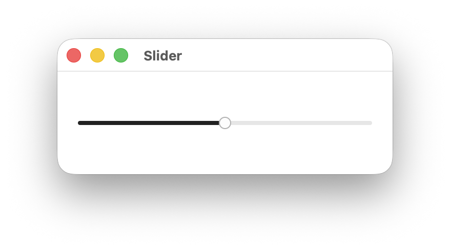
When To Use It
Use Slider when you need users to select a specific value within a continuous range, such as volume, brightness, opacity, or other numeric parameters. Prefer sliders over spinboxes for values that benefit from visual representation of the range.
Constructing a Slider
A Slider takes a binding to an f32 value, normalized to the slider’s range. By default the range is 0.0..1.0.
let value = Signal::new(0.5f32);
Slider::new(cx, value)
.on_change(|cx, val| println!("value: {val}"));Use the range modifier to set a custom value range, the vertical modifier for a vertical layout, and default_value to control the value used when resetting the thumb:
Slider::new(cx, value)
.range(-50.0..50.0)
.default_value(0.0)
.on_change(move |cx, val| cx.emit(AppEvent::SetValue(val)));
Slider::new(cx, value)
.range(-50.0..50.0)
.default_value(0.0)
.on_change(move |cx, val| cx.emit(AppEvent::SetValue(val)))
.vertical(true);Slider Modifiers
| Modifier | Type | Description | Default |
|---|---|---|---|
on_change | Fn(&mut EventContext, f32) | Called with the new f32 value whenever the slider is moved. | — |
range | impl Res<Range<f32>> | The minimum and maximum value of the slider. | 0.0..1.0 |
vertical | impl Res<bool> | Sets the slider to vertical layout when true. | false |
step | impl Res<f32> | The increment used when moving the slider with the keyboard. | 0.01 |
default_value | impl Res<f32> | Value restored when the thumb is double-clicked. | Initial bound value |
Components and Styling

A Slider is composed of the following sub-elements, each targetable by their CSS class name:
| Selector | Description |
|---|---|
slider | The outermost container element. |
slider.vertical | Applied when the orientation is Vertical. |
slider .track | The background track that spans the full width of the slider. |
slider .range | The filled portion of the track representing the current value. |
slider .thumb | The draggable handle positioned at the current value. |
Theming
| Selector | Property | Default Theme Token |
|---|---|---|
slider:focus-visible | outline-color | --ring |
slider .track | background-color | --secondary |
slider .range | background-color | --primary |
slider .thumb | background-color | --primary-foreground |
slider .thumb | border-color | --border |
Customize slider appearance using CSS selectors and theme tokens. Here’s an example with a gradient track and an invisible range:
slider .track {
background-image: linear-gradient(90deg, #4facfe 0%, #00f2fe 100%);
}
slider .range {
background-color: transparent;
}
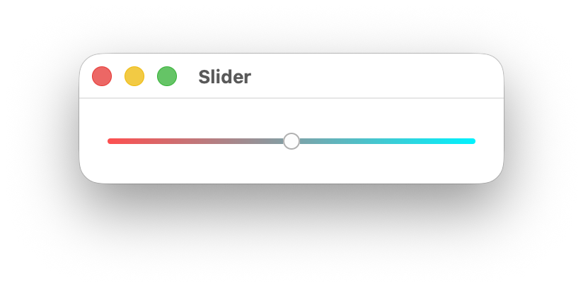
Accessibility
The slider has a role of Slider and exposes its current value, minimum, maximum, and step size to assistive technologies. Adheres to the Slider WAI-ARIA design pattern.
When the slider receives focus (via keyboard navigation), users can adjust the value using arrow keys or jump to the min/max with Home and End. Screen readers will announce the current value and range.
Adding a Label
To associate visible text with a slider for assistive technologies, give the label an identifier and associate the slider with it using .labeled_by:
HStack::new(cx, |cx| {
Label::new(cx, "Volume").id("volume_label");
Slider::new(cx, value)
.labeled_by("volume_label")
.on_change(|cx, val| {
cx.emit(AppEvent::SetValue(val));
});
})
.height(Auto)
.gap(Pixels(8.0));Using name Without a Label
If you are not using a visible Label, provide an accessible name directly on the slider with name:
Slider::new(cx, value)
.name("Volume")
.on_change(|cx, val| {
cx.emit(AppEvent::SetValue(val));
});Use this for icon-only or compact layouts where a separate text label is not present.
Slider and Textbox with a Shared Label
When a slider is paired with a textbox (for direct numeric entry), link both controls to the same visible label using labeled_by:
HStack::new(cx, |cx| {
Label::new(cx, "Volume").id("volume_label");
Slider::new(cx, value)
.labeled_by("volume_label")
.on_change(|cx, val| {
cx.emit(AppEvent::SetValue(val));
});
Textbox::new(cx, value)
.labeled_by("volume_label");
})
.height(Auto)
.gap(Pixels(8.0));This makes assistive technologies announce both controls with the same label context.
Pointer Interaction
Users can interact with the slider using the pointer in three ways:
- Click on the slider track to move the value immediately to that position.
- Drag the thumb along the track to continuously update the value.
- Double-click the thumb to reset the slider to
default_value.
Pointer updates are clamped to the configured range and aligned to the configured step, matching keyboard behavior.
Keyboard Interaction
| Key | Action |
|---|---|
ArrowRight / ArrowUp | Increment the value by one step. |
ArrowLeft / ArrowDown | Decrement the value by one step. |
Home | Set the value to the range minimum. |
End | Set the value to the range maximum. |
Spinbox
An input for incrementing and decrementing numeric values.
When To Use It
Use Spinbox when users need precise step-by-step numeric control, especially where keyboard control and min/max bounds are important.
Constructing a Spinbox
Spinbox binds to a numeric value and emits changes through callbacks:
let value = Signal::new(12.0f64);
Spinbox::new(cx, value)
.min(0.0)
.max(100.0)
.on_change(|cx, val| cx.emit(AppEvent::SetValue(val)));Vertical orientation with plus/minus icons:
Spinbox::new(cx, value)
.orientation(Orientation::Vertical)
.icons(SpinboxIcons::PlusMinus)
.on_increment(|cx| cx.emit(AppEvent::Increment))
.on_decrement(|cx| cx.emit(AppEvent::Decrement));Spinbox Modifiers
| Modifier | Type | Description | Default |
|---|---|---|---|
on_change | Fn(&mut EventContext, f64) | Called when value changes from increment/decrement/set-min/set-max. | - |
on_increment | Fn(&mut EventContext) | Called when increment action is triggered. | - |
on_decrement | Fn(&mut EventContext) | Called when decrement action is triggered. | - |
orientation | impl Res<Orientation> | Horizontal or Vertical button layout. | Horizontal |
icons | impl Res<SpinboxIcons> | Icon set for buttons (Chevrons, PlusMinus). | Chevrons |
min | impl Res<impl Into<f64>> | Minimum allowed value. | none |
max | impl Res<impl Into<f64>> | Maximum allowed value. | none |
Components and Styling
| Selector | Description |
|---|---|
spinbox | Root element. |
spinbox.horizontal | Horizontal orientation class. |
spinbox.vertical | Vertical orientation class. |
spinbox .spinbox-button | Increment/decrement buttons. |
spinbox .spinbox-value | Internal textbox showing value. |
Accessibility
The internal value control is exposed with role SpinButton.
Keyboard interaction:
| Key | Action |
|---|---|
ArrowUp / ArrowRight | Increment |
ArrowDown / ArrowLeft | Decrement |
Home | Set to min (if set) |
End | Set to max (if set) |
HStack, VStack, ZStack
Stack views are container primitives for arranging child views.
When To Use It
Use stack views whenever you are composing layout structure:
- Use
VStackfor vertical flow (top-to-bottom). - Use
HStackfor horizontal flow (left-to-right). - Use
ZStackwhen children need to overlap in layers.
Constructing Stacks
use vizia::prelude::*;
VStack::new(cx, |cx| {
Label::new(cx, "Title");
HStack::new(cx, |cx| {
Button::new(cx, |cx| Label::new(cx, "Cancel"));
Button::new(cx, |cx| Label::new(cx, "Save"));
})
.gap(Pixels(8.0));
})
.gap(Pixels(12.0));
ZStack::new(cx, |cx| {
Element::new(cx).class("background");
Label::new(cx, "Overlayed text");
});Stack API Notes
VStack::new(cx, content)HStack::new(cx, content)(internally sets row layout)ZStack::new(cx, content)
Most layout behavior is controlled through shared layout modifiers:
gap,padding,alignment,size,width,height,wrap, and related constraints.
Components and Styling
| Selector | Description |
|---|---|
vstack | Vertical stack container. |
hstack | Horizontal stack container. |
zstack | Overlay stack container. |
Accessibility
HStack and VStack use role GenericContainer. Keep reading/focus order aligned with visual order for clarity.
Switch
An input where the user toggles a boolean value between on and off.
When To Use It
Use Switch for immediate binary settings such as enabling notifications, dark mode, or realtime updates. Prefer switches for settings panels and quick toggles where state change is applied immediately.
Constructing a Switch
A Switch binds to a bool and emits actions through on_toggle:
let enabled = Signal::new(false);
Switch::new(cx, enabled)
.on_toggle(|cx| cx.emit(AppEvent::ToggleEnabled));With a visible label:
HStack::new(cx, |cx| {
Switch::new(cx, enabled)
.id("notifications_switch")
.on_toggle(|cx| cx.emit(AppEvent::ToggleEnabled));
Label::new(cx, "Enable notifications")
.describing("notifications_switch");
})
.gap(Pixels(8.0))
.height(Auto);Switch Modifiers
| Modifier | Type | Description | Default |
|---|---|---|---|
on_toggle | Fn(&mut EventContext) | Called when the switch is toggled. | - |
Components and Styling
Switch uses a root switch element and a thumb child.
| Selector | Description |
|---|---|
switch | Root switch element. |
switch .thumb | Thumb/handle element. |
switch:checked | Checked/on state. |
switch:disabled | Disabled state. |
Accessibility
Switch sets role Switch and is keyboard navigable.
- Use
name("...")when there is no visible label. - Use
id(...)anddescribing(...)to associate visible label text.
Keyboard interaction:
| Key | Action |
|---|---|
Space / Enter | Toggles the switch when focused. |
TabView
A container that displays one panel at a time, selected by tab headers.
When To Use It
Use TabView when multiple related panels share the same area and users need quick switching between them (for example General/Audio/Advanced settings pages).
Constructing a TabView
TabView::new takes a list and a builder that returns TabPair for each item.
#[derive(Clone)]
struct SettingsTab {
title: String,
}
let tabs = Signal::new(vec![
SettingsTab { title: String::from("General") },
SettingsTab { title: String::from("Audio") },
]);
TabView::new(cx, tabs, |_, _index, tab| {
TabPair::new(
move |cx| Label::new(cx, tab.title.clone()),
move |cx| Label::new(cx, format!("{} content", tab.title)),
)
})
.on_select(|cx, index| cx.emit(AppEvent::SelectTab(index)));Vertical layout and externally controlled selection:
TabView::new(cx, tabs, |_, index, tab| {
TabPair::new(
move |cx| Label::new(cx, tab.title.clone()),
move |cx| Label::new(cx, format!("Panel {}", index)),
)
})
.vertical()
.with_selected(selected_tab_index);TabView Modifiers
| Modifier | Type | Description | Default |
|---|---|---|---|
vertical | fn vertical(self) -> Self | Switches tab layout to vertical mode (no argument). | horizontal |
on_select | Fn(&mut EventContext, usize) | Called when selected tab changes. | - |
with_selected | impl Res<impl Into<usize>> | Programmatically sets selected tab index. | 0 |
Components and Styling
| Selector | Description |
|---|---|
tabview | Root tab view element. |
tabview.vertical | Vertical orientation class on root. |
tabview .tabview-header | Header scroll area container. |
tabview .tabview-content-wrapper | Active panel content container. |
tabheader | Individual tab header item. |
tabheader:checked | Active tab header state. |
tabheader.vertical | Vertical tab header class. |
Accessibility
- Keep tab labels short and unique.
- Track selected index in app state via
on_selectorwith_selected. - Ensure focus order remains clear when switching tabs.
Table
Table renders rows and columns with optional sorting, selection, and resizable columns.
When To Use It
Use Table when you need rich row/column presentation with custom cell content, sortable headers, and controlled selection for medium-sized datasets.
Constructing a Table
Table::new(cx, rows, columns, |row: &RowData| row.id)
.sort_state(sort_state)
.sort_cycle(TableSortCycle::TriState)
.resizable_columns(true)
.selectable(Selectable::Single)
.selected_row_ids(selected_ids)
.on_sort(|cx, key, direction| {
cx.emit(AppEvent::SortBy(key, direction));
})
.on_row_select(|cx, id| {
cx.emit(AppEvent::SelectRow(id));
});Define columns with TableColumn and optional header helpers:
let columns = vec![
TableColumn::new(
"name",
|cx, sort| TableHeader::new(cx, "Name", sort),
|cx, row| Label::new(cx, row.map(|r: &RowData| r.name.clone())),
)
.width(220.0)
.min_width(120.0)
.sortable(true)
.resizable(true),
];Table Modifiers
| Modifier | Type | Description | Default |
|---|---|---|---|
sort_state | impl Res<Option<TableSortState<K>>> | Controlled sort column + direction. | None |
resizable_columns | impl Res<impl Into<bool>> | Enables/disables column resize interactions globally. | false |
sort_cycle | impl Res<impl Into<TableSortCycle>> | Header click sort behavior (BiState or TriState). | BiState |
selectable | impl Res<impl Into<Selectable>> | Row selection mode. | Selectable::None |
selection_follows_focus | impl Res<impl Into<bool>> | Select rows as focus moves. | false |
selected_row_ids | impl Res<[Id]> | Controlled selected row IDs. | empty |
on_sort | Fn(&mut EventContext, K, TableSortDirection) | Called when header requests sort change. | - |
on_row_select | Fn(&mut EventContext, Id) | Called when a row is selected. | - |
Core Types
TableTableColumnTableHeaderTableSortStateTableSortDirectionTableSortCycle
Sorting is controlled by your model: the table emits sort requests via on_sort, and you provide sorted rows back into Table::new.
Components and Styling
| Selector | Description |
|---|---|
table | Root table element. |
table-header | Individual column header view (TableHeader) containing title and sort indicator. |
table .table-header-row | Header row container. |
table .table-header-cell | Header cell container. |
table .table-header-title | Header title label from TableHeader. |
table .table-sort-indicator | Sort indicator label from TableHeader. |
table .table-body | Body list container. |
table .table-row | Row container. |
table .table-row.odd / .even | Alternating row classes. |
table .table-cell | Cell container. |
table .table-header-cell.sortable | Applied to a header cell that is sortable. |
table .table-header-cell.resizable | Applied to a header cell that is currently resizable. |
Accessibility
- Provide descriptive header labels and keep row selection state mirrored in model state.
- Combine
selected_row_idsandon_row_selectfor predictable controlled behavior.
Textbox
A text input control for editing string-backed values.
When To Use It
Use Textbox for short text, numeric entry, search fields, and form input. Use Textbox::new_multiline for paragraph-style editing.
Constructing a Textbox
Single-line textbox:
let name = Signal::new(String::from(""));
Textbox::new(cx, name)
.placeholder("Display name")
.on_edit(|cx, text| cx.emit(AppEvent::EditingName(text)))
.on_submit(|cx, text, from_enter| cx.emit(AppEvent::SubmitName(text, from_enter)));Multiline textbox with wrapping:
let notes = Signal::new(String::new());
Textbox::new_multiline(cx, notes, true)
.placeholder("Notes")
.on_submit(|cx, text, _| cx.emit(AppEvent::SubmitNotes(text)));Validation example:
Textbox::new(cx, age_text)
.validate(|age: &u32| *age <= 130)
.on_submit(|cx, age, _| cx.emit(AppEvent::SetAge(age)));Textbox Modifiers
| Modifier | Type | Description | Default |
|---|---|---|---|
on_edit | Fn(&mut EventContext, String) | Called whenever text content changes. | - |
on_submit | Fn(&mut EventContext, T, bool) | Called on submit/blur with parsed value and source flag. | - |
on_blur | Fn(&mut EventContext) | Called when textbox loses editing focus. | - |
on_cancel | Fn(&mut EventContext) | Called when edit is cancelled (Escape). | - |
validate | Fn(&T) -> bool | Validates parsed value; invalid values are not submitted. | none |
placeholder | impl Res<impl ToStringLocalized> | Placeholder text when input is empty. | empty |
Components and Styling
| Selector | Description |
|---|---|
textbox | Root textbox element. |
textbox.multiline | Applied for wrapped multiline textbox. |
textbox.caret | Applied while caret is visible/blinking. |
textbox:placeholder-shown | Applied when placeholder text is shown. |
Accessibility
- Single-line textbox uses role
TextInput. - Multiline textbox uses role
MultilineTextInput. - Use
name(...)for accessible naming when no visible label is present. - Use
id(...)anddescribing(...)/labeled_by(...)with aLabelfor explicit associations.
Keyboard Interaction
| Key | Action |
|---|---|
Enter | Submit in single-line mode; insert newline in multiline mode. |
Escape | Cancel editing (on_cancel) or end edit if no cancel handler is set. |
ArrowLeft / ArrowRight | Move caret left/right. |
ArrowUp / ArrowDown | Move caret by line in multiline mode. |
Home / End | Move caret to line start/end. |
PageUp / PageDown | Move by page. |
Ctrl+PageUp / Ctrl+PageDown | Move to start/end of document body. |
Backspace / Delete | Delete text backward/forward. |
Ctrl/Cmd+A | Select all text. |
Ctrl/Cmd+C | Copy selection. |
Ctrl/Cmd+V | Paste from clipboard. |
Ctrl/Cmd+X | Cut selection. |
On macOS, word navigation/deletion uses Option, and line-boundary navigation uses Cmd, matching platform conventions.
ToggleButton
A button-style input that toggles between checked and unchecked states.
When To Use It
Use ToggleButton when you want button visuals with persistent on/off state, such as bold/italic toolbar actions or feature toggles.
Constructing a ToggleButton
ToggleButton binds to a bool and accepts custom button content:
let enabled = Signal::new(false);
ToggleButton::new(cx, enabled, |cx| Label::new(cx, "Snap"))
.on_toggle(|cx| cx.emit(AppEvent::ToggleSnap));Icon content works the same way:
ToggleButton::new(cx, is_bold, |cx| Svg::new(cx, ICON_BOLD))
.name("Bold")
.on_toggle(|cx| cx.emit(AppEvent::ToggleBold));ToggleButton Modifiers
| Modifier | Type | Description | Default |
|---|---|---|---|
on_toggle | Fn(&mut EventContext) | Called when the button is activated/toggled. | - |
Components and Styling
| Selector | Description |
|---|---|
toggle-button | Root element. |
toggle-button:checked | Checked/active state. |
toggle-button:disabled | Disabled state. |
Because content is custom, child selectors depend on what you place inside (label, svg, stacks, etc.).
Accessibility
ToggleButton uses role Button, is checkable, and reports checked state to assistive tech.
Keyboard interaction:
| Key | Action |
|---|---|
Space / Enter | Activates/toggles the button when focused. |
Tooltip
A lightweight contextual popup shown for a parent/trigger view.
When To Use It
Use Tooltip for short explanatory text on hover/focus, icon descriptions, and compact contextual guidance.
Constructing a Tooltip
Tooltip is typically attached using the tooltip(...) action modifier on another view.
use vizia::prelude::*;
Button::new(cx, |cx| Label::new(cx, "Save"))
.tooltip(|cx| {
Tooltip::new(cx, |cx| {
Label::new(cx, "Save changes");
})
.placement(Placement::Top)
.arrow(true)
.arrow_size(Pixels(8.0));
});Tooltip Modifiers
| Modifier | Type | Description | Default |
|---|---|---|---|
placement | impl Res<impl Into<Placement>> | Preferred position relative to parent. | Top |
arrow | impl Res<impl Into<bool>> | Show or hide tooltip arrow. | true |
arrow_size | impl Res<impl Into<Length>> | Arrow size. | 8px |
Components and Styling
| Selector | Description |
|---|---|
tooltip | Root tooltip element. |
tooltip arrow | Arrow indicator element shown when arrow(true). |
Tooltip internally repositions to stay visible and supports cursor-based placement via Placement::Cursor.
Accessibility
- Uses role
Tooltip. - Keep tooltip text short and supplemental (not the only way to access required information).
- Ensure trigger controls remain keyboard reachable so tooltip content is discoverable beyond mouse hover.
VirtualList
A high-performance list that recycles item views and renders only visible rows.
When To Use It
Use VirtualList for large datasets where creating a view for every item would be expensive. It is ideal for logs, long search results, large tables-of-content, and file lists.
Constructing a VirtualList
VirtualList::new takes a list source, fixed item height, and item builder.
let rows = Signal::new((0..10_000).collect::<Vec<usize>>());
VirtualList::new(cx, rows, 28.0, |cx, index, item| {
Label::new(cx, item.map(|value| format!("Row {}: {}", index, value)))
})
.selectable(Selectable::Single)
.on_select(|cx, index| cx.emit(AppEvent::SelectRow(index)));For custom data sources, use new_generic with explicit length/index accessors.
VirtualList Modifiers
| Modifier | Type | Description | Default |
|---|---|---|---|
selection | impl Res<[usize]> | Sets selected indices from external state. | no selection |
on_select | Fn(&mut EventContext, usize) | Called when an item is selected. | - |
selectable | impl Res<Selectable> | Enables None, Single, or Multi selection. | Selectable::None |
selection_follows_focus | impl Res<bool> | Select focused item during keyboard navigation. | false |
scroll_to_cursor | bool | Scrollbar jumps to pointer when pressed. | true |
on_scroll | Fn(&mut EventContext, f32, f32) | Called when list scroll position changes. | - |
scroll_x | impl Res<f32> | Sets horizontal scroll position. | 0.0 |
scroll_y | impl Res<f32> | Sets vertical scroll position. | 0.0 |
show_horizontal_scrollbar | impl Res<bool> | Controls horizontal scrollbar visibility. | false |
show_vertical_scrollbar | impl Res<bool> | Controls vertical scrollbar visibility. | true |
Components and Styling
| Selector | Description |
|---|---|
virtual-list | Root element. |
virtual-list.selectable | Applied when selection is enabled. |
virtual-list list-item | Recycled list item elements. |
virtual-list list-item.focused | Focused item state. |
virtual-list list-item:checked | Selected item state. |
VirtualList uses a ScrollView internally and absolute positioning for visible rows.
Accessibility
VirtualList uses role List and row items use list-item semantics.
Keyboard interaction:
| Key | Action |
|---|---|
ArrowDown / ArrowUp | Move focused item |
Space / Enter | Select focused item |
For horizontal virtualized lists, use custom key handling in your container logic.
VirtualTable
VirtualTable is a virtualized table optimized for large datasets.
When To Use It
Use VirtualTable when table datasets are large enough that rendering all rows at once is too expensive. It keeps UI performance stable by reusing row views and rendering only visible rows.
Constructing a VirtualTable
VirtualTable::new(cx, rows, columns, 32.0, |row: &RowData| row.id)
.sort_state(sort_state)
.resizable_columns(true)
.selectable(Selectable::Single)
.selected_row_ids(selected_ids)
.on_sort(|cx, key, direction| {
cx.emit(AppEvent::SortBy(key, direction));
})
.on_row_select(|cx, id| {
cx.emit(AppEvent::SelectRow(id));
});item_height is required and should match your row layout height for smooth virtualization.
VirtualTable Modifiers
| Modifier | Type | Description | Default |
|---|---|---|---|
sort_state | impl Res<Option<TableSortState<K>>> | Controlled sort column + direction. | None |
resizable_columns | impl Res<impl Into<bool>> | Enables/disables column resize interactions globally. | false |
sort_cycle | impl Res<impl Into<TableSortCycle>> | Header click sort behavior (BiState or TriState). | BiState |
selectable | impl Res<impl Into<Selectable>> | Row selection mode. | Selectable::None |
selection_follows_focus | impl Res<impl Into<bool>> | Select rows as focus moves. | false |
selected_row_ids | impl Res<[Id]> | Controlled selected row IDs. | empty |
on_sort | Fn(&mut EventContext, K, TableSortDirection) | Called when header requests sort change. | - |
on_row_select | Fn(&mut EventContext, Id) | Called when a row is selected. | - |
API Notes
- Constructor:
VirtualTable::new(cx, rows, columns, item_height, row_id) - Uses
VirtualListinternally for viewport-efficient row rendering. - Shares sort/selection patterns with
Table.
Components and Styling
| Selector | Description |
|---|---|
virtual-table | Root virtual table element. |
virtual-table .table-header-row | Header row container. |
virtual-table .table-header-cell | Header cell container. |
virtual-table .table-header-title | Header title label from TableHeader. |
virtual-table .table-sort-indicator | Sort indicator label from TableHeader. |
virtual-table .table-body | Virtualized body container. |
virtual-table .table-row | Recycled row container. |
virtual-table .table-row.odd / .even | Alternating row classes. |
virtual-table .table-cell | Cell container. |
Accessibility
- Keep row identity stable via
row_idso controlled selection remains consistent during virtualization. - Provide clear header labels and selection feedback when rows are recycled.
XYPad
A 2D input for controlling two normalized floating-point values at once.
When To Use It
Use XYPad when users need to manipulate two related parameters together, such as X/Y position, panning, or effect parameters.
Constructing an XYPad
XYPad binds to a tuple (x, y) where each value is normalized to 0.0..=1.0.
use vizia::prelude::*;
pub enum AppEvent {
SetXY(f32, f32),
}
let xy = Signal::new((0.5f32, 0.5f32));
XYPad::new(cx, xy)
.on_change(|cx, x, y| cx.emit(AppEvent::SetXY(x, y)));XYPad Modifiers
| Modifier | Type | Description | Default |
|---|---|---|---|
on_change | Fn(&mut EventContext, f32, f32) | Called when pointer interaction changes X/Y values. | - |
Components and Styling
| Selector | Description |
|---|---|
xypad | Root element. |
xypad .thumb | Draggable thumb indicator. |
XYPad sets default size, border, and clipped overflow internally; override with regular style modifiers or CSS as needed.
Accessibility
XYPad does not expose dedicated keyboard stepping by default, so pair it with companion controls (for example Slider or Textbox) when keyboard-only precision is required.
Custom Views
Create reusable components when built-in views are not enough. You will learn composition, local state, custom behavior, and custom drawing.
Custom Views
A custom view is a reusable component built from a Rust type that implements View.
The standard pattern has three parts:
- Define a struct for view state.
- Add a
new(cx, ...) -> Handle<Self>constructor. - Implement
Viewfor the struct.
Minimal custom view
use vizia::prelude::*;
pub struct ColorSwatch {
color: Color,
}
impl ColorSwatch {
pub fn new(cx: &mut Context, color: Color) -> Handle<Self> {
Self { color }.build(cx, |_cx| {})
}
}
impl View for ColorSwatch {
fn element(&self) -> Option<&'static str> {
Some("color_swatch")
}
}The build closure is where you compose child views (if any). The returned Handle<Self> lets callers apply modifiers.
Using a custom view
fn main() -> Result<(), ApplicationError> {
Application::new(|cx| {
ColorSwatch::new(cx, Color::red())
.size(Pixels(40.0))
.background_color(Color::red());
})
.run()
}What to put in the struct
- Put immutable configuration values in the struct.
- Use signals for reactive state.
- Keep large state in models when shared across multiple views.
Next: compose custom views from sub-views.
Custom View Composition
Most custom views are compositions of existing views.
Compose inside build
Create child views in the constructor’s build closure:
use vizia::prelude::*;
pub struct StatCard {
title: String,
value: Signal<i32>,
}
impl StatCard {
pub fn new(cx: &mut Context, title: impl Into<String>, value: Signal<i32>) -> Handle<Self> {
let title = title.into();
Self { title: title.clone(), value }.build(cx, move |cx| {
VStack::new(cx, move |cx| {
Label::new(cx, title.clone()).class("stat-title");
Label::new(cx, value).class("stat-value");
})
.class("stat-body");
})
}
}
impl View for StatCard {
fn element(&self) -> Option<&'static str> {
Some("stat_card")
}
}Composition guidelines
- Keep layout structure in the custom view constructor.
- Pass reactive inputs (signals/memos) to children instead of copying values.
- Expose style hooks with classes and
element()names. - Split very large custom views into smaller custom subviews.
Styling hooks
By returning Some("stat_card") from element(), you can style the root custom view in CSS:
stat_card {
background-color: #1d2430;
border-radius: 8px;
child-space: 8px;
}
Next: add model-backed state to custom views.
View Model Data
Custom views often need state. Use one of these patterns:
- View-local fields for fixed configuration.
- Signals for reactive local state.
- Model data when state is shared across multiple views.
Model-backed custom view
use vizia::prelude::*;
pub struct CounterModel {
count: Signal<i32>,
}
impl Model for CounterModel {}
pub struct CounterView;
impl CounterView {
pub fn new(cx: &mut Context, count: Signal<i32>) -> Handle<Self> {
Self.build(cx, |cx| {
Label::new(cx, count);
})
}
}
impl View for CounterView {}
fn main() -> Result<(), ApplicationError> {
Application::new(|cx| {
let count = Signal::new(0);
CounterModel { count }.build(cx);
CounterView::new(cx, count);
})
.run()
}Choosing ownership
- If state is shared, keep it in a model and pass signals in.
- If state is only for one component instance, keep it local.
- Avoid duplicating the same state in both view fields and model data.
Next: handle events inside custom views and route state writes through models.
View Event Handling
Custom views can handle events by overriding event() in their View implementation.
Handling view events
use vizia::prelude::*;
pub struct ClickableBadge {
text: String,
}
impl ClickableBadge {
pub fn new(cx: &mut Context, text: impl Into<String>) -> Handle<Self> {
let text = text.into();
Self { text: text.clone() }.build(cx, move |cx| {
Label::new(cx, text);
})
}
}
impl View for ClickableBadge {
fn event(&mut self, cx: &mut EventContext, event: &mut Event) {
event.map(|window_event, _meta| match window_event {
WindowEvent::MouseDown(_) => {
cx.emit(BadgeEvent::Pressed);
}
_ => {}
});
}
}
pub enum BadgeEvent {
Pressed,
}Best practices
- Emit domain events (
BadgeEvent::Pressed) from views. - Handle data writes in model event handlers.
- Use
meta.consume()only when you intentionally want to stop propagation.
This keeps custom views reusable and avoids coupling them to specific data models.
Next: bind signals directly inside custom view constructors.
Custom View Binding
Custom views become more reusable when they accept reactive inputs.
Accept impl Res<T> for inputs
Many built-in views accept impl Res<T>. Custom views can follow the same pattern.
use vizia::prelude::*;
pub struct StatusPill;
impl StatusPill {
pub fn new(cx: &mut Context, text: impl Res<String> + 'static) -> Handle<Self> {
Self.build(cx, |cx| {
Label::new(cx, text).class("status-pill");
})
}
}
impl View for StatusPill {}This allows callers to pass:
- A static value.
- A signal.
- A memo/derived value.
Binding modifiers in custom views
You can also bind modifiers to reactive values:
pub struct StatusDot;
impl StatusDot {
pub fn new(cx: &mut Context, color: impl Res<Color> + 'static) -> Handle<Self> {
Self.build(cx, |cx| {
Element::new(cx)
.size(Pixels(10.0))
.background_color(color)
.border_radius(Pixels(999.0));
})
}
}
impl View for StatusDot {}Guideline
Prefer passing reactive inputs into custom views instead of reading global state directly. This keeps components easy to test and reuse.
Next: expose polished APIs with custom modifiers.
Custom View Modifiers
Custom modifiers make your component API ergonomic and expressive.
Define a trait
use vizia::prelude::*;
pub trait StatCardModifiers {
fn highlighted(self, flag: impl Res<bool> + 'static) -> Self;
}Implement for a specific handle type
impl<'a> StatCardModifiers for Handle<'a, StatCard> {
fn highlighted(self, flag: impl Res<bool> + 'static) -> Self {
self.toggle_class("highlighted", flag)
}
}This keeps the modifier scoped to StatCard handles.
Use the modifier
let is_hot = Signal::new(true);
StatCard::new(cx, "CPU", Signal::new(42))
.highlighted(is_hot);Modifier design tips
- Use descriptive names (
highlighted,compact,status_color). - Prefer reactive parameters (
impl Res<T>) for stateful styling. - Keep modifiers focused on style/layout behavior.
- Put data writes in events/models, not modifier methods.
Custom Drawing
Custom drawing lets you paint arbitrary graphics onto a view’s canvas using vizia::vg primitives.
Implementing draw
Override draw in your View implementation to take full control of rendering:
use vizia::prelude::*;
use vizia::vg;
pub struct CircleView;
impl CircleView {
pub fn new(cx: &mut Context) -> Handle<Self> {
Self.build(cx, |_cx| {})
}
}
impl View for CircleView {
fn element(&self) -> Option<&'static str> {
Some("circle_view")
}
fn draw(&self, cx: &mut DrawContext, canvas: &mut Canvas) {
let bounds = cx.bounds();
let cx_f = bounds.x + bounds.w / 2.0;
let cy_f = bounds.y + bounds.h / 2.0;
let radius = bounds.w.min(bounds.h) / 2.0 - 2.0;
let mut path = vg::Path::new();
path.circle(cx_f, cy_f, radius);
canvas.fill_path(
&mut path,
&vg::Paint::color(Color::rgb(100, 149, 237).into()),
);
}
}Using bounds
cx.bounds() returns a BoundingBox with x, y, w, and h in logical pixels describing the view’s position and size.
Drawing primitives
Build paths using vg::Path:
| Method | Description |
|---|---|
path.rect(x, y, w, h) | Axis-aligned rectangle. |
path.circle(cx, cy, r) | Circle. |
path.move_to(x, y) | Move pen without drawing. |
path.line_to(x, y) | Draw a straight line. |
path.bezier_to(c1x, c1y, c2x, c2y, x, y) | Cubic bezier segment. |
path.close() | Close the current subpath. |
Filling and stroking
// Fill
canvas.fill_path(&mut path, &vg::Paint::color(Color::red().into()));
// Stroke
let mut stroke = vg::Paint::color(Color::black().into());
stroke.set_line_width(2.0);
canvas.stroke_path(&mut path, &stroke);Composing with default rendering
To layer custom graphics with the standard background, border, and text rendering, call the default draw helpers:
fn draw(&self, cx: &mut DrawContext, canvas: &mut Canvas) {
cx.draw_background(canvas);
cx.draw_shadows(canvas);
// ... custom drawing here ...
cx.draw_border(canvas);
cx.draw_text(canvas);
}See also
Bundling
Optimize distribution and packaging details for production builds. This section includes binary-size reduction and platform-specific behavior.
Reducing Binary Size
Add this to the Cargo.toml of your project to reduce binary size in release mode.
[profile.release]
codegen-units = 1
lto = true
opt-level = "z"
panic = "abort"
strip = true
Bundling with cargo-bundle
cargo-bundle creates platform-specific app bundles from a Rust binary.
For desktop applications, this is a convenient way to produce distributable artifacts with app metadata.
Install cargo-bundle
cargo install cargo-bundle
Add bundle metadata
Add bundle metadata to your project’s Cargo.toml:
[package.metadata.bundle]
name = "My App"
identifier = "com.example.my-app"
icon = ["assets/icon_32x32.png", "assets/icon_128x128.png", "assets/icon_256x256.png"]
resources = ["assets", "translations"]
short_description = "A Vizia application"
long_description = "A desktop application built with Vizia."
At minimum, set a unique identifier and a user-facing name.
Build a bundled app
From your app crate, run:
cargo bundle --release
This builds your binary and emits bundle output in target/release/bundle/.
The exact bundle format depends on your operating system.
Notes
- Bundle icon paths are relative to the crate root.
- Test the bundled app on the target OS before distribution.
- You can combine this with release profile tuning from the binary size page.
Removing Windows Shell
If you don’t need the shell to appear when running your application on Windows, you can add the following to the main.rs file:
#![windows_subsystem = "windows"]