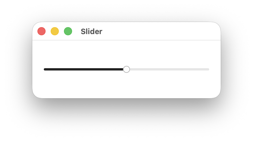
Slider
An input where the user selects a value from within a given range.
When To Use It
Use Slider when you need users to select a specific value within a continuous range, such as volume, brightness, opacity, or other numeric parameters. Prefer sliders over spinboxes for values that benefit from visual representation of the range.
Constructing a Slider
A Slider takes a binding to an f32 value, normalized to the slider’s range. By default the range is 0.0..1.0.
let value = Signal::new(0.5f32);

Slider::new(cx, value)
    .on_change(|cx, val| println!("value: {val}"));
Use the range modifier to set a custom value range, the vertical modifier for a vertical layout, and default_value to control the value used when resetting the thumb:
Slider::new(cx, value)
    .range(-50.0..50.0)
    .default_value(0.0)
    .on_change(move |cx, val| cx.emit(AppEvent::SetValue(val)));

Slider::new(cx, value)
    .range(-50.0..50.0)
    .default_value(0.0)
    .on_change(move |cx, val| cx.emit(AppEvent::SetValue(val)))
    .vertical(true);
Slider Modifiers
| Modifier | Type | Description | Default |
|---|---|---|---|
on_change | Fn(&mut EventContext, f32) | Called with the new f32 value whenever the slider is moved. | — |
range | impl Res<Range<f32>> | The minimum and maximum value of the slider. | 0.0..1.0 |
vertical | impl Res<bool> | Sets the slider to vertical layout when true. | false |
step | impl Res<f32> | The increment used when moving the slider with the keyboard. | 0.01 |
default_value | impl Res<f32> | Value restored when the thumb is double-clicked. | Initial bound value |
Components and Styling

A Slider is composed of the following sub-elements, each targetable by their CSS class name:
| Selector | Description |
|---|---|
slider | The outermost container element. |
slider.vertical | Applied when the orientation is Vertical. |
slider .track | The background track that spans the full width of the slider. |
slider .range | The filled portion of the track representing the current value. |
slider .thumb | The draggable handle positioned at the current value. |
Theming
| Selector | Property | Default Theme Token |
|---|---|---|
slider:focus-visible | outline-color | --ring |
slider .track | background-color | --secondary |
slider .range | background-color | --primary |
slider .thumb | background-color | --primary-foreground |
slider .thumb | border-color | --border |
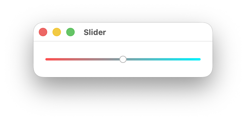
Customize slider appearance using CSS selectors and theme tokens. Here’s an example with a gradient track and an invisible range:
slider .track {
    background-image: linear-gradient(90deg, #4facfe 0%, #00f2fe 100%);
}

slider .range {
    background-color: transparent;
}
Accessibility
The slider has a role of Slider and exposes its current value, minimum, maximum, and step size to assistive technologies. Adheres to the Slider WAI-ARIA design pattern.
When the slider receives focus (via keyboard navigation), users can adjust the value using arrow keys or jump to the min/max with Home and End. Screen readers will announce the current value and range.
Adding a Label
To associate visible text with a slider for assistive technologies, give the label an identifier and associate the slider with it using .labeled_by:
HStack::new(cx, |cx| {
    Label::new(cx, "Volume").id("volume_label");

    Slider::new(cx, value)
        .labeled_by("volume_label")
        .on_change(|cx, val| {
            cx.emit(AppEvent::SetValue(val));
        });
})
.height(Auto)
.gap(Pixels(8.0));
Using name Without a Label
If you are not using a visible Label, provide an accessible name directly on the slider with name:
Slider::new(cx, value)
    .name("Volume")
    .on_change(|cx, val| {
        cx.emit(AppEvent::SetValue(val));
    });
Use this for icon-only or compact layouts where a separate text label is not present.
Slider and Textbox with a Shared Label
When a slider is paired with a textbox (for direct numeric entry), link both controls to the same visible label using labeled_by:
HStack::new(cx, |cx| {
    Label::new(cx, "Volume").id("volume_label");

    Slider::new(cx, value)
        .labeled_by("volume_label")
        .on_change(|cx, val| {
            cx.emit(AppEvent::SetValue(val));
        });

    Textbox::new(cx, value)
        .labeled_by("volume_label");
})
.height(Auto)
.gap(Pixels(8.0));
This makes assistive technologies announce both controls with the same label context.
Pointer Interaction
Users can interact with the slider using the pointer in three ways:
- Click on the slider track to move the value immediately to that position.
- Drag the thumb along the track to continuously update the value.
- Double-click the thumb to reset the slider to
default_value.
Pointer updates are clamped to the configured range and aligned to the configured step, matching keyboard behavior.
Keyboard Interaction
| Key | Action |
|---|---|
ArrowRight / ArrowUp | Increment the value by one step. |
ArrowLeft / ArrowDown | Decrement the value by one step. |
Home | Set the value to the range minimum. |
End | Set the value to the range maximum. |